How to GUI in Defold

Intro
 Hello! I’m Insality
In this thread, I’ll be sharing some notes on How to make GUI in Defold. I’ve been working with Defold for over 6 years now, and during this time, I’ve gained a lot of experience with GUI. I hope some of my notes can be helpful for you! Feel free to share your own tips and notes as well.
A big part of this section will be about Druid, as I believe it can make your GUI life much easier if you use it correctly.
Please note that everything I mention here is based on my opinion and my best practices. You may have a different approach, which is also good. Feel free to share your experiences too! Let’s build the good user experience manual about GUI in Defold.
GUI Layout
This section is about the overall GUI layout in Defold without any library. I’ll share my workflow with GUI and some tips that can be applied to make GUI layouts for game scenes, game windows, Druid components, and other UI elements.
How To Layout
Root Node
Every GUI file in the project should have a root node, and only this node should be at the top of the GUI hierarchy. The presence of a root node offers several advantages, including easier transformation, convenient control and simplified management of the GUI elements within the hierarchy. By maintaining a consistent practice of including a root node, you can ensure better organization and efficiency when working with GUI layouts throughout your project.
This root node usually has an empty texture, is not visible, has a stretched adjust mode, and is placed in the center of the GUI (it’s applied for game scenes and game windows).
The stretch adjust mode helps to keep this node always in the center of the game screen without any code.
Also, this root node is always defined in any gui_script or Druid component. So the root node is always accessible to the component.
The node size of the root is always shows the content size and should be changed if content size is changed.
Anchors
For game scenes and several game windows, I always use anchor nodes. An anchor node is an empty node with a stretched adjust mode that is placed inside the root or another anchor node, positioned at the border of the game screen.
For example, if root are placed at (800:600), the position of the NE_Anchor will also be (800:600) (the top right corner). It will always be in this corner, no matter the screen dimensions.
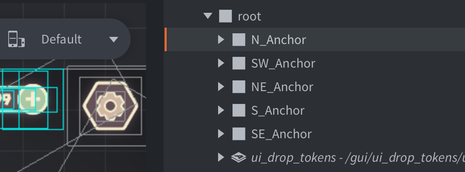
Anchor Naming
Anchor node have special node naming style for easier catch nodes by eyes.
Examples: N_Anchor or SE_Anchor.
Why Anchors Is Useful: Layouts
If I have the anchors in my GUI scene and I have to add different layout for this GUI screen. The only thing I have to do is override the position of root and anchor nodes to keep the layout generaly the same. It can be useful for different layout like portrait or landscape.
Also can be useful on GUI scene refactor if for some reason you have to change screen dimension only for this screen.
Why Anchors Is Useful: Insets
If I have anchors in GUI scene, it’s easy to manage the mobile devices insets with safearea extension.
How it looks in my code:
Note: luax is a helper file with some extended functions
local insets = safearea.get_insets()
luax.gui.add_y(gui.get_node("N_Anchor"), -insets.top  /  2)
luax.gui.add_x(gui.get_node("SW_Anchor"), insets.left  /  2)
luax.gui.add_x(gui.get_node("NE_Anchor"), -insets.right  /  2)
luax.gui.add_x(gui.get_node("SE_Anchor"), -insets.right  /  2)
Why It Is Useful: GUI Upscale Limit
By including anchors in a GUI scene, I can easily manage the GUI upscale for different devices. For example, I usually work with GUI for mobile devices, but sometimes I need it to render well on desktop or tablet devices.
To calculate the overall GUI upscale for the current device screen and set a limit for it, I use Anchor nodes and the Druid Layout component.
The following code shows how I set the maximum GUI upscale using the Druid Layout component:
self.druid:new_layout("N_Anchor"):set_max_gui_upscale(const.MAX_GUI_UPSCALE)
self.druid:new_layout("S_Anchor"):set_max_gui_upscale(const.MAX_GUI_UPSCALE)
self.druid:new_layout("SW_Anchor"):set_max_gui_upscale(const.MAX_GUI_UPSCALE)
self.druid:new_layout("NE_Anchor"):set_max_gui_upscale(const.MAX_GUI_UPSCALE)
Here is an example of how the GUI upscale limit works. This is the screenshots with GUI upscale turn on/off from my desktop:
GUI Nodes Naming
To facilitate rapid navigation through a GUI scene, I use several naming conventions for GUI nodes. You may find these helpful or you can develop your own conventions.
- Text nodes: All text nodes start with text_ (example: text_header)
- Button nodes: All button nodes start with button_ (example: button_agree)
- Icon nodes: All icon nodes start with icon_ (example: icon_money)
- Group nodes: All group nodes usually start with info_ (example: info_buttons Sounds like it should be group_, but I use info_ prefix for some reason)
- Prefab nodes: All prefab nodes start with prefab_ (example: prefab_card_item)
- Particle or effect nodes: All particle or effect nodes start with fx_ (example: fx_flashlight)
- Background nodes: Background nodes usually start with background_ (example: background_small)
- Panel nodes: Panel nodes usually start with panel_ (example: panel_experience)
- Basic Druid components: Some commonly used components always have a prefix, such as scroll_, grid_, progress_, etc (example: scroll_buttons, grid_items)
I have noticed that some people use a similar approach, but with uppercase postfixes like GROUP_, SCROLL_, GRID_ to make it easier to identify nodes at a glance. This seems like a useful convention as well.
GUI File Naming
To make it easier to manage GUI files, I follow next specific rules for naming them:
- Game window GUI files with window_ (example: window_settings)
- Game scene GUI files with scene_ (example: scene_game)
- Druid component GUI files with ui_ (example: ui_player_panel)
Using Mockups
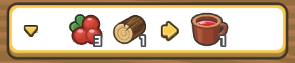
When I have a screen mockup that needs to be created, I load the image into the GUI scene using a GUI node (after loading the image into the atlas). Position it on the scene, adjust the alpha value (typically around 0.6), and create a layout that closely matches the mockup image, aiming for a pixel-perfect design.
The video example:
Editor Features
GUI Node Enable / Disable
This is perhaps one of the most practical features for me. If you haven’t been using it, now is the perfect time to start.
Toggle Component Guidelines
To hide all the lines in your GUI scene can be quite useful, especially when dealing with a large number of nodes that make it difficult to see the actual GUI screen. There is even a hotkey available for quickly toggling this feature.
Toggle Visibility Filters
Honestly, never used it. Just showing that you can do.
Empty Texture
There are many nodes in the GUI scene that should not be visible, such as the root node, anchor nodes, and other nodes used for additional transformations and grouping.
Before the release of Defold 1.3.5, a common practice was to insert an empty texture in every atlas and use it for these nodes to avoid breaking the batches.
Even after the 1.3.5 version, I still use the empty texture. It has become a familiar approach for me. I am aware of one difference between these methods. If a node is not visible, the stencil will not work for that node. Since I often use stencils for scrollable elements, I prefer to use the method with the empty texture.
Layers
There is a good topic about layers for Defold.
I have my own rules for naming GUI layers. Usually, I have a general layer that contains all the basic UI images. Additionally, I have a text layer for game texts. If I need another set of layers, I use the “_bot” or “_top” postfix. For example, a scene can have the following layers:
- general_bot
- text_bot
- general
- text
- general_top – Usually used for different hints over main GUI
- text_top
The order of these layers is consistent across all of my GUI files, which makes it easier for me since I don’t have to double-check the layer names in other GUIs and so on.
I use the auto-layout script from the Druid extension. It iterates over all GUI nodes and sets the layer name to be the same as the atlas name used by that node. It covers most generic cases, and for other cases, I make slight changes. But this script helps me save a lot of time that would have been spent on manual initial layer setup.
Prefab
Prefab is a node that is cloned to create multiple instances of it. Typically, it goes as a template with a root node.
I place the prefab inside a node where it should be and name it with the prefab_ prefix. I leave it visible in the GUI scene. In the gui_script init function, I typically have the following code:
	self._prefab_card = gui.get_node("prefab_card/root")
	gui.set_enabled(self._prefab_card, false)
When I need to create a new card, I clone the prefab and pass the nodes to the Druid component.
	local card_nodes = gui.clone_tree(self._prefab_card)
	local card_component = self.druid:new(CardComponent, "prefab_card", card_nodes)
	gui.set_enabled(card_component.root, true) -- also it can enabled directly from card_nodes["prefab_card/root"]
Starting from Defold 1.3.5, we can set the enabled state directly from the GUI, but in this case, the prefab nodes will not be visible in the GUI scene by default. My approach is to always see all prefab nodes in the GUI scene and set the enabled state from the script.
Helper nodes
Helper nodes are commonly used for transitions, enabling/disabling states, fading effects, and other types of animations. During GUI scene development, you may often find the need for such helper nodes.
In my cases, I frequently needs the additional nodes for scaling and animation transformations.
Node sizes
Always ensure that the empty nodes have sizes that correspond to the area they should cover. For instance, the size of the root node should always match the potential content size. Certain helper nodes may actually display the size of their content.
This practice is especially important for text nodes, as Druid can automatically fit the text within the node size, making it more convenient. For instance, if your game supports multiple languages, you can simply set the area for the text node, and regardless of the language, you can be confident that the text will always fit within that node size.
Druid Components

Custom Components
I want to emphasize that Druid is not just a set of defined components for placing buttons, scrolls, etc. Instead, it is mostly a way to handle all of your GUI elements in general. Custom components are the most powerful way to separate logic and create higher abstractions in your code.
Custom components are nearly everything in the GUI of my games. Decomposing the whole GUI into these components gives me the ability to easily manage them and be more agile with development and GUI layouts.
Component Events
All Druid components utilize the Druid Event to provide the ability to set up callbacks for various component actions. You can subscribe to any event and define a callback function, as well as unsubscribe from events.
Component Requires
It is important to remember to minimize the use of require calls in your custom components. Instead, abstract your logic so that it is not tightly coupled to your specific game. By reducing the number of require calls, your code becomes easier to debug and maintain. Additionally, it allows for more shareable components that can be used across multiple games.
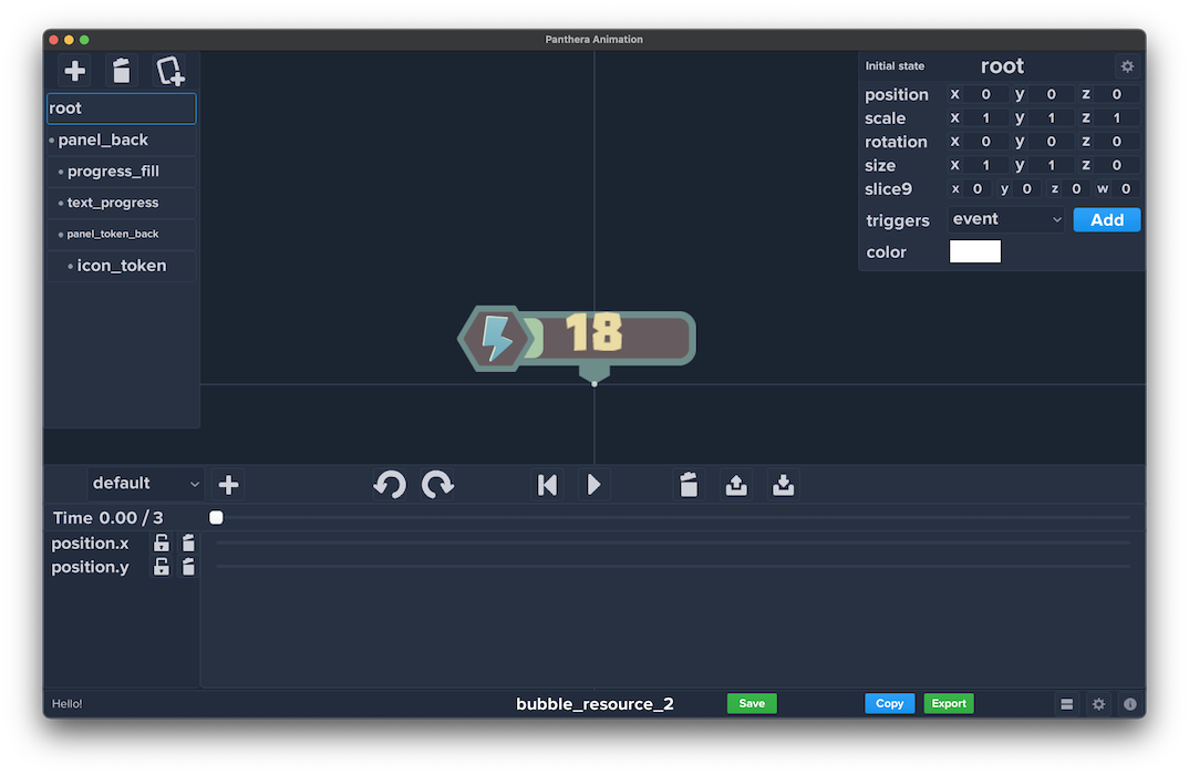
Animations
By Code
Here are some important notes to keep in mind when working with animations using code:
- If you disable a node that has animations, the animation will stop. When you enable the node again, the animation will continue from where it left off. It’s better to cancel animations when disabling a node.
- If you start a new animation on a node, it will cancel any previous animation that was running on that node. As a result, the callback associated with the previous animation will not be invoked.
Spine
I don’t remember any specific caveats when working with animations using Spine. Maybe you know any oh them?
Panthera
When using Panthera for animations, you can follow this approach:
- Create an animation table in the component’s
initializefunction. - Use the animation table to play and control animations.
- Finalize the animation in the
on_removecallback function.
Using Panthera allows for a convenient way of managing animations. When playing or stopping an animation, it automatically cancels any ongoing animations. This means that you don’t have to manually manage the states of nodes affected by the animation.
In the current version of Panthera, all of my fully animated components have the following definition in the initialize function:
    self._animation = panthera_animation.create(nil, {
        get_node = function(id) return self:get_node(id) end,
    }, true)
And later I call the animations like:
    panthera_animation.play(self._animation, {
        animation_id = animation_id
    })
Timers
It is important for Druid components to always clear timers in the on_remove function. If you have scheduled timers, make sure to cancel them when the component is removed. While this is not critical for *.gui_script files, as all timers will be cleared when the script is finalized, it is important for manually created and deleted components. You need to handle this yourself.
This applies not only to timers but also to event bindings, web connections, and other similar things.
Here’s an example of how to handle timers in a component:
function Component.init()
	self._timer_id  = timer.delay(1, true, refresh_function)
end

function Component.on_remove()
	if  self._timer_id  then
		timer.cancel(self._timer_id)
		self._timer_id  =  nil
	end
end
Set Component Data
It is recommended to create a single function for updating component data. This is particularly useful for DataList in the future, and it makes testing, component management, and stubbing easier.
In most cases, all of my Druid custom components (which comprise almost all GUI elements) have a Component:set_data(data) function. This function serves as the entry point for updating any component data. It allows for dynamic changes to the component at any time and makes testing easier by providing data table stubs.
Several GUI layouts per component
As mentioned earlier, Druid custom components consist of *.gui and *.lua files. To make a “variation”, you can copy the GUI file and making the necessary modifications, but keep in mind that used nodes in Druid component should exists. This approach allows for the use of different visual styles or skins for GUI components without requiring changes to the code.
Composition Over Inheritance
The principle of composition over inheritance is highly valuable in the long run. There are several advantages to using composition:
- Easy identification of the exact functions being called
- Improved code readability
- Simplified code testing and maintenance
Try to break down your interfaces into standalone widgets or small components. This approach makes the overall GUI development process much easier.
When you see a button in the GUI, it is always a button. If it’s a scroll, it’s always a Druid Scroll. With this approach, you can directly identify which functions are being called in your custom components and throughout the GUI.
Decomposition On Druid Components
Let’s consider a simple example of decomposing the interface into reusable Druid components. We’ll use the fantastic game CowBay as an example.
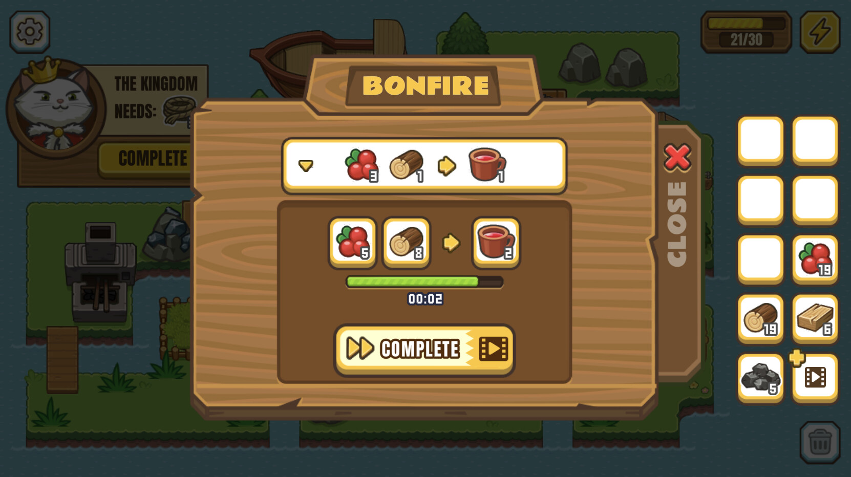
If I were to create this interface, I would break it down into the following components:

One of the basic components that can be reused everywhere. It could have a background with additional logic and icons around it.

Another core component that uses the item icons.
In essence, this is a scroll with the previous component. It has minimal internal logic.

The progress bar has animations and can have different variations depending on the game. Multiple .gui files and a single .lua file with component logic can be used.

A simple ad button that can be reused anywhere
Once we have all the components in the game, creating the window becomes quite simple. You place all the component templates in the window, and in the init function of the GUI script, you would have something like:
function init(self)
	-- ...
	self.ui_drop_items = self.druid:new(UiDropItems, "ui_drop_items")
	self.ui_selected_recipe = self.druid:new(UiItemRow, "ui_item_row")
	self.ui_progress_bar = self.druid:new(UiProgressBar, "ui_progress_bar")
	self.ui_ad_button = self.druid:new(UiAdButton, "ui_ad_button")
	-- ...
end
As mentioned earlier, in most components, I have a single function Component:set_data(data) for initializing data.
	-- ...
	self.ui_drop_items:set_data(recipes_list)
	self.ui_selected_recipe:set_data(selected_recipe)
	self.ui_progress_bar:set_data(progress_data)
	-- ...
All interaction between the components occurs through Druid events. They subscribe to each other and perform their respective tasks.
EmmyLua with Components
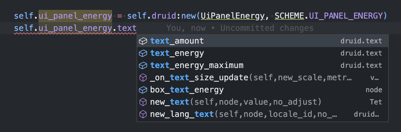
I always set the class name for any custom components I create. Here’s an example:
---@class ui_panel_energy: druid.base_component
---@field root node
---@field text_amount druid.text
---@field druid druid_instance
local UiPanelEnergy = component.create("ui_panel_energy")
Note: the druid.base_components is already defined in Druid EmmyLua annotations
This allows me to use the class name in the place where it’s created and benefit from full autocomplete and function navigation. For example:
self.ui_panel_energy = self.druid:new(UiPanelEnergy, "ui_panel_energy") ---@type ui_panel_energy
Logging
Advanced logging can be very useful, although during development, I often use pprint. Press  if you also use
 pprint instead of logging  .
.
Druid Component Lifecycle
- When the
*.gui_scriptfinal function is called, all components will trigger their on_remove function. - When a Druid component is removed, all child components will also be removed.
- If you have custom event bindings, make sure to remove them correctly in the
on_removefunction. - Druid components provide many useful lifecycle functions. Take a look at them, as you may find them helpful in your own components, such as on_window_resized or on_focus_lost.
Druid Component Visual Setup
Druid follows the ideology that everything that can be done in the GUI should be done in the GUI. This means that various node properties matter, especially node pivots and sizes.
Grid Anchor, Grid Prefab Size
- You can adjust the direction of the Druid Grid by changing the pivot of the Grid node.
- The size of each Grid element is determined by the size of the prefab node passed to it. It is not necessary to pass the exact prefab node; it is only used to initialize the element size.
Scroll Side
The Druid Scroll component relies on the following node values:
- Scroll view node size: the user input zone for scrolling.
- Scroll content size: the size of the content that can be scrolled. This can be modified by the Grid component or manually. In simple cases, you can adjust this size directly in the GUI scene.
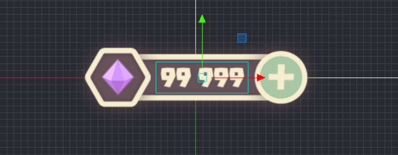
Text Area Size
The Druid Text component uses autoscaling by default. The size of the GUI text node represents the maximum size for your text. Therefore, it’s important to adjust this value accordingly. It’s also helpful to visualize the maximum possible text area directly in the GUI.
Progress size
The Druid Progress component utilizes the maximum progress size defined in the GUI layout. Therefore, make sure to set up your progress bar with a filled progress image that matches the desired size.
Druid Rich Text
Stay tuned for the upcoming release of Druid Rich Text!
Druid Back Component
In many games, especially early ones, the ability to navigate between windows using a “Back” button or the “Backspace”/“Esc” key on desktop platforms is often disabled. With Druid, you can easily add this functionality to every window. Here’s how:
function init(self)
	...
	-- The close function is your custom function to close window
	self.druid:new_back_handler(close)
end
That’s all you need to add to each window. If you haven’t implemented “Back” button handling yet, now is a good time to start!
Druid Component Code Generation
Druid provides a convenient feature for generating custom component code based on your *.gui file. You can refer to the documentation for more information on how to use this feature.
Here is a how it is looks like:
Unique Cases
In this section, I’d like to share a few additional notes that may come in handy. If you have anything to add, feel free to share it as well!
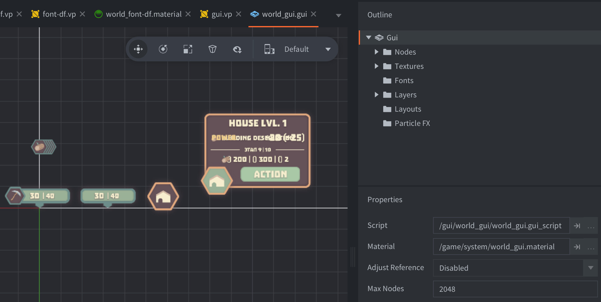
GUI in World Coordinates
In one of my prototype, I utilized GUI in world space, allowing GUI components to be rendered in world coordinates. Here’s how you can achieve this.
To use GUI in world coordinates, follow these steps:
- Use a separate material for the GUI and a different font for the game, which will be rendered using a different tag.
- In your render script, add a new render predicate for the world GUI:
	--- In init():
	self.world_gui_pred = render.predicate({ "world_gui" })

	--- In update():
	render.draw(self.tile_pred)

	-- If you use stencil in world GUI, add it here. Otherwise you can skip it
	render.enable_state(render.STATE_STENCIL_TEST)
	render.draw(self.world_gui_pred)
	render.disable_state(render.STATE_STENCIL_TEST)
- Before sending the action to
druid.on_input(), perform the necessary transformations to convert the input position from screen coordinates to World GUI coordinates. You can userendercamor any other method you prefer for this conversion:
function on_input(self, action_id, action)
    -- World GUI transform action input position
    local window_x, window_y = window.get_size()
    local stretch_x = window_x / gui.get_width()
    local stretch_y = window_y / gui.get_height()
    local x, y = rendercam.screen_to_world_2d(action.screen_x, action.screen_y, nil, nil, true)
    action.x = x / stretch_x
    action.y = y / stretch_y

    return self.druid:on_input(action_id, action)
end
- Create two new materials:
world_guiandfont_world_gui. Both materials should have theworld_guitag. Additionally, modify the position field accuracy in the vertex programs of both materials:
-- from:
attribute mediump vec4 position;

-- to:
attribute highp vec4 position;
-
Disable the
Adjust Referenceoption in your GUI scene since the GUI elements will be placed within world coordinates without adjustment to the screen size. -
Assign your world GUI materials to the relevant elements in your world GUI scene, including the world GUI font. Note that even if the font is the same, using different materials will generate separate textures (this issue is here).
Node limit
Calculating the node count for your GUI scenes can be challenging, but it’s important to invest time in making these calculations. Additionally, if you have a large list of elements, consider using the DataList component provided by Druid. This component creates GUI nodes only for the visible elements, optimizing performance.
Position nodes cross components
You can use the screen position of nodes as a universal cross-component reference. The following gui functions can help you with this:
https://defold.com/ref/gui/#gui.get_screen_position:nodehttps://defold.com/ref/gui/#gui.set_screen_position:node-screen_positionhttps://defold.com/ref/gui/#gui.screen_to_local:node-screen_position
For world GUI elements, use world positions to position your elements accordingly.
Case with gui.animate and node enabled state
It’s important to remember that animations started on a node will be paused when you use gui.set_enabled(node, false) to disable the node. When you enable the node again, the animation will continue from where it left off. This behavior can sometimes lead to bugs or unexpected behavior if not considered carefully. Keep this in mind when working with animations and node states to avoid any issues.
Starting from Defold 1.3.5, you can also use gui.set_visible in certain cases. When you turn off the visibility flag for a node, the animation will not be interrupted. This can be a useful alternative to disabling the node if you want to control the visibility of elements without affecting their animations.
Change GUI dimensions only for specific scene/window
There may be situations where you need to create a GUI layout for a different resolution than the one used in the main game. For example, if you have a window that is wider than the game’s main resolution. Instead of modifying the entire game’s resolution and redoing the GUI, you can follow this approach:
- Create a separate GUI layout with the required dimensions for the specific scene or window.
- Add this layout to the GUI scene along with the other layouts.
- When creating the window, adjust the anchor positions and consider the element sizes based on the added layout’s dimensions. This includes areas such as the window shadow, close button area, and other elements specific to that window.
- Ensure that only the added layout is used for this particular scene or window. Since it’s the only layout that matches the desired dimensions, it will be selected automatically.
By following this method, you can create a GUI layout specific to a different resolution without impacting the game’s overall resolution or requiring significant changes to the existing GUI.
Links
-
Druid - Defold UI Framework
-
Panthera - Visual Animation Tool for Defold
-
Monarch - Defold Screen Manager
-
Game UI Database - Awesome library to get inspiration for your game UI and learn from other game UI
-
Interface in Game - Another awesome library to get inspiration for your game UI and learn from other game UI
Support
Your donation helps me stay engaged in creating valuable projects for Defold. If you appreciate what I’m doing, please consider supporting me!
 Wow!. Hey man, the point is that if there are no donations you don’t contribute?, (Your donation helps me stay engaged in creating valuable projects for Defold. ) Are you conditioning your support?