Hello! My name is Dmitry and I’m a graphic designer (mainly). In addition I do programming for web development. I recently started developing games as a hobby. And for this I chose the Defold game engine because I like the Lua language. I really like how quickly I can prototype with Defold. But after working for two weeks, I found that the interface could be better and more convenient and then I (and many others) could make games even faster.
So I decided to make a quick sketch of what can be improved in my opinion. The main problem of the interface is that it uses space inappropriately and everything looks very large on my laptop, so I have to hide and open the panels or change their sizes in order to win some useful space.
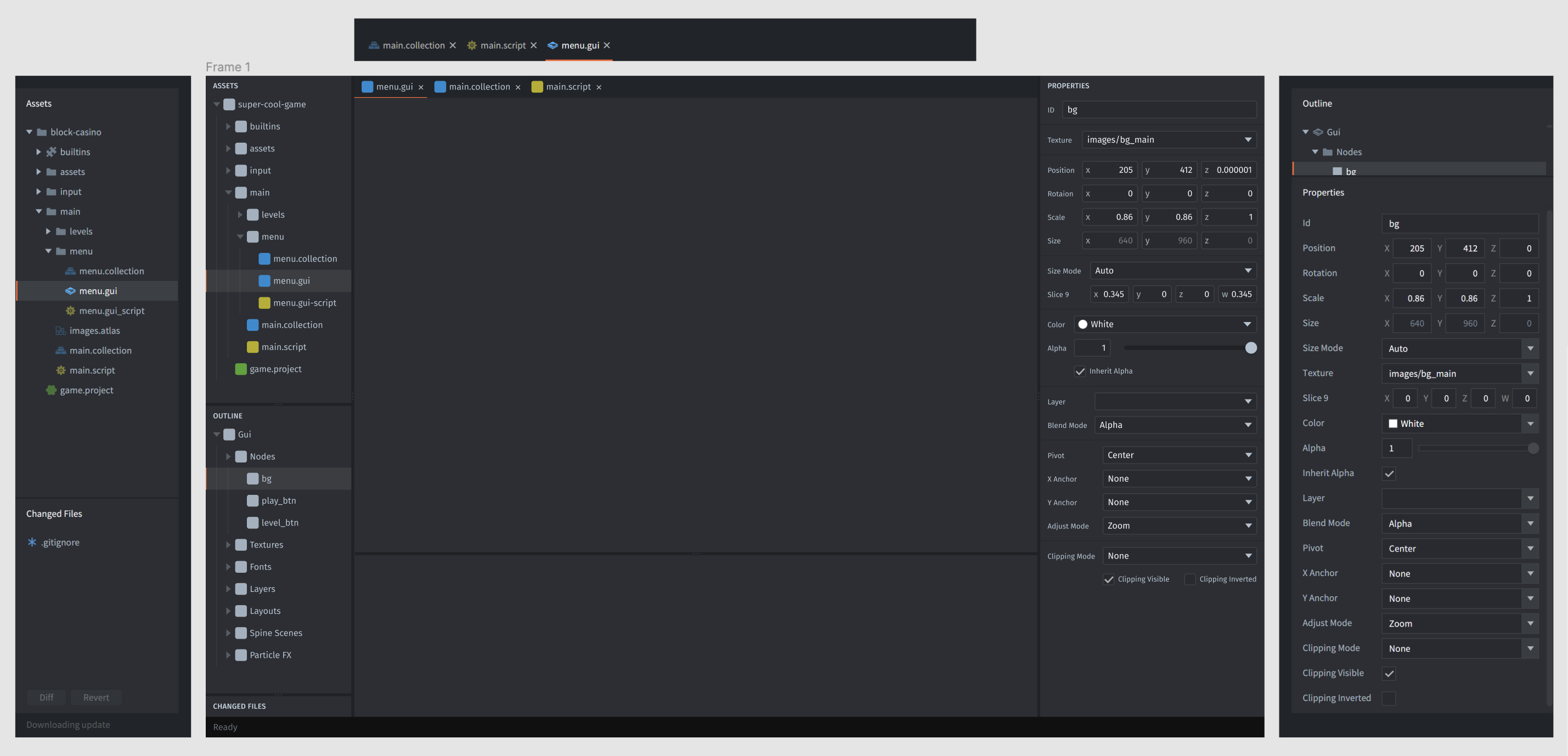
This is my attempt to improve the editor’s usable space — Figma.
I will be very happy if these changes appear in future updates.
Welcome @Strash! Some thoughts I have on your mockup:
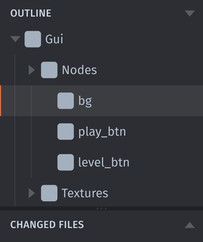
For a large project you will likely have both a long list of Assets and probably also complex scenes which will result in a long Outline. Wouldn’t it be harder to get a good overview if the Assets and Outline is in the same panel?
Another thought. When you select something in the Outline (or in the scene) the properties for that component or node is shown in the Properties panel. This makes me think that there’s a closer connection between Outline and Properties than between Assets and Outline, and to me it makes more sense to have Outline+Properties together like they are today.
One improvement I can think of is to hide/minimize the Properties panel when nothing is selected. This would give me more space for the Outline.
Yes, that makes sense. In this case, I think that it’s enough to add the ability to minimize panels by clicking on the title. But my main point is not to move Outline panel, but to correct the layout in the Properties. In my sketch I added separators for semantic blocks, but the height is still less than in the current version. There is too much air in the interface: wide dividers between panels, high indentation in the header and actually not used status bar.
Maybe. Or maybe I’m just used to the fact that in all graphic editors the layer panel and the inspector are always separate. It may be worth adding the ability to rearrange panels. Just my thoughts.
Remove extra vertical space in tab bar and panel title bars.
Add dividers to properties
Would take up extra space, but improve readability.
Condense some adjacent checkboxes into one line?
This looks nice in your mockup, but strikes me as a kind of arbitrary thing to code into the editor and decide how it works for the properties of every different kind of object.
Also I don’t think it would work well when the panel is made narrower.
One interesting idea I’ve seen about movable panels—Instead of having free drag-and-drop, you can have predefined locations (top-left, bottom-left, top-right, bottom-right, etc.) and a menu button for each—simpler to code, for 90% similar functionality.
Yup. I agree with a few of these things. Here’s my opinion on the matter:
Totally for these. I’ve always felt Editor 2 had excessive negative space. Sometimes, on my laptop I need to scroll the properties panel until I find what I’m looking for. Reducing the size of the form like this feels like a great quick win.
Also a big +1 for this. This makes vector fields much easier to visually parse and possibly even saves some horizontal space, which is at a premium in the properties sidebar. Also the rounded corners for the inputs is a nice touch.
I’m not sure about this one. Adding extra layout and structure metadata to each node type sounds like a non-trivial task with extra maintenance effort involved along the line. It’s a cool nice to have and would help greatly, but it’s also probably not worth it from a production PoV.
Maybe a decent compromise here would be to make boolean fields break title alignment, since their form control is very small anyway, but keep every other title aligned. Possibly moving the checkbox to the left of the boolean field might make this convention break stick out less. I’m not sure about this either, but might look better.
Yes. The Properties panel should not move. Letting the user re-arrange panels if they so wish would be a cool nice-to-have, but I don’t feel it’s essential. I like the layout the way it is. As @britzl pointed out, I feel it makes sense navigation-wise.
Yes. It really helps with readability with longer lists. I always enable visible whitespaces or indent guides in the code editors that I use for this very reason.
I didn’t read this topic completely yet, but it’ll be nice to get mouse cursor position ( x, y) somewhere like status bar. ruler lines are not enough for me when i’m working on editor window.