But in general it is a common use case, and I think Defold GUI system would be way awesomer if there will be a built-in feature that could allow to create custom clipping shapes!
I also thought about a simple solution where I can use two built-in GUI shapes: box + pie, like this:
But I can’t add one bar below both of this nodes, so I can either add it below box shape or pie shape
It would be nice if we could bound(?) somehow those nodes?
Ok, it is a solution, but what if I want at e.g. 50% HP have a straight edge of this bar at the end, but when at 100% have it clipped below the rounded shape?
Maybe even for this thick border an image could be hidden below the rounded end, so the box shape could be used, but again, all those are workarounds, therefore I think custom clipping shapes would be awesome
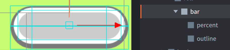
I set the percentage by simply resizing the rectangle underneath the border. To illustrate how things are layered, I’ve moved the progression rectangle in this screenshot:
This technique works as long as the curvature of the overlay border completely covers the progression rectangle and as long as the progression rectangle doesn’t stick out in the corners.
I was looking for a quick solution using rounded cornered progress bars and this post helped me come up with another solution. Hope this helps someone out there.
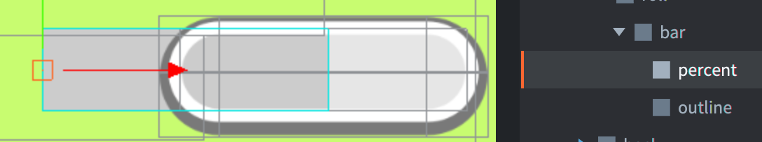
I ended up solving this by using a transparent stencil clipping node, and instead of resizing the fill image I resize the clipping node which reveals the child filler node.
The progressbar node contains the frame/background. The progressbarStencil is a box node with 1px transparent sprite, with clipping enabled, aligned to the left edge of the progressbar node and using a West pivot. The progressbarFill remains at its full width and is positioned in its final (100%) state inside the stencil.
At runtime, I only resize the stencil node. The fill image is never resized, so it doesn’t become distorted at low percentages (e.g. 1%), and the rounded ends remain perfect. This worked really well for creating a rounded progress bar in the GUI. You can also set the pivot to East for draining from right → left.
 )
)


