Pretty cool overall, here’s some playtest feedback for you:
A logo screen that’s skippable!  This game is already 10/10.
Menus that wrap and can be used with mouse and keyboard!  11/10!
The UI doesn’t seem to scale properly in fullscreen (may just be an HTML5 issue).
It’s a bit weird that you switch menu buttons on key release rather than press. It gives a “laggy” feel to the keyboard navigation.
I think some kind of tutorial is needed. I didn’t find out about the dash until an upgrade mentioned it, and then just hunted the keyboard for a few seconds to find it. Also there’s some upgrades that I don’t understand. The stuff about shields??? “Projectile cooldown”? Is that just your normal fire rate/delay between shots? “Explosion cooldown”? No idea what that is. To me, “cooldown” sounds like the delay between uses of an active ability that the player triggers.
No idea how to solve it, or even if it needs to be solved, but it’s a little bit weird in the very beginning, when you’re offered upgrades that you have no clue about (and that won’t even do anything until later), like “orbital damage” or whatever.
I don’t like the bouncy XP bar. It’s a bit annoying when it looks like it’s full because it’s bouncing around, but it’s actually not.
The “cards” could use some graphical work. I assume the text style is placeholder, and the card body/border design doesn’t really fit the sci-fi greeblyness of everything else.
When selecting an upgrade card, you don’t actually have to click on them with the mouse. If one is highlighted with the keyboard and you click anywhere, it chooses it. Also I would do the confirmation on key/button release, so if you press the wrong one by mistake you can correct it if you keep holding the button and move away.
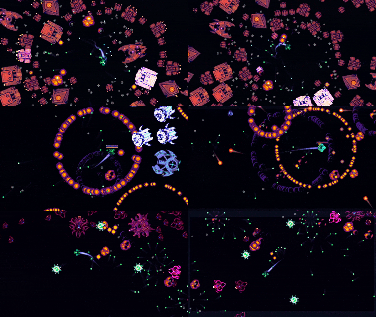
The way the enemies jostle against each other is kind of jittery. When you get a whole mass of them (pretty much always), the ones in the middle jump around a lot.
I would add next/prev arrow buttons to the character select screen. It’s not obvious that you click on the little characters (they’re basically the lowest-contrast thing on screen anyway). I only found it by using the arrow keys.
On my first run when I really had a mass of guys piling up it definitely started slowing down a bit, but overall it ran well. I’m guessing that all the collisions between enemies was dragging it down, rather than the total number of enemies, since it ran fine later when I was killing the main mob faster (but there were a ton of enemies total).
If you click like crazy on the screen when the game starts up  , it gets stuck. It starts black, shows a slightly reddish-black screen, then goes back to black, and only shows the little version text on the top left, and doesn’t get to the menu. [Edit:] Actually I guess it does get to the menu, you can start the game with the keyboard anyway, but nothing’s visible.
Now I sound like a hater  , but these are all just little nitpicks/UI tweaks. Overall it seems pretty professional!
![]() PLEASE HIT WISHLIST HERE NOW: (and bask in the radiant glory of the algo boost
PLEASE HIT WISHLIST HERE NOW: (and bask in the radiant glory of the algo boost ![]() thank you!)
thank you!)


