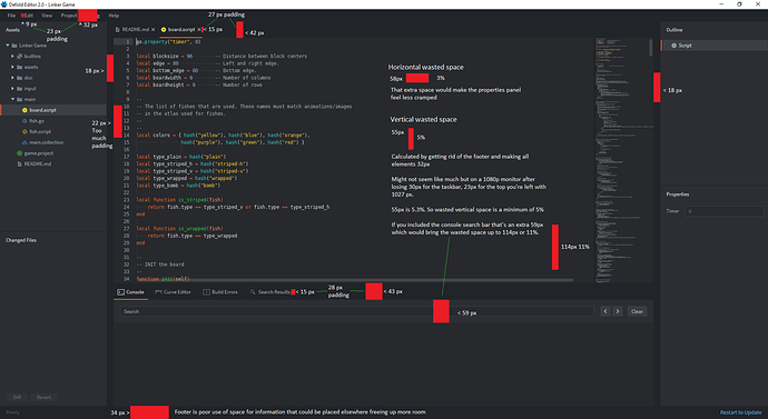
The UI in defold is beautiful and clean but the more I use it the more cramped it begins to feel. The properties window always feels cramped so much so that numbers get cut off. Yet it doesn’t have to be like this if some of the padding was reduced.
Defold UI has a lot of unnecessary padding both horizontally and vertically. I calculated some of the padding on the attached image in red.
Using a 1080p monitor on windows 10.
Horizontal wasted space is around 58px or 3%. 18px of padding either side of the middle window is way too much.
Vertical wasted space is around 114px or 11%. Search in console is permanently shown and takes a massive 59px. I know you can minimise the console window. The footer for most of the time unless building a project is useless and just wastes 34px vertically. This information could easily be moved and the footer removed.


 Eventually resizing or hiding things should be optional.
 +1
+1