StarOde : NES style, pixel art, grind heavy RPG (indev 7%)

I assume because of some encoding issues somewhere. Although I have not tested other east asian fonts yet to tell if it’s an error with this font…


I’ve been thinking about a name for this project, and decided to use one that I’ve been holding onto for a while to use on a project. This game will be called StarOde (and maybe later can make other projects with same IP). Ode as in a poem meant to be sung. Adventure! Space Magic! Fun!

https://www.starode.com/ Even have the .com but there’s nothing on there yet.

Initial logo, but I will still clean it up and make it fancy. The process of making its initial pixel form is very rough. Just import shrunk image of the larger vector logo, then make it a solid color, and then clean it up slightly. I’ll clean up, fix shapes, and add nice details over time.

I want to make a nice intro for the game eventually too. If you start game and don’t press any button it would show initial credits, some transitions into a logo, and then begin to go into some background lore (zelda lttp style).

5 Likes

Main work has to take priority so can only do so much a day… this next weekend I’d like to focus fully on this project though.

Small update to the Start menu screen

Wireframe for what I’ll call for now the Nexus menu screen

The […] button goes to the config screen. The [<-] button would return to previous screen.

If user stays idle long enough on the Start screen it would repeat the intro sequence.

If user is on mobile they would rarely see these screens after the first time unless they want to play another game slot.

Game would autosave constantly for user. I want to look into how Defold does saving under the hood and make sure there is enough going on there to guarantee saves are well handled and maybe modify system so I can save backups.

3 Likes

I tested another font - YS handy writing - and it does appear to work better. It’s good to know most likely with other projects this will be a non-issue. Just with this specific pixel font something is wrong…

I’ll have to look at this again in the future when I get to localization work.

2 Likes

Submenu - many menus with a list of options will have similar design.

A basic example flow of some screen when you first start up…

Splash -> Credits -> Story -> Start -> Nexus -> Creation -> World -> Battle -> End of Battle -> Inventory -> Zone Select -> World -> Submenu …

The basic pixel font I’m using by a friend (Nobuyuki` who has also been working on a NES like game) - I’ll be modifying it a bit later. It is a fixed width font with some built in support for monospace ligatures!

5 Likes

Minor change to world UI

Menu opens the submenu, which can lead to the Start screen

Action allows the player to activate anything immediately in front of them (such as when you use a bookcase in Pokemon to find a hidden item). Have some hidden things in the layouts of the world - most hinted at by the tiles.

“PK looked into the hole in the ground… and found a Yellow Pill!”

“PK looked into the hole in the ground… but it was empty.!”

Warp allows player to go to the zone select screen - they can always cancel out of this screen to return to exactly where they are on the current zone if they don’t go anywhere else. (May change order of buttons so action is on the far right instead.)

Team goes to this screen

Items show tab based lists of items based on category. Will have no carry weight, and 999x for stackable items. Will have ability to sell items somewhere, and to make multiple items to sell at once.

Abilities allow you to use any (if you have any) abilities that your team has, such as being able to heal anywhere using some energy, or using some buffs that last a few steps / can be active before entering battle…

Loadouts allow you to change your equipped items on your units and see difference in relevant stats.

Stats show full stats for each unit in your team.

This weekend I’ll devote most of the time to working on this project and will try to do several updates and have something playable!

2 Likes

Had to do some other things some of today unfortunately, but getting started now.

As far as any coding things go, disclaimer: I am not an expert at all though I do know a lot of general things, but I want to learn as much as I can and improve, which is part of why I’m doing this as solo as I can to improve on my weaknesses and to learn Defold well enough to use it for any kind of project we want. Most of my expertise is in other fields though I wouldn’t say I’m a specialized master at anything.

I used some of the modifications mentioned here

And modified the render script a bit further to add a basic kind of autofit.

See in action here.

Later I would like the ability to draw background tiles all of the way to the screen’s edges no matte the size, and to float/scale UI. That will have to come later though.

I’ve attached the modified render_script (renamed lua to upload) but it still needs optimizations and improvements. Regarding the autofit, do the sizings and positionings look right? It looks right to me, but again I’m not an expert.

pixel.lua (2.8 KB)

By the way, just to get this out of the way, any code I post is same license as Defold.

Edit: I’m noticing the display of the game looks much better when not in fullscreen. What’s up with that?

Here it is maximized on my screen

Direct link to raw image

And a screenshot taken by fraps while in fullscreen

The full screen screenshot has a resolution of 640x480 and looks to be stretched / fuzzy on my monitor when displayed. How to force fullscreen mode to be full resolution of monitor?

Is it possible yet to control going in and out of fullscreen mode with scripting?

Screen size too. What I’d like to do is let users choose window mode in options screen and then give them control over 1x 2x 3x 4x scaling with default being 2x for window mode, and then full screen mode just size to fit their screen.

Tried to do HTML build with basic setup (only changing render script) works in Firefox but crashes in chrome

A basic project with no editing of render script works. Tested magic_link tutorial and also crashes in Chrome for me. Not sure what is messing it up.

  • Chrome Crash Fixed - Caused by long running Chrome browser. Fixed by closing Chrome completely.

It’s possible to cause Defold Editor to crash by clicking “Build HTML and Launch” multiple times while it’s still launching a build.

I eventually want to make it so that the HTML build game screen takes up 100% of the browser window it is in. With or without fullscreen active.

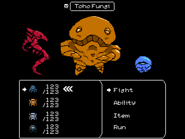
1 Like

TODO

Screens - independent screen logic
Maps - linked map system with tiled meta data
Events - these are what would be activated with Action on maps
Messages - combat text / text which appears when using Action
9patch - for ui and text boxes
Transitions - screen transitions when changing screens
Tiles - get maps working made with tiled including meta data that I want
Movement - nice movement with collisions, events to mess with

Once these are done, I will work on starting work on items, equipment, combat, monsters…

I want to be able to pan in the editor with the middle mouse button held down without other keys held down. Is this possible to configure?

Is it possible to have editor’s “zoom level” displayed somewhere?

Would be handy to be able to set zoom to zoom in / out at the x,y of the mouse pointer instead of center of the editor view. This would lower some of the panning necessary to do.

1 Like

I still want to get more done today, but have had to do other things today too unfortunately.

Friend who lent me his font didn’t want me making it into a ttf even for private use, doesn’t want it being a used as a webfont either which I intended to use for the site later - so I started making custom pixel fonts. I’ll make a few, and look to older games too for ideas on how to make the characters look. Here is the start with little polish on one font. I’ll make a few some scifi vibe others fantasy vibe. Still going to be fixed width, and support ligatures. And polishing each a bunch so they look as good as possible.

Trying to get it to display in game - what am I doing wrong?

Tried following advice from this thread

The only ways to pan and zoom are the ones described in the scene editing manual.

What happens if you increase the size from 7 to 8 or 9 in the .font file? Does it look better? @sven should be able to answer why it doesn’t render properly.

Does not help, just makes it look more distorted and clipped and still fuzzy on the edges.

Here is temp link to the font for testing. However I tested with other similar sized pixel fonts and had same result of fuzziness / clipped glyphs even with the sizes right and apparently everything else sampling wise right.

The red/black preview on the .font file does look correct but not what is displayed in the editor.

Adding option for just middle mouse button held down to pan would be convenient. Is there any other function that the middle mouse button alone is being used for?

Many menu screens with scroll bars do not respond to my mouse wheel either unless a text field is selected. Such as game.project there is scroll bar but mouse wheel does not scroll it until I click into a text field. I’d actually rather no matter what is selected if the menu has focus / mouse is over it I’d like to to scroll. It would also be nice that if the mouse is over a text field that is numeric while the mouse is over + mouse wheel scrolls it increments / decrements the value to the nearest whole number - would be convenient quality of life thing.

Ah, I tried myself and it looks like crap in the editor, but it’s crisp when running in emulator:

@sven, do you know why the editor doesn’t render the font properly?

1 Like

Here are a bunch of examples of NES style fonts. Good to study for a library of ideas on making glyphs readable and also full of character.

3 Likes

For fun, going to make a mock NES cart image.

Found a decent scan, cleaned it up, masked it, darkened it as I think a darker cart would have looked cooler. After I do some character and monster illustrations (I plan to make some water color / copic marker characters / monster art in the style of DQ Akira Toriyama) I’ll add them to the cover art on the cart and then try to make it look more authentic with scuffs and fading… Will do proper illustration style cover art too. For the NES games, it seems they rarely if ever used the pixel art style logos for their printed cover art.

Some inspiration for eventual look…

1 Like

Progress on new font. It’s heavily inspired by those other ones however! I’ll still improve it over time and add some fun characters to it.

1 Like

Hi @Pkeod!

I tried to get the editor to crash by running the “Build HTML and Launch” multiple times while it’s still building. However, it didn’t crash for me, but rather output error messages, and a dialog like this. (I’ve added a backlog item to fix these errors: DEF-1745).
Is this similar to what you got, or did your editor shut down?

2 Likes

I thought it closed completely with an error but I may have been mistaken. I tried to reproduce now and I got the same thing as you, which seems familiar.

Does the html build communicate with the editor in a way that could cause a crash potentially? I think it was around the same time that my Chrome browser was failing to also create a WebGL context. Sorry, I didn’t screenshot or attempt to reproduce before.

1 Like

Ok, at least that’s somewhat better than crashing. But perhaps it is like you said, that there is an edge case somewhere that could be triggered occasionally. Hopefully, it should be resolved by fixing this issue anyways, since we don’t really want to build/launch multiple instances at once :slight_smile:

2 Likes

I’m releasing the font I made today as free to use! If anyone happens upon it, or needs a nice pixel font. I’ll be updating it over time. I want to add a few more glyphs so it can support as many languages as possible, but can only do a few at a time. I’ll just post here when there is an update. It’s not the best but still wanted to share!

https://www.pkeod.com/NES-Chimera-Font.zip

5 Likes