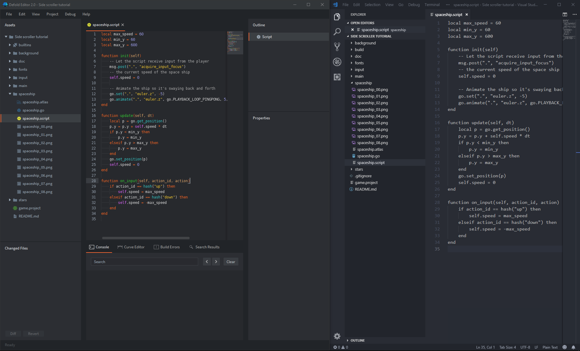
I was excited to try Defold but my journey has came to a halt just a minute after opening the Editor 2
There’s something very wrong with the way the default IDE font is rendered on Windows 10 without Hi-DPI display, and there is no way to change the font. It looks like botched font rendering without font hinting:
You can see how blurry and poorly antialiased the font is. Unfortunately, it’s very hard for me to read even with my glasses on. On the right, you can see font rendering in VScode. It’s a day vs night kind of difference.
I suspect that perhaps Editor 2 was never officially tested on Win10 without Hi-DPI display?
Although what’s strange is that the font is rendered correctly in the rest of the UI interface, such as UI panels or the project outline. It’s really only within the IDE text editor where the font is very blurry and poorly antialiased. But even there, the line numbers on the left of the text are rendered well. Maybe I got somehow corrupted install?
Something should really be done about this as this font rendering will be a very painful experience with anyone without perfect 20/20 vision
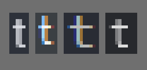
It’s strange the things people see as intolerable, night-and-day issues. I can’t tell a difference myself, except that they are different fonts in different colors of course.
Are any of these Ts really better or worse? I dunno.
There is an issue open for supporting custom fonts in the code editor, you can add your vote there if you want and it may be prioritized higher.
You can also use Ctrl + and Ctrl - to increase and decrease the font in the code editor. Maybe a slightly larger (or smaller?) font would work better for you.
Also, you are not at all required to use Defold’s code editor! You can us VScode if you want, there is even a Defold API package for it here: Defold API Snippets for Visual Studio Code I use Atom myself, since the Defold editor doesn’t have some hotkeys and features that I really like to have.
The chromatic aberration on some of them may indicate weird/poor handling of Windows’ ClearType. Btw, are you viewing it on Hi-DPI monitor? If so, that’s probably the reason the difference is not so significant for you.
The second T with chromatic aberration is from the code in Visual Studio in your screenshot. The other one is from Defold’s assets panel.
Nope, just have a regular monitor here. I can’t (or rather, won’t) afford that fancy Hi-DPI stuff. For me it is a bit harder to read because it’s a narrower font, but that’s it.