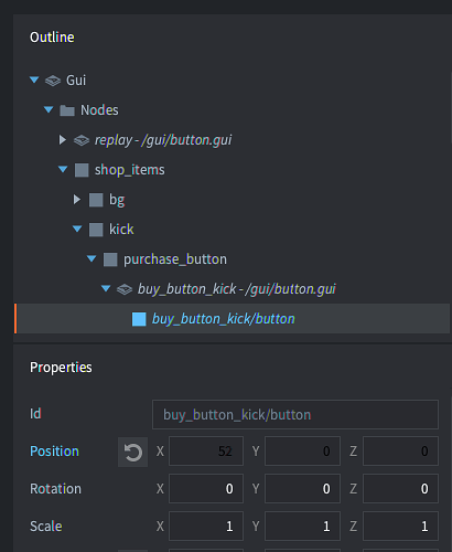
This is a small thing, but thought I’d mention it; template properties are displayed as black on dark grey = hard to read. I’m on macOS. I suppose the colour is different because it’s a template, but would be better to have it more readable.
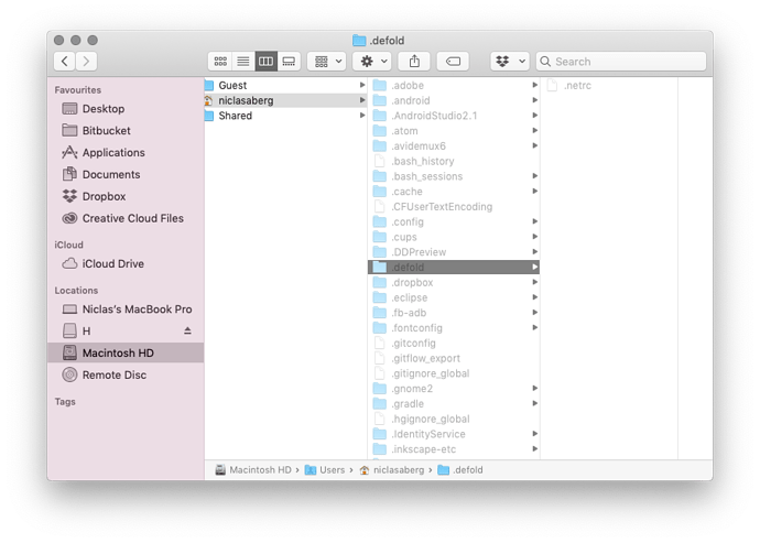
Can’t reproduce it on my machine, do you by any chance have custom editor.css in ~/.defold folder?
Not sure, how can I check?
Open .defold folder in you home directory (it’s a hidden directory, so you might need to press ⇧ ⌘ . to see it)
Yep, seems like it’s not the case here. Can you share your project with me so I can take a look at it since I can’t reproduce it in my project?
Don’t think it’s project related, I haven’t seen it behave differently in any of my projects. But can create an empty project if that helps?
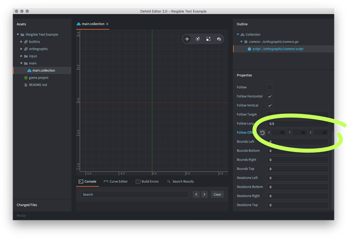
Finally got around to doing this. Project and screeny below. It’s an empty project with just one dependency. To replicate:
- Add dependency.
- Change a custom value (turns light blue).
- Restart Defold.
- Custom values are now black, and stay black if edited.
IllegibleTextExample.zip (777.2 KB)
Thank you for such an amazing repro case: minimal and to the point 
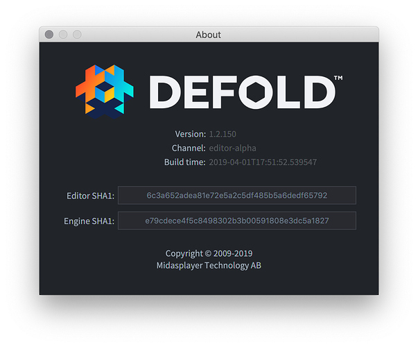
I was able to reproduce this issue and fix is coming in the near future 
Blimey! You’re welcome, and thanks! 
Released a fix!

