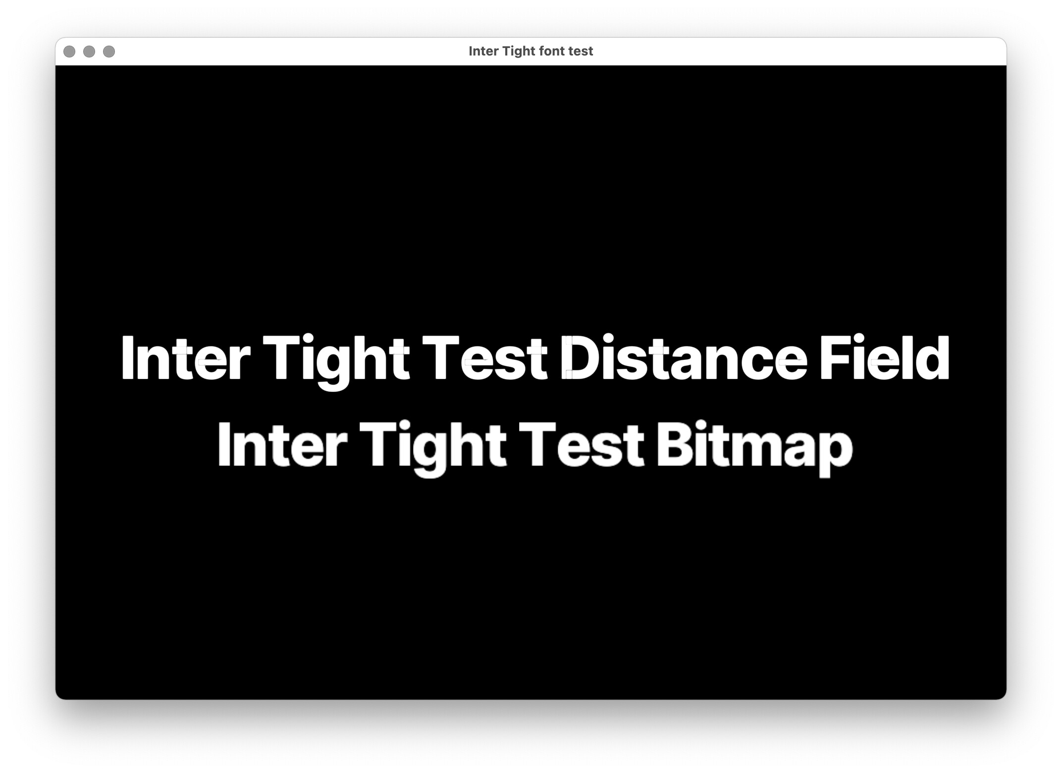
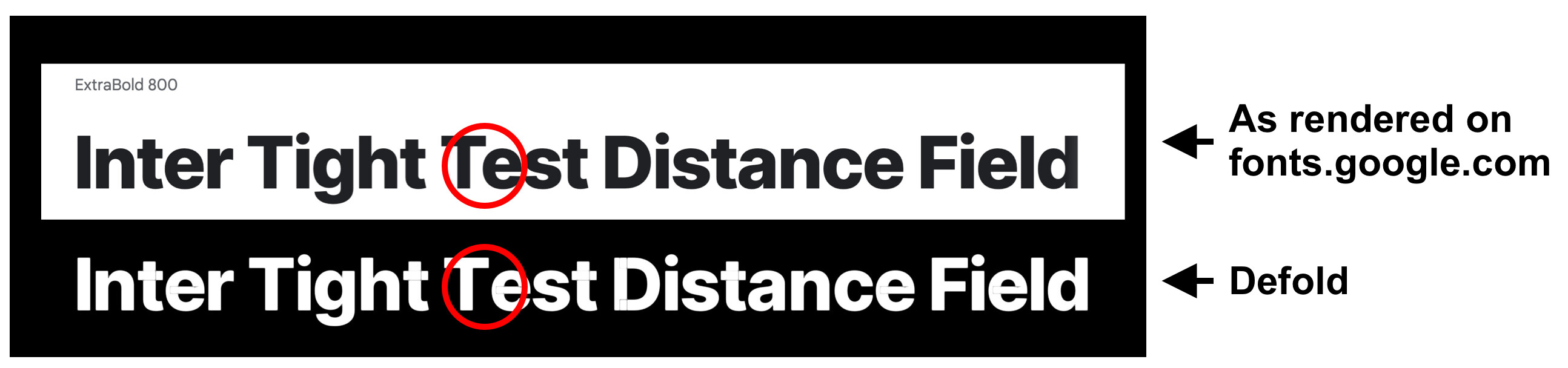
Follow up question: Using the default Text Tracking in Defold (0), the kerning seems off in paces, in this example the space between the T and e is much bigger than the space shown on fonts.google.com. What’s the reason for this, and could this be tweaked somehow?
It’s a bug (imho) in our distance field generator that doesn’t account for shape intersections.
This is a small and isolated piece of code, so perhaps someone may be able to help out?
That is a pity, it is a beautiful font.
You could try and tidy it up using a font editor (but do check the license if you are allowed to alter and then use the font in your projects). This would be quite a lot of work though and probably wouldn’t solve the kerning problem.
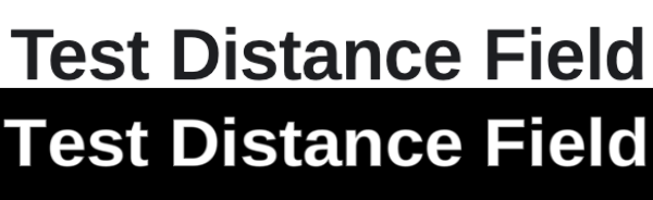
And since I love fonts, I had a quick look for similar Google Fonts, all seem to be ok (I just checked the capital D):
Arimo, Work Sans, maybe IBM Plex Sans. Or other Helvetica Alternatives.
You are right, Work Sans has also overlapping. Not in the “D” though, which is what I quickly looked at in fontforge. Sorry!
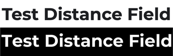
I don’t have overlapping troubles with Arimo though
But: Arimo has the same kerning problem where “T” and “e” meet. I then also tried with my favourite font, Montserrat. Same thing. I never noticed this before and I use this font in almost every app.