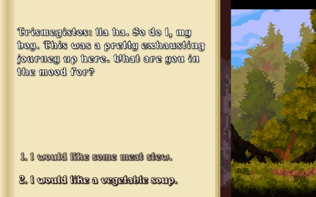
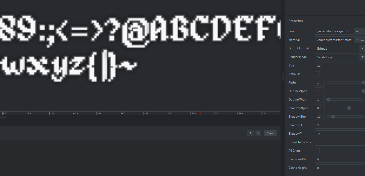
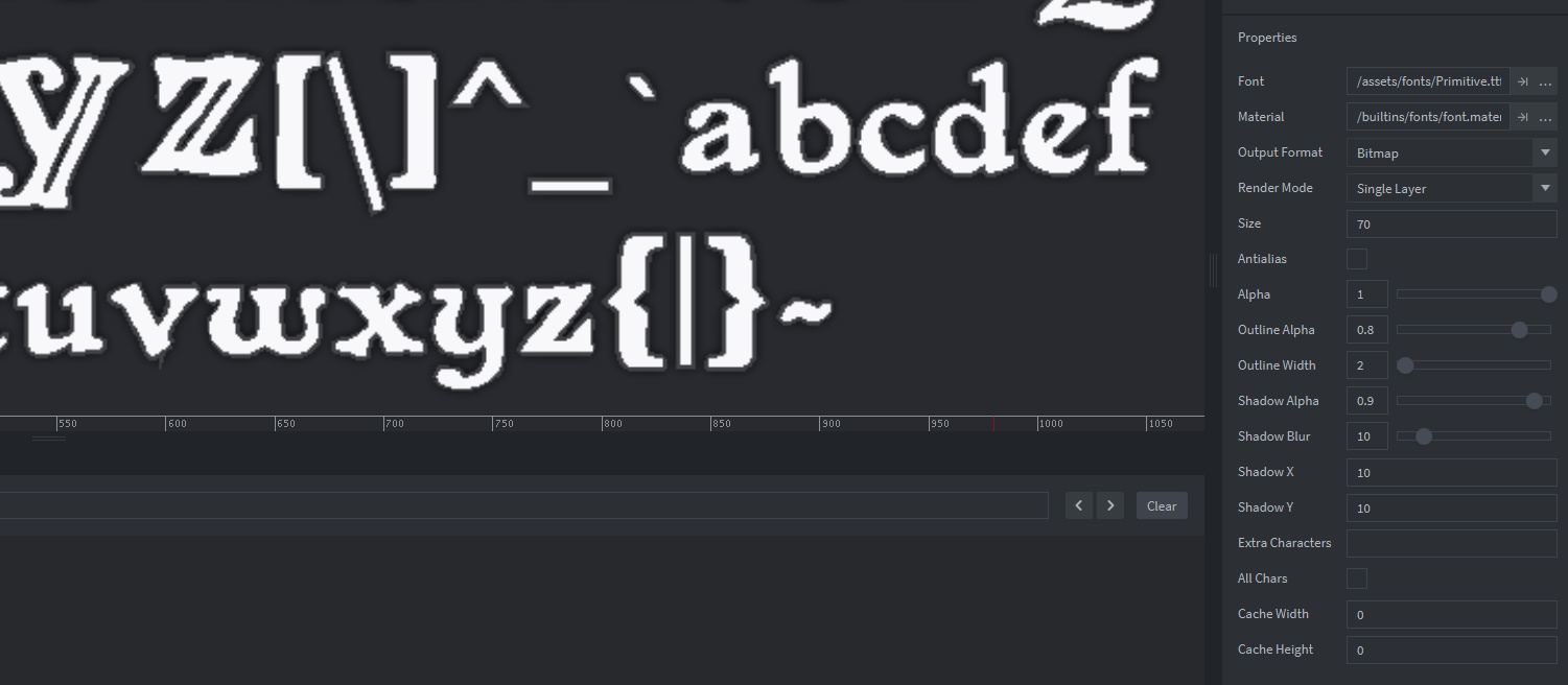
So I have a lot of feedback that my font is unreadable and I totally agree with this I tried to add outline to make it more readable, tinkered with shadows and so on, but I think I don’t know how to properly set up font settings. I try to make a huge font e.g. 70 and then scale it down, because it looks more clear to me.
All of them has some “irregular” shapes - different outline width or some artifacts. Those are free fonts and maybe the original ttf file is just as is and I can’t make it look more sharp?
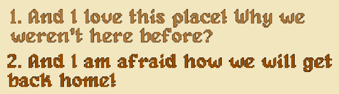
On a side note, not taking technical aspects of tweaking fonts, I would suggest moving from this font to more readable one. It is stylistically right to use such font, but even when it is clearly visible sometimes it’s hard to read. And it is static screenshots. In my opinion it will take some time for players to read it even when done perfectly.
I’m not saying that you should use just regular font, maybe other stylistic, but more readable one)
Or have option to change font in the game (but it would require additional work)
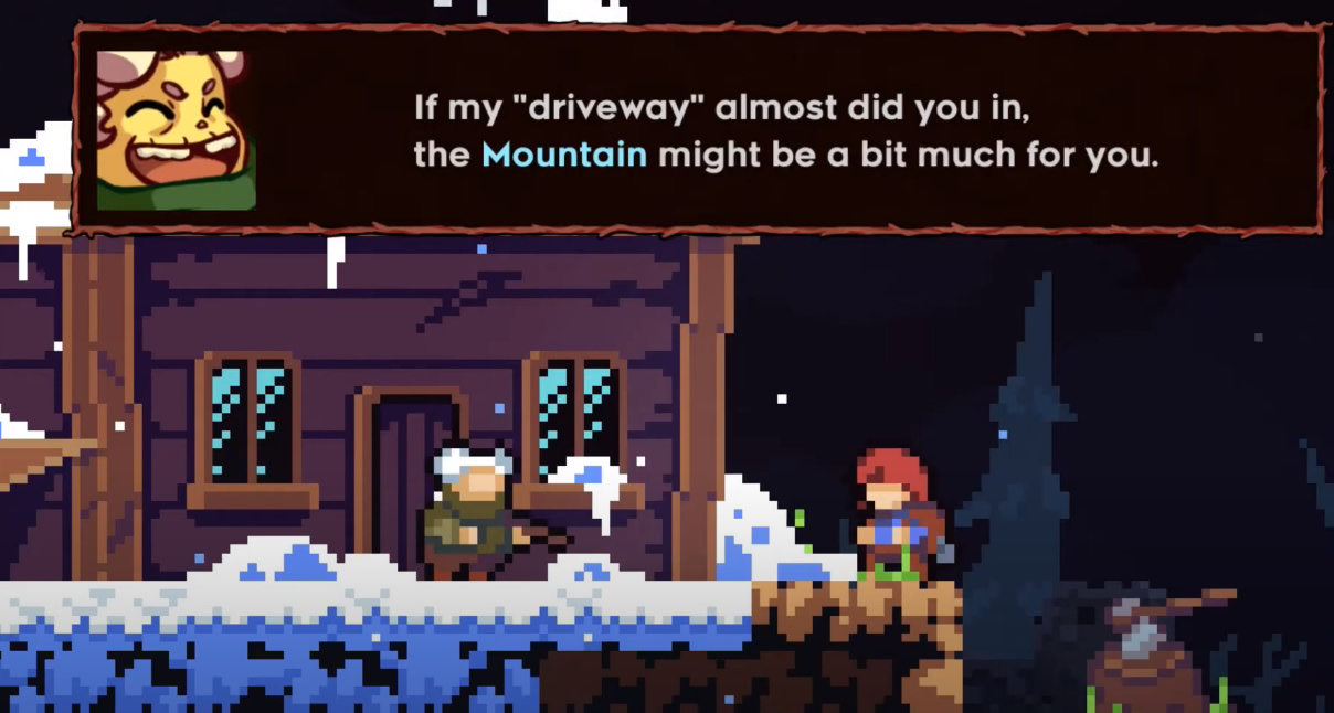
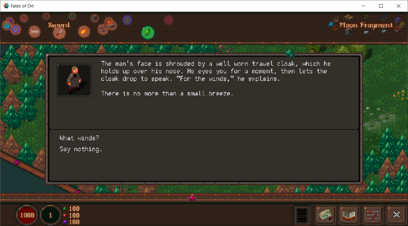
I agree with @Pkeod. I was getting similar feedback on Fates of Ort and in the end the only thing that made fonts look good was DF. Actually, the font itself is a pixel font, but it just looks better in DF anyway:
If you want it to be more readable I would get rid of the outline/shadow/glow effects and just use solid dark text on light background or light text on dark background.
Test it by taking a screenshot and shrinking it down. The white text with black background + shadow on a light background will quickly become illegible.
Also, there’s only so much you can do with that font. Personally I would look for a more…“standard”(?) serif font, at least for the smaller dialogue text and stuff. I’m sure there are fonts with a fantasy flair that are much more legible. You could still use this one for large titles and things.

")