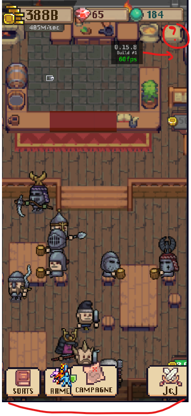
GUI Layouts & dynamic profile selection = weird result

Hello!

I’m currently working on making my GUI handle different ratios (using layouts), and since this is my first time, I’m facing an “unexpected” issue.


Creation of display profiles (a bit of context)
I created a “default” profile (640x960) and an “iPhone X” profile.
image

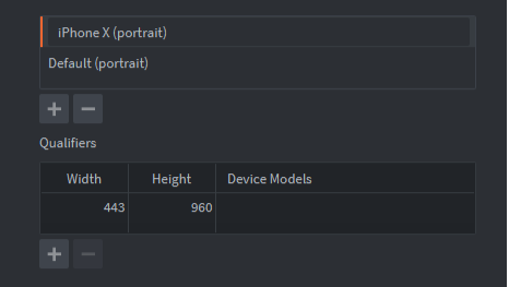
*I didn’t fill in the “Device” field because when I select “iPhone X,” it’s not detected when I test it with the Resolution Simulator.

1/ Default / 640x960 => This is what I’ve been using from the beginning (without thinking too much about it).

2/ iPhone X / 443x960 => The iPhone X ratio is 6:13. I kept the same height (960) and adjusted the width because it seemed easier to adapt the GUI that way, but I’m not sure if that’s the correct approach.

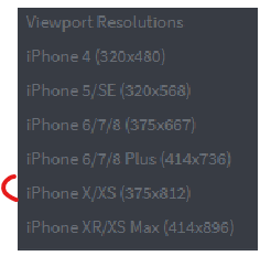
For example, in the “Simulate resolution” tool, the iPhone X resolution is as follows:
image


GUI Layouts (more context)
Then, I created my layouts in my GUI
image
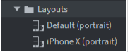
and modified the nodes, etc. (at least for the “iPhone X” layout).
So far, so good.


Resolution Simulation (the issue)
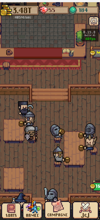
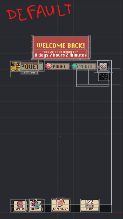
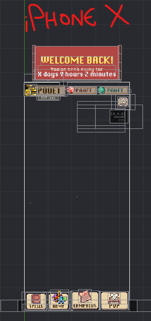
Next, I used the Resolution Simulator to check if everything rendered correctly in the game according to my settings.

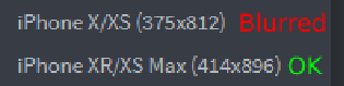
When I select the iPhone X/XS resolution (375x812 - same ratio as my iPhone X layout), the result is… “partially satisfying.”

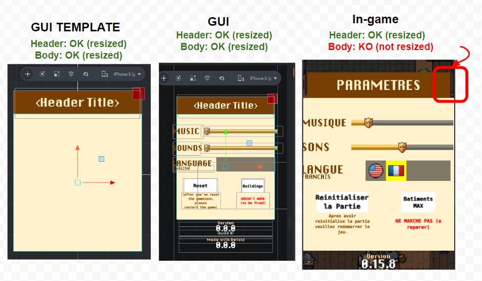
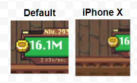
Header => The three currency areas seem okay (although the font is less legible), but the Settings button is missing, and the info block (version, FPS, etc.) is not in the right place.

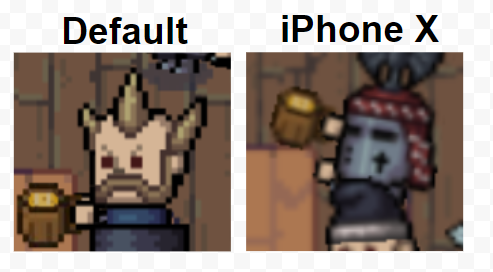
Footer => The buttons are not positioned as they should be.


Questions (concerning this first issue only)

1/ Is there something I might have missed that could explain this issue?

2/ Should I use the resolutions listed in the Resolution Simulator, or is it the ratio that matters?

3/ The documentation states that the system dynamically chooses the most suitable resolution.
=> Does it choose one OR the other (the closest one), or does it try to do some kind of interpolation?


Thank you!

Or chooses the closest match.

If I remember correctly it is the ratio that matters. It should be quick to test though!

I’m thinking that it has to do with anchors etc Are all of the buttons in the footer set up the same way? What if you position the four buttons with exactly the same amount of spacing between them in the default layout?

1 Like

Hello, yes you were right… it was an issue with anchors. Since there was none :hushed:

Now I’ve added top-left anchors for each GUI button (without really knowing why “top-left” at this point), and the iPhone X layout works as expected. :slightly_smiling_face: So I should be able to create a first generalized version that works correctly.
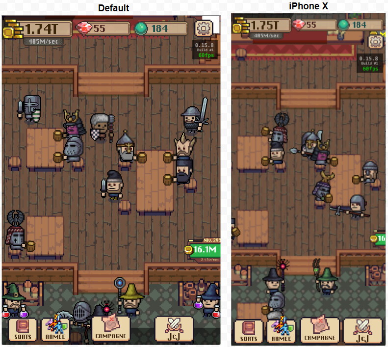
Thank you!


There are two other problems related to resolution changes (did not mentioned them earlier because the dynamic layout thing was more important).

Problem 1 => The width is no longer the same, so logically some elements are off-screen.
image
(this is a game object, not a GUI element)

Question: should I handle zoom-in/out of the scene so that the user can see all the objects?

If yes, I could have a table of resolutions with a corresponding camera distance for each layout. Is this the right approach?

Problem 2 => The pixels seem “blurred”…
image

Question: How do I maintain the original pixel precision?

I tried this:
image

But the result is not very satisfying… Some parts are not very readable, and there are glitches appearing in some places (look at the ground).
image

The same applies to interface texts, which are less clean/readable.
image

image

Is there a way to render the pixels as cleanly as in the default resolution?
Basically, with just camera zoom in/out and an adjusting UI? :thinking:

Note that with the iPhone XR/XS resolution, the pixels are displayed fairly accurately, and the game is not blurred.

However, the aspect ratio remains the same.

image

Oh, and when I use the native resolutions (which are much higher), everything is sharp.

Maybe it is unnecessary to worry about this “blurred pixels” issue because in the end, the result will be fine on device?

And also, a strange thing… I would like a GUI template to adapt to the iPhone X resolution, but something weird is happening (once the template is used in the GUI):

In the editor, the header and the body have the same width (width reduced for the iPhone X). Works as intended in both the GUI template and the final GUI.

But in the actual game (iPhone X), only the header is resized. The body keeps its original width.

Note that it works correctly when I do it directly from the final GUI.

Is there something I missed regarding GUI templates & layouts?

Edit: I just found this => is this related to this bug?

If so, I suppose I’ll have to directly modify the final GUI.