update 2022-06-29: There is nowadays a manual page for editing the css.
The defold editor is created using Java/Clojure with JavaFX for its UI* and JavaFX CSS for styling. We use Sass to generate the final stylesheet(s) used by the editor with the various bits of the stylesheet defined here:
This solution works really well, but it is difficult for a user to change the styling of the editor. I’ve slowly started working towards a setup that is more user styling friendly and I’m presenting the first step on this journey and I invite you to help out if you want to! End goal:
- Allow the user to change colors/theme (anyone dreaming of a light theme?)
- Allow the user to change fonts
- Allow the user to change the layout
The first step to unlocking user styling is to make it easier for users to override the default style. This was easy since the editor actually already has support for loading a user css on top of the default css. Here’s how:
- Create a
.defoldfolder in your user home folder - Create a
editor.cssfile in the.defoldfolder
That’s it! The editor will load the default css and then look for and load the $user.home/.defold/editor.css. Definitions in the editor.css will override the defaults.
Changing colors
Previous versions of the Defold editor used Sass variables to inject color definitions into the generated style sheet. This made it impossible to change editor colors without basically replacing the entire editor css. The new version the editor, released earlier today, uses css color variables instead. This makes it possible to define the colors in a single global definition and reference them throughout the stylesheet. The current color definitions can be seen here:
The basic theme is divided into three groups of colors (with darker and lighter variants):
- Background color - background color in panels, windows, dialogs
- Component color - buttons, scroll bar handles, text field outlines
- Text color - text and icons
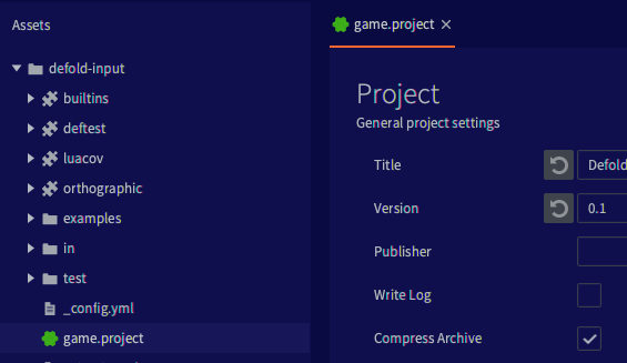
If you feel a bit blue then try this in your editor.css:
* {
	-df-background-darker:    derive(#0a0a42, -10%);
	-df-background-dark:      derive(#0a0a42, -5%);
	-df-background:           #0a0a42;
	-df-background-light:     derive(#0a0a42, 10%);
	-df-background-lighter:   derive(#0a0a42, 20%);
}
If you try this you’ll notice that most of the UI follow the rules outlined above with the three color groups background, components and text, but not 100%! There are two noticeable areas which doesn’t adhere to the css:
- The scene/code view
- The log/console
These two areas are not rendered using JavaFX. Instead they use a more direct OpenGL approach to improve performance.
To fix this we need to read color definitions from the css and use those in the custom views used by the scene/code view and the log/console.
Changing fonts
This is unfortunately trickier as we can’t use the CSS variables to define fonts in a single place (only colors and numbers are supported in JavaFX). The editor uses two fonts: Dejavu Sans Mono for code and mono spaced text (errors) and Source Sans Pro for the rest of the UI. The font definitions are mainly found in _typography.scss:
The main font is defined in a root element which makes it quite easy to replace the font in most places though:
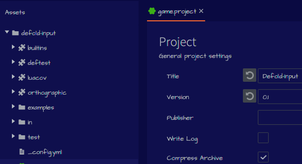
@import url('https://fonts.googleapis.com/css2?family=Architects+Daughter&display=swap');

.root {
    -fx-font-family: "Architects Daughter";
}
This will result in this good looking editor ![]() :
:
Besides a few places where light and italic versions of Source Sans Pro are used you’ll mostly get your custom font from the simple change above. Note that I’m loading a web font from Google Fonts. It’s also possible to load a local font (from .defold folder):
@font-face {
  font-family: 'Comic Sans MS';
  src: local("cs.ttf");
}

.root {
  -fx-font-family: 'Comic Sans MS';
}
Again, you’ll also notice that the code editor and console aren’t affected by any CSS change to fonts. To enable a change of code editor font we need to read font styling and apply that when the custom views are created, in the same way as with the colors.
Changing font size
It is also possible to change the default font size:
.root {
    -fx-font-size: 13px;
}
Summary and next steps
This is the first step towards a more user styling friendly editor, but there’s still a long way to go. Next steps:
- Additional color cleanup.
- A few elements aren’t assigned colors from the right group (some buttons use the background colors instead of the component colors).
- Trim down the number of colors if possible. There are five background shades and five component shades. We can probably get rid of some of them.
- Some UI elements aren’t using consistent mouse over/hover and selected styles and are sometimes lacking a mouse over effect completely
- Color adjustments
- The color cleanup has resulted in some minor changes in the color scheme from previous versions. There may be areas that need increased contrast or where the current scale of colors need to be adjusted slightly to improve readability etc.
- Code editor font change
- Read font style on code view creation and use it when rendering the code view
Much of the above lends itself very well to user contributions. If you like to help out please let us know!


