i want to creat screen size for ios and android
Do you have to add in layout all the name of Device Models “iPhone10,3”, “iPhone10,6”
But if I did not add some devices like samsung s6, What if you enter from that device"samsung s6" what will take any size.
Will it take the default size
And where I will find all the devices size for Android
Do you want to design a layout that works for a certain aspect ratio or for specific device models, such as those with a notch?
In general gui scenes will scale and reposition nodes so that the gui works well regardless of aspect ratio or screen dimensions. As for game objects with sprites, particle effects and so on you can control how those are rendered in the render script (stretch, scale to fit, zoom etc).
2 Likes
for specific device models
What is the best way to fit with all device models,
do you need to creat display profile, Each size is different.
Exp:
640960
7501334
12422208
11252436
1242*2688
7201280
10801920
1440296
14402560
I will use just “Portrait”
n fact I do not know how to deal with a different size screen.
What are the best ways to do this?
I’ll repeat my answer from above:
You should not really have to care about it for gui scenes at least. The gui should scale and align components properly.
What kind of UI and game are you trying to create?
This is a really difficult question to answer this without an example. You might want your non GUI content to scale to width, height or both depending on your project.
Using one of the camera scripts helped me a lot, they take a lot of legwork out of this.
Rendercam:
https://www.defold.com/community/projects/84064/
Orthographic camera:
https://www.defold.com/community/projects/76573/
The rendercam page has some nice example screenshots on different ways of handling scale modes for different screen sizes.
Also if your target is mobile, don’t concentrate on specific resolutions - there’s just too many. Your project should fit any resolution from 320x240 (iPhone 1) to 2688x1242 (iPhone Xs Max) and everything inbetween to to be safe.
This is something you have to just try and come back when you’re stuck.
4 Likes
Crossword puzzle
We need window fits screen. Display resolution in our project settings - 640x960. But other devices have different screen resolutions, so we need correct size
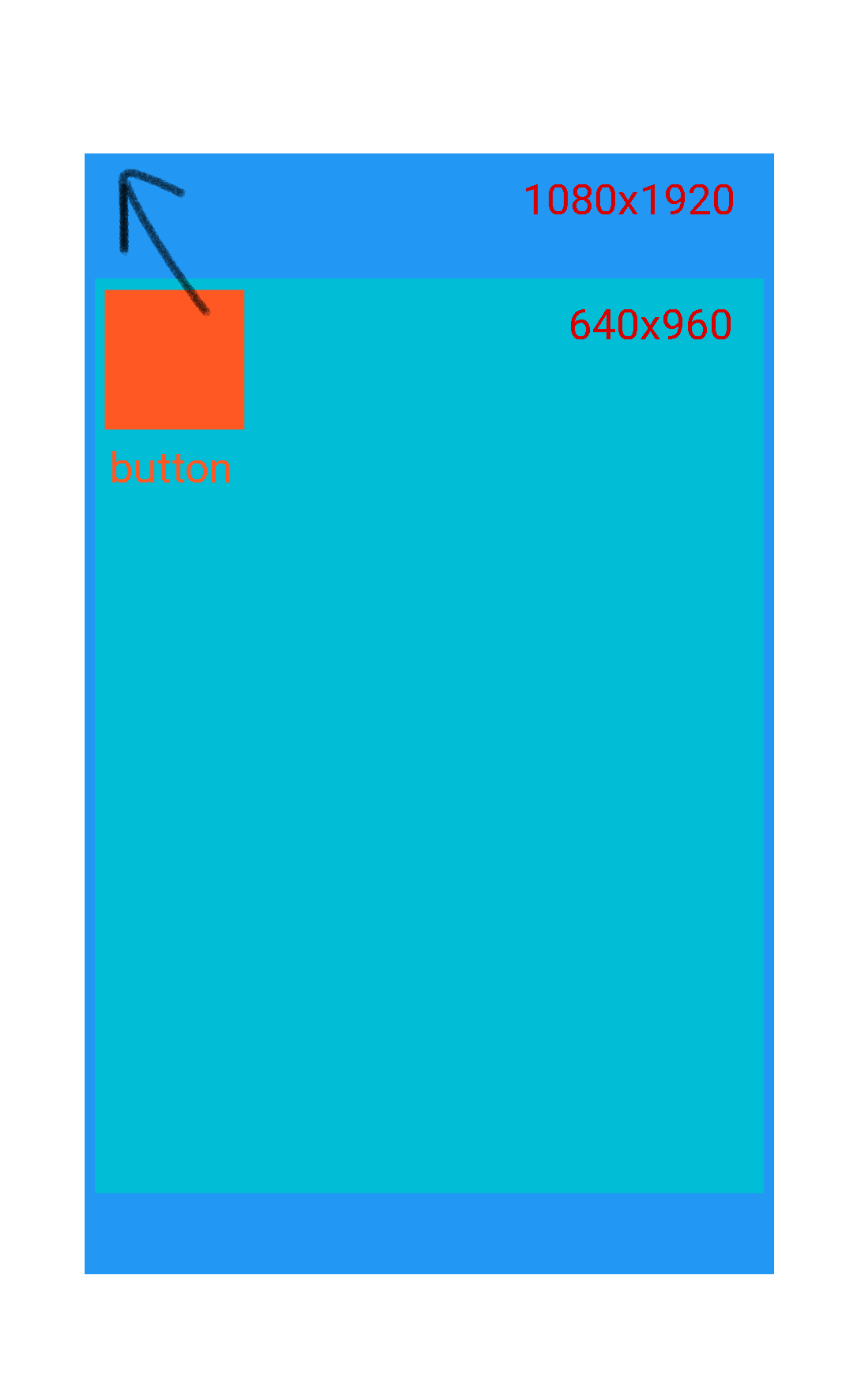
I use 640x960 but if we use my smartphon huawie 1080x1920 we see espace in up and down .
For this ask if you need to creat layout for most device models and move the button to Full screen
For gui components you should use the anchor properties to make a component stick to a certain percentage of distance from edges etc
2 Likes
Is it enough to use anchorY to fill the screen with all the devices or is there another way
Thanks for you and I apologize for the inconvenience
The purpose of the anchorX and Y properties are to control these things. If you set the anchorY property to top it “scales the vertical position of the node so it keeps the position from the top and bottom edges of the parent node or scene at the same percentage.” So yes, use anchorX and Y to get your UI to behave as you want it to on different screen resolutions.
Layouts are primarily used for transforming a gui from portrait to landscape mode or other situation where you need to rearrange your UI.
3 Likes
I understand what you mean
Thank you @britzl for your interest 
2 Likes