Curious Fishing [15 devlogs, complete]

#5: Case anatomy and pixel-perfect rendering

I have just finished the very long and very painful process of making the game handle any aspect ratio and any resolution while remaining pixel-perfect. In the process I added support for landscape layouts and completely redesigned the available case palettes.

Defining ‘pixel-perfect’

[The program I’m using to resize the window is a tool I made called Positive Aspects, there’s a forum thread about it and you can download it for free.]

As you can see in the demo above, the game renders correctly no matter what aspect ratio or resolution it is resized to. Generally in the rest of this post I’m going to refer to the section of the window where all the actual gameplay happens as the ‘game’ and the handheld console surrounding it as the ‘case’. I had several criteria to meet:

  • The game should always be the largest exact multiple of 128x128 that can fit in the window while still leaving enough space for the case
  • On a phone or tablet the game should remain the same size when rotating between portrait and landscape
  • Every element of the case should be scaled equally so that it remains internally consistent
  • The relative proportions of the case should be flexible to allow the game to be as large as possible
  • The size of a case pixel can be different than the size of a game pixel
  • The buttons of the case must always be interactable and should never overlap
  • No case element should ever overlap the game
  • Every game pixel and every case pixel should always be perfectly square
  • No pixel should ever be anything other than one of the 16 colors of the PICO-8 palette

Custom render pipeline

To avoid the complexities of the actual game, I made a separate prototype project with just the case rendering and a 128x128 game screenshot. It took 4 or 5 attempts before I finally got everything working and integrated the prototype into the main project.

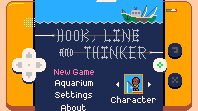
I now have a totally custom render pipeline with 3 materials: pre-game, game and post-game. The materials are functionally identical but everything with the pre-game material is obviously rendered first, then game, then post-game. Most of the case is pre-game but the buttons are post-game because if a scenario ever arises where the buttons and game overlap, the buttons should be visible since they’re how you interact with the game. This scenario shouldn’t ever happen other than for resolutions lower than 128 in one or both dimensions, such as this tiny 198x111 window:
tiny

To ensure crisp edges each material uses ‘nearest’ min and mag filters and ‘clamp to edge’ wrapping, with border extrusion enabled on the case atlas since sprites with those textures are actually scaled up. All sub-pixel rendering is disabled through the game.project file.

The case elements are sized and positioned to match the window size with (0, 0) at the bottom left corner. No camera manipulation necessary for the case rendering, just simple projection and view matrices and no viewport clipping. The game rendering uses a fixed 128x128 projection matrix and gets the view matrix from a camera moved around the world (as described in devlog #4: Bootstrapping, menu transitions and level loading). The game is placed and sized within the case through manipulating the viewport. The relevant bit of the render script looks like this:

-- setup render state
render.set_stencil_mask(0xFF)
render.set_depth_mask(false)
render.disable_state(render.STATE_DEPTH_TEST)
render.disable_state(render.STATE_STENCIL_TEST)
render.disable_state(render.STATE_CULL_FACE)
render.enable_state(render.STATE_BLEND)
render.set_blend_func(render.BLEND_SRC_ALPHA, render.BLEND_ONE_MINUS_SRC_ALPHA)
render.clear({[render.BUFFER_COLOR_BIT] = col(g_palettes[g_save_data.palette].background),
	[render.BUFFER_DEPTH_BIT] = 1,
	[render.BUFFER_STENCIL_BIT] = 0}
)

-- draw pre-game case elements
local case_projection_matrix = vmath.matrix4_orthographic(
	0, g_window_width, -- left, right
	0, g_window_height, -- bottom, top
	-1, 1) --near, far
render.set_projection(case_projection_matrix)
render.set_viewport(0, 0, g_window_width, g_window_height)
render.set_view(vmath.matrix4())
render.draw(self.pre_game_predicate)

-- draw game
render.set_projection(vmath.matrix4_orthographic(0, GAME_SIZE, 0, GAME_SIZE, -1, 1))
render.set_viewport(g_viewport_left, g_viewport_bottom, g_viewport_size, g_viewport_size)
render.set_view(self.view)
render.draw(self.game_predicate)

--draw post-game case elements
render.set_projection(case_projection_matrix)
render.set_viewport(0, 0, g_window_width, g_window_height)
render.set_view(vmath.matrix4())
render.draw(self.post_game_predicate)

On startup and whenever a resize is detected (including changing device orientation between landscape and portrait) some calculations are run to work out where the game viewport should now be and what size and position each case element should now have. The script responsible for all this is ~800 lines long, but here are some of the top-level functions that handle resizing:

local function pre_viewport_resize_case()
	-- letterboxing
	g_case_bounds.width = g_window_width
	g_case_bounds.height = g_window_height
	local aspect = g_case_bounds.width / g_case_bounds.height
	g_is_portrait = (aspect < BOUNDARY_ASPECT_RATIO)
	if g_is_portrait == true then
		CASE_WIDTH = WIDTH_PORTRAIT
		CASE_HEIGHT = HEIGHT_PORTRAIT
		MAX_SCREEN_HEIGHT = MAX_SCREEN_HEIGHT_PORTRAIT
		VIEWPORT_CENTRE = VIEWPORT_CENTRE_PORTRAIT
		aspect = math.min(aspect, 1 / MAX_ASPECT_RATIO)
		g_case_bounds.width = g_case_bounds.height * aspect
		aspect = math.max(aspect, 1 / MAX_ASPECT_RATIO)
		g_case_bounds.height = g_case_bounds.width / aspect
	else
		CASE_WIDTH = WIDTH_LANDSCAPE
		CASE_HEIGHT = HEIGHT_LANDSCAPE
		MAX_SCREEN_HEIGHT = MAX_SCREEN_HEIGHT_LANDSCAPE
		VIEWPORT_CENTRE = VIEWPORT_CENTRE_LANDSCAPE
		aspect = math.max(aspect, MAX_ASPECT_RATIO)
		g_case_bounds.height = g_case_bounds.width / aspect
		aspect = math.min(aspect, MAX_ASPECT_RATIO)
		g_case_bounds.width = g_case_bounds.height * aspect
	end
	g_case_bounds.width = math.floor(g_case_bounds.width) -- make it integer
	g_case_bounds.height = math.floor(g_case_bounds.height)
	g_case_bounds.width = g_case_bounds.width - (g_case_bounds.width % 2) -- make it even
	g_case_bounds.height = g_case_bounds.height - (g_case_bounds.height % 2)
	g_case_bounds.x = math.floor((g_window_width - g_case_bounds.width) / 2)
	g_case_bounds.y = math.floor((g_window_height - g_case_bounds.height) * 0.3)
	
	local x_scale = math.floor(g_case_bounds.width / CASE_WIDTH)
	local y_scale = math.floor(g_case_bounds.height / CASE_HEIGHT)
	g_case_bounds.pixel_scale = math.max(1, math.min(x_scale, y_scale))

	for i = 1, #g_case_parts do
		resize_part(g_case_parts[i], (i - 1) / #g_case_parts)
	end
end

local function calculate_viewport()
	-- work out the largest multiple of GAME_SIZE we can fit in the window while obeying MIN_CASE_BORDER size
	local limiting_dimension = math.min(g_case_bounds.width, g_case_bounds.height)
	local best_size = GAME_SIZE * math.max(1, (math.floor(limiting_dimension / GAME_SIZE)))
	if limiting_dimension - best_size < 2 * MIN_BORDER * g_case_bounds.pixel_scale then
		best_size = math.max(GAME_SIZE, best_size - GAME_SIZE)
	end

	-- don't let the size of the game occupy too much vertical space as we need room for the buttons
	while best_size / g_case_bounds.height > MAX_SCREEN_HEIGHT and best_size > GAME_SIZE do
		best_size = math.max(GAME_SIZE, best_size - GAME_SIZE)
	end

	-- calculate viewport
	g_viewport_size = best_size
	local border = (g_case_bounds.width - g_viewport_size) / 2
	g_viewport_left = g_case_bounds.x + border
	g_viewport_bottom = g_case_bounds.y + (VIEWPORT_CENTRE * g_case_bounds.height) - (g_viewport_size / 2)
	g_viewport_bottom = math.floor(0.5 + g_viewport_bottom)
end

local function post_viewport_resize_case()
	local surround = nil
	for i = 1, #g_case_parts do
		if g_case_parts[i].name == "screen_surround" then
			surround = g_case_parts[i]
			break
		end
	end
	if surround ~= nil then
		local id, size
		if g_is_portrait == true then
			id = surround.port_id
			size = go.get("port_"..surround.name.."#sprite", "size")
		else
			id = surround.land_id
			size = go.get("land_"..surround.name.."#sprite", "size")
		end
		
		local pos = go.get_position(id)
		pos.x = g_case_bounds.x + g_case_bounds.width / 2
		pos.y = g_case_bounds.y + g_case_bounds.height * VIEWPORT_CENTRE
		go.set_position(pos, id)
		surround.position = pos

		local scale = go.get_scale(id)
		scale.x = (g_viewport_size + 2 * SURROUND_SIZE * g_case_bounds.pixel_scale) / size.x
		scale.y = (g_viewport_size + 2 * SURROUND_SIZE * g_case_bounds.pixel_scale) / size.y
		go.set_scale(scale, id)
	end
end

local function resize_case()
	pre_viewport_resize_case()
	calculate_viewport()
	post_viewport_resize_case()
end

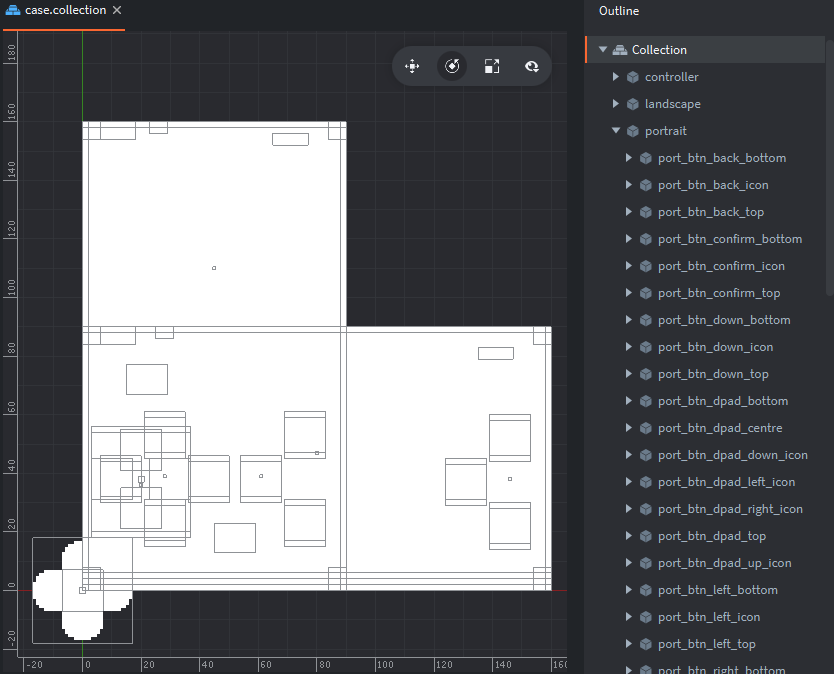
To avoid floating point rounding issues and ensure pixel-perfect rendering it was crucial that all x/y positions and scales ultimately end up as integers. The second parameter passed to resize_part is the z-coordinate for each case element: (i - 1) / #g_case_parts. The g_case-parts table is a long list defining the size, position and color of each case element listed from back to front. Setting the z coordinate of each element appropriately in the collection would have been extremely error prone and time consuming; setting it programmatically makes it trivially easy to add and remove case elements as the design was iterated. By hiding elements above a certain z value it also made it fairly easy for me to create this visualisation showing the overall back-to-front render order, with pre-game elements followed by game elements followed by post-game elements:

Case anatomy

The case is made of ~60 pure-white sprites pixelled at a resolution of 160x90 and arranged in landscape and portrait layouts. There is some redundancy here from several iterations of the case design. If the aspect ratio (width ÷ height) is less than 1 then the portrait layout is enabled and resized, otherwise the landscape one is.

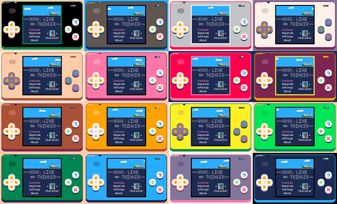
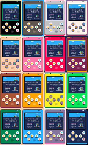
The reason all the sprites are pure-white is because players can choose one of 16 color variations, one with a base color for each of the 16 colors in the PICO-8 palette. I had to condense the arrow buttons into a d-pad for the landscape layout in order to keep the game centred.
palette_arranged

The result

In total this was around 4 months of work and the game should now render correctly and be fully playable on every device in any orientation, including all future devices with whatever weird resolutions and aspect ratios the device manufacturers throw out next. If that sounds like a long time, bear in mind that I have a full-time job and can only work on Hook when time/energy permits (typically weekends). One month of that time was spent making the Positive Aspects tool; it does more things than I strictly needed it to do but it’ll be useful for every future project, plus completing and releasing a smaller project was a great motivator when returning to The Big One.

Twitter: @rhythm_lynx

23 Likes

Really impressive and inspiring, @connor.halford – once again, thanks for sharing your progress :raised_hands:

4 Likes

Really good job @connor.halford ! How did you solve the issue on windows resize (that brokes the GUI nodes alignment respect the on_input action.x~y)?

I’m experiencing similar issue, in a very simple GUI layout

1 Like

Hey, thanks. I’m not actually using Defold’s GUI system at all, everything is just sprites in a collection. I mentioned above that it took 4 or 5 attempts to finally get everything working, several of those involved the GUI system but I could never get it to do exactly what I needed. Typically UI assets are high resolution then scaled down, but for me everything is at a tiny resolution* and massively scaled up. I needed complete control and wrestling with automatic layouts just wasn’t worth it.

*Fun fact: I can fit every single texture in the project, including every bit of baked localization text in all 12 languages, into a single 2048x1024 texture with about a fifth still empty.

12 Likes

#6: Undo

There is a single dedicated button in Hook which required a massive code refactoring and ate several months all by itself: undo.

Design evolution

In the original 6-day jam version of the game there was no undo at all. In response to a comment asking about it, I wrote:

No, you have to reel it all the way back in. This was done intentionally to discourage players from brute-forcing the solutions and instead force more thoughtful, slower, confident movement. It is a little punishing at first though, or when you inevitably hit the wrong key by mistake.

5 months after I started the Defold version (7 months after the jam) I added a limited undo which allowed players to correct basic movement mistakes. Each move you made (including hooking a creature) could be individually undone, but once you reeled something in you were committed and the only way to undo that would be to restart the level.

Another 7 months later and I knew it was time for the full, complete undo. All the difficulty should be in understanding how the systems work together and working out how to exploit those to do what you want to do. Once you have a plan, executing it should be easy. The goal was that you could play any level all the way to the end and then as you’re reeling in the final creature hold down the undo button and watch the entire thing play in reverse right back to the very beginning. Undo is free and unlimited in every level.

Gameplay code

As I write this Hook currently consists of around 5500 lines of Lua spread across 31 .script files and 1 .render_script. Two files are primarily responsible: hook.script has 1121 lines, with gameplay_events.script following at 767. These two files are where the game is. (They are closely followed by case.script at 759 lines, which handles everything the previous devlog was about).

Since my game is completely deterministic there were just two simple requirements for full undo: an input counter and an event log. There is (almost) a one-to-one relationship between the number of button presses it takes to do something and the number of undo button presses it takes to undo all the effects of those button presses. This is where the input counter comes in. Whenever a viable move or reel button is pressed we increment the input counter and trigger the relevant gameplay events. Whenever undo is pressed we undo all the events that occurred as a result of the most recent input number and then decrement the input counter. This is how pressing one button like ‘reel in’ can result in dozens and dozens of gameplay events over many frames (e.g. reeling the hook in, pulling a creature along, cutting seaweed, etc) but then one press of ‘undo’ backtracks the whole sequence.

There are currently 18 types of event and each has an add(), an execute() and an undo() function; these and the top level undo() function are what makes up the gameplay_events.script file. The hook.script file is responsible for calling the relevant add() functions or the top level undo() at the right times. Each add() function adds a new table element to the event log which stores all the data necessary both to execute() and undo() the event, then immediately calls execute(). Here’s one of the simpler examples:

function add_grab_creature_event(hook, creature_index)
	local event = {}
	event[1] = EVT_GRAB_CREATURE
	event[2] = g_input_count
	event[3] = creature_index
	table.insert(g_event_log, event)
	execute_grab_creature_event(hook, event)
end

function execute_grab_creature_event(hook, event)
	hook.hooked_index = event[3]
	hook.func_start_reaction(hook, "exclaim")
	msg.post("#sprite", "disable")
	msg.post("main:/audio", "play_sfx", { sound = "grab_fish" })
end

function undo_grab_creature_event(hook, event)
	hook.hooked_index = -1
	hook.func_hide_all_reactions()
	msg.post("#sprite", "enable")
end

The hook.script always passes itself into the add() function along with any data specific to that event. The first element in the event table is always the event type, the second is always the input count. After that each event has its own structure depending on what data it needs, though they all use simple numerical indexing to avoid string overheads. As you can see all the actual data/state changes (setting the hooked_index, playing a reaction animation, disabling the hook sprite) occur in the execute() function, with the undo() function doing the reverse of each operation.

Here’s the top level undo() function called when the button is pressed:

function undo(hook)
	if g_input_count < 1 or #g_event_log < 1 then return end
	while #g_event_log > 0 and g_event_log[#g_event_log][2] == g_input_count do
		local event = g_event_log[#g_event_log]
		if event[1] == EVT_MOVE_HOOK then			undo_move_hook_event(hook, event)
		elseif event[1] == EVT_REEL_HOOK then		undo_reel_hook_event(hook, event)
		elseif event[1] == EVT_GRAB_CREATURE then	undo_grab_creature_event(hook, event)
		elseif event[1] == EVT_REEL_CREATURE then	undo_reel_creature_event(hook, event)
		elseif event[1] == EVT_START_REELING then	undo_start_reeling_event(hook, event)
		elseif event[1] == EVT_FINISH_REELING then	undo_finish_reeling_event(hook, event)
		elseif event[1] == EVT_DROP_CREATURE then	undo_drop_creature_event(hook, event)
		elseif event[1] == EVT_SPAWN_SKELE then		undo_spawn_skele_event(hook, event)
		elseif event[1] == EVT_BREAK_DEBRIS then	undo_break_debris_event(hook, event)
		elseif event[1] == EVT_SQUID_INK then		undo_squid_ink_event(hook, event)
		elseif event[1] == EVT_SPONGE_INK then		undo_sponge_ink_event(hook, event)
		elseif event[1] == EVT_PATROL_MOVE then		undo_patrol_move_event(hook, event)
		elseif event[1] == EVT_PATROL_TURN then		undo_patrol_turn_event(hook, event)
		elseif event[1] == EVT_PATROL_HIDDEN then	undo_patrol_hidden_event(hook, event)
		elseif event[1] == EVT_PATROL_LOCK then		undo_patrol_lock_event(hook, event)
		elseif event[1] == EVT_PATROL_UNLOCK then	undo_patrol_unlock_event(hook, event)
		elseif event[1] == EVT_CUT_STINGER then		undo_cut_stinger_event(hook, event)
		elseif event[1] == EVT_CUT_SEAWEED then		undo_cut_seaweed_event(hook, event)
		end
		table.remove(g_event_log, #g_event_log)
	end
	g_input_count = g_input_count - 1
	msg.post("main:/audio", "play_sfx", { sound = "undo" })
end

All the events which occurred as a result of the most recent input are undone in reverse chronological order (since events are added and executed in chronological order). Then the input counter is decremented.

The engineer in me wants to move this whole system to C and really optimize the data storage, but I almost certainly won’t unless I do some profiling nearer to launch and discover a big problem. The difficult part of this refactor was just working out all the places where relevant data changes occurred, why, and what other data was necessary to allow those changes. The game remained playable throughout though since I just worked my way through each gameplay interaction one by one, refactoring and testing and committing as I went, until I could undo every level all the way back to the beginning and everything was back to where it started.

One exception

I said earlier that there is almost a one-to-one mapping between action button presses and undo button presses. When you reel in with nothing hooked, the input counter is incremented so that you can undo that action and return to where you were. However once you’ve hooked a creature there is nothing you can do other than reel it in, so it stands to reason that whenever you want to undo reeling in a creature you also want to undo hooking it. So when you reel in with something hooked the input counter actually isn’t incremented, meaning that when undo is pressed it will undo everything that occurred as a result of reeling in the creature, as well as the hook movement that caused the creature to be hooked in the first place.

This can be seen in the gif below. When the hook is above the crab and reels in there is nothing hooked, so one action input (reel in) matches one undo input. From there it takes three action inputs (down, down, reel in) to reel the crab in and smash the debris, but only two undo inputs to get back to the spot above it.

Replay

Theoretically the event log is all I need to play back the player’s solution. The log could be parsed to remove pointless inputs such as moving then reeling in without hooking anything, or dropping a fish at A then B then back at A. The log could then be iterated through and executed at a steady rate to show the player the ideal version of their personal solution to the puzzle. With such low resolution and only 16 colors I could even record very long gifs at very small file sizes. This is very much a stretch goal, but it would be pretty cool to let people share their progress.

As always you can follow me on Twitter @rhythm_lynx.

12 Likes

#7: Design iteration: player movement

In this game all you do is move and reel back in. Sound simple? Making games is hard.

A couple of caveats for the days per version listed here. It’s a rough estimate based on days where there’s a relevant commit in the log, but some commits represent several days of work, often there are many tweaks done later which are bundled under other commits, I may have been working on other stuff too, and some of these were weekend / full days while others were just evenings after work. Still interesting though.

Version 1: Moving and reeling in (4 days, October 2016)

According to the daily devlog I wrote during the week-long game jam, I had movement working on day 1; collision on day 2; reeling in the hook on day 3; and reeling in creatures on day 5. When you pushed the reel-in button you were committed to reeling all the way in, with no way to stop it or undo your action. This was particularly annoying on puzzles which require you to drop creatures since you had to wait for the hook to reel all the way back in before moving it again.

My thinking at the time was that by making every move matter it would ̶e̶n̶c̶o̶u̶r̶a̶g̶e̶ force players to think through their actions before taking them, rather than using trial-and-error to fudge their way to a solution. I think there’s several issues with that reasoning. For one thing, I don’t explicitly tell the player anything about how to play, instead using level design to prompt players to work things out for themselves through experimentation. Making every move matter is directly opposed to this, causing players’ introduction to the game to be needlessly punishing.

In my opinion, as designer it is not my job to prescribe how players play my game. It is my job to prescribe what they’re trying to do and what tools they have to accomplish their goals (which they may have even set themselves). If someone wants or needs to trial-and-error their way through a puzzle that is a perfectly valid way of playing the game. Do I think that’s the most enjoyable way to play? No. Does the design facilitate such a playstyle anyway? Yes. Encourage it? Early on, yes. People learn through mistakes and using trial-and-error is a great way to make a lot of mistakes fast. Through this experimentation players will (hopefully) start to understand the mechanics of the game and gain the ability to reason about and predict the effects of their actions before making them (consistency is key here). At this point the player transitions from trying to complete the level to trying to solve the puzzle.

Version 2: Limited undo (1 day, May 2017)

After initially being opposed to any undo at all, my design thinking changed over time and eventually landed on unlimited unrestricted undo. This was the first step towards that: you could undo your movements up to grabbing a creature, but once you reeled it in there was no way to cancel it or undo the effects other than to restart the level.

This was better than no undo at all but the restrictions immediately felt frustrating and arbitrary. As a player I felt a little more free and relaxed about my movements, because a misjudged or accidental button press was no longer a loss of progress (prior to this an error meant at best reeling in the whole line to play it out again, at worst having to restart the entire level). Around this time I added full undo to my todo list.

Version 3: Interrupting an empty reel-in (1 day, October 2017)

This was another way for the player to recover from a misclick. I showed the game to a couple of friends and noticed that they sometimes reeled the hook in after getting adjacent to a creature but not actually grabbing it. They would immediately realise their mistake and jab at the movement buttons in a panic, trying to recover their lost progress as the hook wound its way back to the start. Cue frustration and helplessness.

Once I added this I used it constantly as a way to explore levels; approaching something from one side, then reeling in partially and approaching it from another. It increased my options as a player and made stress testing levels for broken solutions easier. My only concern was that it potentially made patrol fish trivial. Patrols move when you move and the intent was that you’d have to outsmart them by creating a trap with your line. They were the most frustrating part of the game because you often knew how and where you wanted to trap them, but when you got there you were out of sync with their movements and couldn’t execute your plan through no real fault of your own, instead having to resort to reeling in and trying again until everything happened to line up. Being able to resume movement after reeling in meant you could now sort of wiggle back and forth on the spot while they moved into place. This issue with patrols stood for well over a year; we’ll come back to it later.

Version 4: Full undo (~8 days, January 2018)

Freedom, at last! As a player I finally have no reservations about trying different approaches and playing with new mechanics to see how they work. It feels liberating.

At this point I thought the movement was done and was confident that unlimited unrestricted undo was a smart decision for this game. That’s handy because it was a lot of work!

Version 5: Auto-stopping the reel-in when you drop something (~2 days, November 2018)

There were two things that motivated me to make this change. A few months prior I was able to do some proper playtesting and saw that absolutely no-one understood that pulling a patrol through seaweed would cause you to drop it. I considered ditching the mechanic but was focused on other tasks for the time being. The second was the realization that most of the time after dropping something the next move you want to make is somewhere in the vicinity.

This felt very strange at first; it changes the rhythm of the game and felt like it was interrupting the flow. It successfully highlights the fact that you drop patrols on seaweed, because it stops you and forces you to realise it (dropping something is the only thing that automatically stops the reel). I had to add a locking mechanic to patrols to prevent the one you dropped from moving until the hook comes to rest, because if it isn’t where you left it then it’s unclear what happened. In some cases the hook was left in a position where the route I wanted to take was blocked by the line so I would have to awkwardly press the reel-in button again to backtrack before moving forward. Sound familiar?

Version 6: Backstepping (1 day, January 2019)

Hopefully the final piece of this designer-facing puzzle is to allow the player to backtrack one step at a time. This had been possible for more than a year through the awkward process of pressing the reel-in button then almost immediately pressing a directional button. I’ve made strong, conscious design decisions throughout the project to avoid any kind of real-time requirements for players and hated that a reaction-based mechanic had essentially been introduced. As a player I was doing this because it allowed me to more easily achieve my goals. It was time to add another tool to the toolbelt!

And that is where movement stands today (February 2019). My concerns about this making patrols easier to catch proved true, but I now consider that a good thing. I want all the difficulty to be in working out what what you need to do, not in executing your plans.

Version 7: ???

Judging by this track record I’m due to change something about the movement around October 2019, then January 2020 (No, I don’t plan to still be working on this game in 2020!). I haven’t played enough of the game with the auto-stop and backstepping to be totally confident about them, but they solve a lot of design issues so I reckon it’s just that I’m not used to it yet. Hopefully it feels good to move now and isn’t frustrating! I think the button visuals help with the feel too, especially that d-pad *pats self on back *.

I hope this look at the design evolution for such a seemingly simple mechanic gives some indication of the interesting, sometimes difficult problems I’m encountering along the way. For those who are eager to play, I hope I’ve garnered a little more of your valuable goodwill and patience. Believe me, I want this game to be finished more than anyone.

Follow me on Twitter @rhythm_lynx

13 Likes

Again, amazing writeup! Thx!

5 Likes

Cheers :slight_smile:
This was a fun one to write because I got to roll back to older versions to record the gifs, funny seeing how different some things were and how others are exactly the same

2 Likes

Agree with Mathias—I really enjoy reading every post. Also, big up for demonstrating the importance of user-/play testing, which can really shatter ones beliefs on game mechanics. Also also, that’s once nice-looking d-pad you’ve got there :slight_smile:

3 Likes

:smiling_face_with_three_hearts:

1 Like

#8: (Work)flow: art

For the past few months I’ve been working on underwater currents: flowing water that pushes creatures and hook alike. I call them flows because currents was too confusing during loop iteration. I’m definitely going to write a post or two about both the design and technical challenges of this feature, because there were a lot of both. But I’ve just wrapped the feature with some nice art and I thought I’d write about my pixel art workflow.

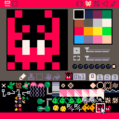
I originally started the game in PICO-8 and so inherited the 128x128 pixel resolution and the excellent 16 color palette from there. Many of the game’s sprites were first made in some form in PICO-8 and some have remained untouched in the ~2.5 years since then, such as the crab.

pico8

The PICO-8 pixel art editor is suitably simple. You have a few banks of sprites, a few colors, a few tools and no layers. These restrictions were what enabled me to start drawing pixel art in the first place; when the blank page is this small it’s a lot less scary. Drawing at this resolution often feels more like solving a puzzle than artistic expression: how do you make a 2-frame crab animation in an 8x8 space with just one shade of red?

With the move to Defold and the need for larger, more complex pixel art I shifted to paint.net because I already knew how to use it, it was still simple and it had layers. It doesn’t do animations at all, but neither does my game for the most part! I’m now transitioning to what has become the industry standard for pixel art and for good reason: Aseprite. Aseprite does do animations as well as tiling and many other features, it’s great but I’m still quite slow and clunky with it.

How hard could it be?

OK so there’s only 16 colors and an 8x8 space and I need to make an animation for flowing water. There can’t be that many options, right? Well there’s actually many more constraints than that, because it needs to fit in with the many existing sprites using up that limited palette, it can’t be too distracting because this is a puzzle game, plus you need to be able to tell which direction a flow will push a creature while the creature is on top of it and blocking it from view. Hmm.

My first thought was a particle system. When the player enters a flow they lose movement control until the flow spits them out or becomes blocked; I figured some rapidly moving pixels would help convey the strength of the current. I had a quick go at messing with Defold’s particle effects editor but I’ve never used it before and knew it would be quicker for me to try the effect I had in mind by rolling my own ‘emitter’ which just moves sprites along and respawns them when they go too far. I stuck some flows in level 1 for quick access and fiddled with the speeds and number of particles until I had this:

That’s pretty much what I envisioned and I think it does look reasonably like a torrent of water. But it’s almost literally noise. The random, rapid movement was far too eye-catching and distracting. I wanted something more regular, so I quickly made a UV scrolling shader and drew several variations of an 8x8 sprite to wrap around. The Shadertoy tutorial was helpful here in showing me how to pass a timer value into the shader.


In case you’re wondering about the colors, I have a debug flag set so that a random avatar and case palette is chosen at startup so that I’m constantly confronted with the different designs and can tweak them if I see something I don’t like.

Note that we’re no longer pixel-perfect at a resolution of 128x128 (there’s sub-pixels in the scrolling) but this was just a quick temporary test. The larger waves looked less like water and more like conveyor belts so those were out straight away. I liked the intensity that the more densely packed waves had and how clear the boundaries were but they were too noisy with creatures on top of them; trying to focus on the creatures became uncomfortable.

I used ScreenToGif to record these quick tests so I could put them all side by side and assess things altogether, as well as make sure I’m not trying the same things over and over again. Having all these GIFs lying around is what prompted me to write this devlog! Anyway, it was becoming clear that small waves were the way to go. So far all the designs I’d tried were completely behind the sea creatures. Most of the creature sprites touch all four boundaries of their 8x8 sprites which meant that the flow sprites had to as well so that a little bit of them would be visible around the edges e.g. under a fish’s tail. What if the flow went in front of the creatures instead? Then it could be smaller and go straight down the middle. After a few variations the best bet was this:

I really like the simplicity of this design, it makes the flow system as a whole very clear and easy to understand. It doesn’t really look like water any more though - it looks like UI, plus I really don’t like obstructing the sea creatures like this. The creatures are riding the flow, it makes sense for them to be on top. This is just a flow test level btw, not an actual puzzle.

I went back to having the flow fully behind the creatures and after some more tweaks and color explorations I settled on this for the final version:

I think this has the best balance between all the different factors:

  • Very clear which direction flow is moving
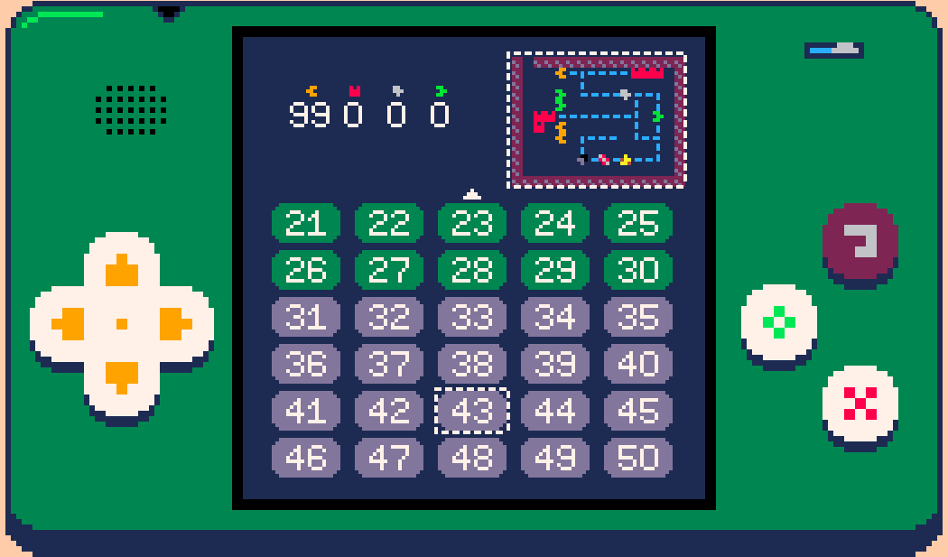
  • Can’t be confused with anything else as this is the only use of light blue underwater (this is useful both in the game and for the minimap on the level select menu)
  • You can tell what direction a creature occupying a flow will be pushed next tick thanks to the small gaps around the creature sprite edges and the vividness of the light blue (if you’re ever unsure you can always move then undo it anyway)
  • It’s at least suggestive of a flowing underwater current, which with this resolution and palette is pretty good
  • Not too distracting or eye-catching
  • Not so noisy that it makes looking at creatures occupying flows uncomfortable
  • Easy to see even on dim phone screens

There were also some happy accidents:

  • Flow waves go either side of the line when the hook is pushed through them
  • A 2x2 loop produces a whirlpool effect in the middle

Downsides:

  • If a position is surrounded on multiple sides by flows it can be hard to distinguish whether it is part of the flow system or not
  • Dense winding paths with multiple directions next to each other are difficult to parse

The 3x3 minimap tiles were quite straightforward as I already knew I wanted it to be a dashed line. I did try animating it to show the direction of flow but didn’t like the effect.

Time flows gently ever on

From start to finish this was around ~7 hours of work for a single 8x8 sprite. Small sprites don’t usually take much more than an hour but there was no obvious approach so I ended up trying several things, plus there was an unusually long set of requirements/restrictions since flows interact with every other system in the game. Quite happy with it.

Follow me on Twitter @rhythm_lynx

17 Likes

Great art! :smiley: Again, very useful diary, thanks for that :wink:

Didn’t you want to try larger minimap and fewer level selection buttons?

3 Likes

Good question! For a long time there were only 30 levels and having the minimap tiles be 3x3 worked out perfectly to show all 30 levels without any scrolling. I also really like the fact that the game is still pretty legible at 3x3. Now that I’ve introduced scrolling anyway, I could resize the minimap in future if I need some space for something else but I don’t see a reason to atm. Levels are distinctive and recognizable enough at that resolution.

5 Likes

Hello! It’s been a while but this project is not dead!

The last significant period of work was in March 2019, with just a few maintenance commits since then. In the last year I have changed jobs and cities for the second time since starting this project, and there have been several other important life events, not to mention world events. As this is a (mostly) solo project done entirely in my spare time, it takes a back seat whenever I don’t have time or energy to spare (particularly the latter). Some of the periods of highest productivity on the game have been during times where I didn’t enjoy my day job and needed a creative outlet, but wasn’t so unhappy that I had no energy or motivation. These periods were also when the scope of the game tended to creep up; from small game jam, to maxing out PICO-8’s memory limits, to premium multi-platform Defold mobile game, to ever-increasing numbers of levels and features (both gameplay and app).

Not only have there been significant life events, I have finally found myself in a job that I thoroughly enjoy and which pushes me creatively. As such I’ve felt less of a need to spend my own time outside of work toiling away. I still very much intend to finish and ship this game, but I’m not going to even pretend to know when that will be any more, or to put too much negative pressure on myself to deliver.

The important thing is that a hiatus is not a cancellation. I really appreciate those who have been following along with the project and giving such encouraging feedback. The next time I sit down and look at this thing I’ll be critically assessing the todo list and making significant cuts. I am very happy with the actual gameplay as it stands now and have been for a long time. I struggled mentally and morally with the idea of people paying money for this game; I felt I needed to add significantly more content for it to be worth the small fee I intend to charge, to not feel like a scam. I no longer feel this way. I think it’s a good game, I’m proud of it, and I’ve put a significant amount of time and energy into it. My friend Andrew has also put significant time and energy into the audio for the game and is rightly proud of his work, but he is dependent on me to actually finish and ship this thing for the world to hear it. The game has value, and I will charge for it appropriately. Plus, in all likelihood, very few people will buy the game, so this was all purely theoretical guilt anyway.

To summarise, I still intend to finish this game. I don’t know when that will be. The project has been on hiatus for a little over a year now. I’d like to come back to it soon. Thank you for showing an interest, and thanks especially to the Defold team for believing in the game enough to fly us out to GDC and to put us in the splash screen; it means a lot!

10 Likes

#09: Interview with sound designer Andrew Dodds

I recently read an article called A Swimmer’s View of Abzû by Hannah Nicklin, published in Issue #1 of A Profound Waste of Time. As a game developer and avid swimmer Hannah had a unique experience playing Abzû and decided to interview friends and relatives who were also avid swimmers about their own experiences with the game. One part in particular stood out to me:

Opening a new avenue of communication in a relationship sounded exciting. As noted in devlog #1 History and Motivations, my friend Andrew Dodds joined me early on in Hook’s development to create music and sound effects for what was, at the time, still a fairly small-scope PICO-8 game. We had spoken in the past about writing a devlog about his contributions and an interview seemed like a fun and engaging way to put words to paper. Through this interview I learnt a lot about Andrew’s process and about how a sound designer approaches a problem. I hope you find this as fascinating as I did!

Can you talk a little about who you are and what your background in audio is?

Hi, I’m Andrew Dodds and I’m a Sound Designer. My day to day involves creating sound effects and implementing them into games or syncing them with video.

I’d like to think I have a diverse background in audio. I worked my way through being a more engineering based sound person, working on stuff like the Commonwealth Games, BBC and STV productions as a freelancer. I then moved onto games at Abertay, where I met an incredibly talented programmer called Connor [editor’s note: I objected but he said I had to leave this in], which led me down the path of making some fun and interesting games. I’ve used different game engines, audio middleware, and countless other tools to make sound effects and music for games.

I currently work at a company called Krotos Audio where we make audio software. Our stuff has been used on Strangers Things, Game of Thrones, Avengers: Age of Ultron, and many others. I spend my time creating libraries of audio content (foley, swords, magic, weapons and many others) for use in the games and film/tv industries.

What do you do on the project? How did you come to join the team?

I create all the sound effects and music. I ended up joining the team when I saw Connor’s version of the game from a game jam. I’d played through it and thought it was really exciting, charming and fun. The whole time I seemed to have this sea shanty, chiptune music in my head and all these fun 8-bit style sound effects. The style and character of the game felt like it was already exuding the sound and I wanted to be the one to add it to the game. So I messaged Connor and told him all this, and he got me on the team as the sound designer.

I’d like to ask you about each of the 5 music tracks in turn. Let’s start with the title screen / menu song. What kind of feeling were you going for? Were there any particular inspirations? The use of white noise for ocean waves is really effective and pretty.


A 30s clip from music_menu

The whole song started around the waves and the idea of what a wave is. I liked the animation of the boat rocking up and down and the feel of the title screen as a whole, so thought some gentle wave sounds would be a good introduction to the game. I created this in PICO-8 using its noise generator and some filtering. As the sequencer steps through I increase and decrease the notes to get the rising and falling pitch. I do the same for the volume giving it that flowing sound.

With the gentle waves setting the mood I wanted the music to follow that. The title screen looks relaxing, so I kept the pace of notes slower. I faded in one layer of music at a time, building it up just like a wave rising. I liked the idea of falling and rising notes just like the waves, so I used some arpeggios to climb and descend the C major scale. It kept everything happy sounding and it was pleasant to loop.

At the end I added a lead so the song would go somewhere. I wanted it to rise all the way up the scale and then back down through a couple of octaves. This is just another extension of the same idea. Then the music fades out layer by layer until only the waves remain. This completes the full loop of the music in PICO-8 and from the waves, the song starts again.

Whenever a level is started the game will alternately play one of two songs (except boss levels, which we’ll get to later). Did knowing that these songs could potentially play on any level affect the design process?

Not really. Basically, I was just thinking about how all the songs I made for the game fitted the theme and style of the original title music. So as long as it stuck to the falling and rising arpeggios and it felt like the music fitted the style of the visuals, I was happy. Really though, I feel like all the music I made for Hook are melancholy sea shanties, which I really like since most of my music is quite melancholy. It feels like I made it, it comes from me but at the same time fits the game.

Both gameplay songs (known simply as game1 and game2) have some structural similarities: they feature strong melodies with accompanying harmonies, and are slightly over 1 minute long with a noticeable shift around the halfway mark. Players will hear these songs on loop longer than any other pieces since they play during the core gameplay, is this what led to the two-halves structure – a way to give the player some contrast and respite from each half?


A 30s clip from music_game1

Yeah that is exactly what it was! There were also the restrictions of PICO-8 and that I only had 64 blocks of 4 bars to create 5 tracks. It meant I needed to keep the songs short, but there also needed to be some kind of movement and change, instead of always repeating itself. So I made 2 distinct sections and ensured that they moved away from each other and back together at the end. Again, all because of that wave idea, I had the layers and the music ebb and flow.

Is there anything else you’d like to say about these songs? I particularly enjoy the tremolo at the end of the long notes in game1’s melody, and the bassline in game2.


A 30s clip from music_game2

Yeah, I think that they were really fun to make as it is not a medium I was used to. With everything being essentially 8 bit, I had very few tones to work with. I noticed very quickly that notes would clash a lot easier than on other instrumentation, so I had to be quite careful with how I did the harmonies. It ended up having a really nice effect where the different layers have some notes overlap. This results in them getting a little lost for a beat and then another layer will change revealing that other note. It seemed to make the sum of all the parts much richer than the component parts.

To add to what you are saying about the tremolo, PICO-8 has these minimal effects you can add to every note. They include things like fading, tremolo, slides, and a few others. They were a really nice way to make the music feel a little bit more alive, than just having static notes. Overall I enjoyed all the stuff I made, but my favourite to make was music_game2, as I feel that is the point I began to hit my stride with the music system in PICO-8.

The music that plays on boss levels is noticeably more up-beat and has a stronger driving rhythm compared to the other songs. It helps a lot in making the bosses feel special and stand out. Was it hard to balance this more intense music with the relaxed feel of the rest of the soundtrack, or was it a refreshing change of pace for you? The song feels very layered and complex, despite adhering to the same 4-channel restriction and ~1 minute runtime.


A 30s clip from music_boss

It was definitely a fun change of pace. I knew I wanted something different to stand out and show that this was a more difficult and important level. I made a real conscious effort to make it more engaging and brighter, as you may get stuck on these levels for a while. I didn’t want it to be too repetitive and annoying. The level may take as long as 10 mins to figure out and the track loops round every 1min 6s, meaning you were possibly going to hear it 10 times or more. It had to be fun. I also think this song reflected my mood after working on the game for a while. I was excited and happy to be working on the game and I’d got most of the other sounds done. This felt like the accumulation of work and it kind of came together really easily and naturally.

The layers compliment each other and harmonise well. The bass octave note pattern makes it feel upbeat, bouncy, and fuller than the other tracks. Also the low melody line is around the same notes as the bass, they are just using a different waveform in PICO-8. I noticed that if you combine the sine and organ waveforms it gives them a richer tonality that is greater than the individual parts. This makes the melody and bass feel like a chord at some stages rather than just a couple of layers of notes playing. Then with all of that mix going on with the low and mid notes, the highs kind of shine through, and feel like an extra bit on top of this fuller sound.

The fifth and final song in the game is for the credits sequence. The melody moves a lot here, becoming almost melancholic towards the end, like a goodbye. You make strong use of those arpeggios again here, too. How did your approach for this song differ compared to the others?


A 30s clip from music_credits

The method of approach was very similar to the other songs. I felt it was an important part of working in PICO-8 and the melodies and style I was working with to be considering everything around the arpeggios. The only thing that changed was the feeling and mood on this song. It was the end of the game and that was a good feeling to be able to finish it up and complete it, but also sad that we were done with it. That led to the more melancholic goodbye tone. A lot of the games I played when I was a child, with all the 8-bit music, always seemed to sign off on a rather sombre note. I think it was a portion of that and my mood that made it feel like a fitting way to end it.

As a sound designer, what’s your most desired audio feature that Defold is missing?

I would like to see more controls that people who work in audio are familiar with. Just now it is very bare bones and relies heavily on the programming. The system allows me to cue up and trigger sounds, but unless I write the code, or get a programmer to do it for me, adjustment of levels, real-time controls, and even sequential or random triggers of multiple sounds in a container, it’s all done through coding. Attaching some kind of simple audio UI and folder structuring system for the sounds you want in the game would be really helpful. Luckily in Hook, I was working with motifs and sounds that triggered with some form of repetition expected. Showing variety or audio depth, such as multiple footstep sounds and surfaces, with the tool would take more time from a programmer to set up how all these sounds will trigger, than the sound designer. It would make the team work smoother, like hooking up Wwise to Unity. It gives a lot more creative control to the sound designer, and they can focus on making the game sound, rather than trying to explain to the programmer how they want the sounds to trigger and fade in.

What’s your process for designing a new sound effect for Hook? Does that differ from how you create sound effects for other projects?

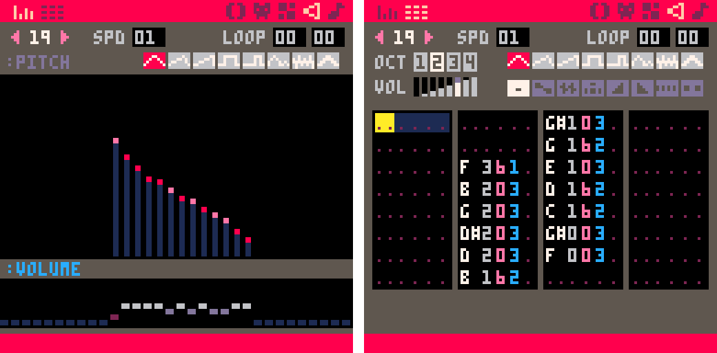
A lot of the general idea is the same for the way I’m thinking about it and dealing with feedback, but in PICO-8 my approach to making the SFX was a little different. The main thing was the brief. The goal was to make the SFX sound like they were underwater and fit the visuals and animations. With this in mind PICO-8 has 2 views where you can work with the sound, one where you can draw in the sound like a bar graph and another which is the same as the music chart. For SFX I would start with drawing them in as it felt very natural. If you started high and drew down to low, you would get a descending note chromatic progression, and vice versa if you drew low to high. This made it easy to get the character of the sound and make them fun and gestural. I could experiment with the rising and falling patterns, leave gaps to create stuttering effects, or be really random with the pattern and see what came out.

After this I would focus on getting the tonality to match the visual/animation more accurately. I did this by changing the waveforms for the different notes in the pattern. This created a richer and more designed feel for each of the SFX, and made them more unique for the visual. For example the crab breaking a debris block is a mixture of a couple of low sine notes to give the low end impact, then noise waveform starting from high pitch and descending to low pitch, and at the end another couple of sine notes descending in pitch as well. This allowed me to give it the crisp breaking sound that fitted the animation, but at the same time the sine waveform immediately after it dampens the harshness, making it feel more underwater.


The break_debris sound effect


The break_debris sound effect in PICO-8’s pitch mode and tracker modes.

After I had a pattern and tone I liked, I could then use the playback speed, same as the music BPM control, to change the pace and feel of the sound. This allowed me to sync the SFX with the visual better.

Lastly, I had to make sure the SFX didn’t clash with the music. Working with SFX that are more musical in tonality, since they are all still made with the same waveforms as the music, meant using notes that were dissonant could make a positive sound really jarring and off. I had to make sure all my positive SFX were in the key of C like the music. All my negative sound effects are either dissonant with C or if they were too harsh, some other notes that made it clear that something was wrong. This is quite fiddly to do in the SFX drawing section, so I did this the music editor view. Since all the notes in here are named, I could easily see which note was the wrong one and correct it.

How have you found dealing with the restrictions imposed by PICO-8? For instance the range of waveforms available, the 4-track limit for music, the tracker-style tooling.

I quite enjoyed the restrictions that PICO-8 has. It made me have to think a bit differently about my approach to the sound design as a whole. I think it also made me realise I could over-think my design at times, when I have unlimited tracks and sounds to play with. At the time I think it helped me progress and get more in tune with SFX and music working together, as well as thinking about pitches, tonality, and harmonies to make it all work as a cohesive whole. Also the limitation made it easier to embody the characteristic of the visual style and what we expect audibly from games of this genre. I think that the way PICO-8 does the visual graph for making SFX made it easier to do though. I didn’t need to know the code behind the scenes too deeply to get the results I wanted, so it was really fun to work with it. Lastly, it was nice to work with audio in an older style, it gave me appreciation for what I have and can make now.

What does the audio pipeline for Hook look like? Walk me through the process from needing a new sound effect to having it in the game.

Through other questions I have kind of answered the majority of this, the final part is how I get the sound out of PICO-8 and into Defold.

Once the sounds are all created I can render them to WAVE files out of PICO-8. I will then mix and master the effects in a DAW [Digital Audio Workstation]. My preference is Reaper here. Due to certain limitations with not being able to use Wwise or FMOD for this project, I actually do all the mixing in the DAW. This way I can get all the SFX and music lined up and see how they play together. I basically have a mock-up with the music and then simulating the process of the level and the order the sounds will typically play in. I then mix all the SFX and music to this and it seems to mimic the game pretty well.

After this, I render all the sounds out of the DAW and then I import them into Defold. From there Connor has set up code to trigger them in-game. I can then playtest the game and check to ensure all the SFX and music are working well together. If I make adjustments to the SFX or music, I just make sure to render them with the same name as the sound before. That way when I import them into Defold, it just overwrites the previous one.

How do you make something sound “aquatic”? Do you have any favourite techniques that you used in Hook? Are there any you wanted to use but couldn’t because of technical or aesthetic limitations?

It was all to do with using the sine waveform as it’s the most soft sounding of all the waveforms. I noticed in PICO-8 it has a very muted and muffled sound in general and if you combined it with different amounts of the other waveforms, it would make them seem less harsh. This became my go-to technique for the design. It was kind of similar to when you are layering in a Digital Audio Workstation doing more modern style sound effects. The combination of different elements makes different results, but in PICO-8 you cannot layer. As a result the closest you can get is changing the waveforms right after one another and adjusting the speed of the SFX playback. This yielded the best and most interesting sounding results. It’s like the layering was slightly syncopated, but by such a small amount your ears don’t realise. This gives the SFXs a bit more meat and allowed me to experiment and find ways to get a characteristic sound for an object, but then smooth it over with the sine wave to make it more underwater sounding.

As I mentioned above, the limitation came with not being able to layer several sounds together to achieve the effect you want. I needed to think more abstract and suggest elements of the sound that fit the object, or animation, in game. It works for the art style though and the limitation honestly helped keep me on track. I didn’t see it as I couldn’t make something, more how can I make it this way?

If you had to pick one, what would be your favourite sound effect and favourite piece of music in Hook?

Hard choice for both… I think for SFX, it is the sound as you hook a fish or creature and then that first part of the hook being reeled in. I just feel like the little bloop noises are quite satisfying. I know that is cheating on choosing but it’s the combination of those two sounds that set the tone for the rest of the game. And for music is a toss up between music_game2 and music_boss. I think music_boss just pips it.


From both of us, thank you very much for reading!

You can follow Andrew on Twitter @doddsy91
You can follow me on Twitter @rhythm_lynx

9 Likes

#10: Audio tech

The previous devlog was about 1 audiophile. This devlog is about 23 audio files.

At the time of writing there are 18 sound effects in the game:

  • break_debris
  • collect_fish
  • crab_snip
  • cut_stingers
  • drop_fish
  • grab_fish
  • hook_move
  • invalid_move
  • kill_fish
  • level_restart
  • level_start
  • level_win
  • menu_move
  • menu_select
  • reel_in
  • sponge_absorb
  • squid_ink
  • undo

We may need a few more but probably not many. All of these are between 0.1 to 0.2 seconds except level_restart at 0.4s and level_win at a lavish 1 second. Each sound effect file is between 5KB to 7KB except level_win at 12KB.

There are 5 pieces of music:

  • music_menu: 1m 54s, 888KB
  • music_game1: 1m 3s, 527KB
  • music_game2: 1m 10s, 576KB
  • music_boss: 1m 6s, 554KB
  • music_credits: 1m 24s, 730KB (work in progress)

As you might expect music_menu plays during most menus including the title screen, level select, aquarium and settings screen; the two exceptions are the about screen where music_credits plays instead and the pause menu which doesn’t interrupt the gameplay music. Speaking of gameplay music, every time you enter a level the music alternates between music_game1 and music_game2 except of course the boss levels which play music_boss.

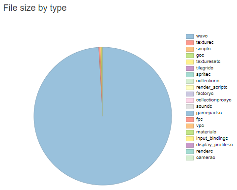
Originally all of the audio was stored as .wav files. Since the number of other assets is pretty low and the textures are all incredibly low resolution pixel art, when I bothered to generate and check a build report I discovered that audio accounted for literally 99% of the build size:

before

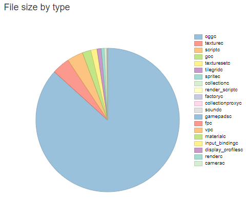
Changing from .wav to .ogg dramatically reduced file sizes without a noticeable drop in audio quality (helped by the retro nature of the sounds). Audio now accounts for a slightly more modest 87% of build size (the 5 music tracks account for 85% by themselves):

after

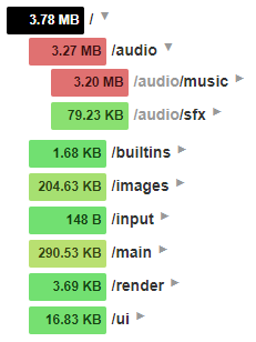
This dropped my Android release build from ~60MB to ~8.5MB! Turns out build reports are pretty useful, thanks Defold. Overall the content of my project amounts to ~3.8MB of the build, with audio being ~3.3MB of that:

build_structure

Implementation: sound effects

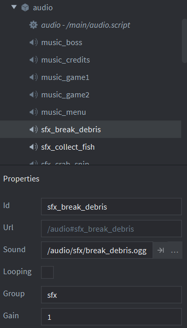
I’ve said this before but one of the pleasures of this project is not having to care at all about loading and unloading assets or general memory management (so long as we don’t leak, we’re good). All audio and textures are just kept in memory at all times. In the bootstrap main.collection there is an audio game object with an audio.script component and 23 sound components - one for each audio file.

All the sound effects belong to the ‘sfx’ group and do not loop. Triggering a sound effect is as simple as sending a message to the audio game object:

msg.post("main:/audio", "play_sfx", { sound = "break_debris" })

This message is then handled in the audio.script on_message function:

if message_id == hash("play_sfx") then
	if not self.played_this_tick[message.sound]
	and (message.sound ~= "reel_in" or self.reel_timeout <= 0) then
		msg.post("#sfx_"..message.sound, "play_sound")
		self.played_this_tick[message.sound] = true
		if message.sound == "reel_in" then
			self.reel_timeout = MAX_REEL_TIMEOUT
		end
	end
end

When the hook was the only thing that could trigger sound effects it wasn’t possible to have the same sound triggered multiple times in one frame. When I added flowing water I encountered an issue where for example two flows would push two crabs into two debris on the same tick, causing the break_debris sound to be triggered twice in the same frame and play much louder than usual. Now the self.played_this_tick table prevents sounds that have already fired from firing again and is reset each frame in the update loop.

There is also a timeout applied specifically to the reel-in sound effect as it’s the only one which can fire rapidly enough to become monotonous. A comparison without and with the timeout:

Implementation: music

The only difference for music sound components is that the group is set to ‘music’ and looping is ticked. Triggering a music change is done through a similar message:

msg.post("main:/audio", "crossfade", { music = "music_boss" })

The handling of this message is slightly more complex though. Sound effects are ‘fire and forget’ but music is continuous - we don’t want to play multiple songs at once nor do we want to immediately cut from one song to another; we want to fade the current song out then fade the next song in. This can be heard in the video above showing the reel-in sound effect timeout, when the music transitions from music_menu to music_game1 after the level selection menu.

if message_id == hash("crossfade") then
	if self.current_music ~= message.music then
		self.crossfading = true
		self.crossfade_target = message.music
		self.crossfade_time = 0
	end
end

During the update loop we first fade out the original song, then when the transition can’t be heard we cut it and start the new song, then fade that up to full volume. Fading is achieved by linearly interpolating the music group gain from 1 to 0 or from 0 to 1.

if self.crossfading then
	if self.crossfade_time < HALF_CROSSFADE_LENGTH then
		-- during the first half we're fading out the original music
		self.crossfade_time = self.crossfade_time + dt
		if self.crossfade_time >= HALF_CROSSFADE_LENGTH then
			msg.post("#"..self.current_music, "stop_sound")
			self.current_music = self.crossfade_target
			self.crossfade_target = nil
			msg.post("#"..self.current_music, "play_sound")
		end
	else
		-- during the second half we're fading in the new music
		self.crossfade_time = self.crossfade_time + dt
		if self.crossfade_time >= CROSSFADE_LENGTH then
			self.crossfade_time = CROSSFADE_LENGTH
			self.crossfading = false
		end
	end
	local start_gain, ratio = 1, self.crossfade_time / HALF_CROSSFADE_LENGTH
	if self.crossfade_time >= HALF_CROSSFADE_LENGTH then
		start_gain, ratio = 0, (self.crossfade_time - HALF_CROSSFADE_LENGTH) / HALF_CROSSFADE_LENGTH
	end
	local end_gain = 1 - start_gain
	local gain = vmath.lerp(ratio, start_gain, end_gain)
	sound.set_group_gain("music", gain * g_save_data.music_volume / MAX_VOLUME)
end

I guess technically this isn’t a crossfade, since we’re not actually playing both songs at once. For a true crossfade you’d want to be altering the gains on the sound components themselves rather than on the group; since they both belong to the ‘music’ group they can’t be faded independently using my approach.

Implementation: volume sliders

In the settings screen there are separate volume sliders for sound effects and music, these are just directly setting the gain on the ‘sfx’ and ‘music’ groups. The only gotcha here was that in right-to-left languages such as Arabic (which we support) the sliders need to be mirrored so that they run from right to left (moving the slider to the left increases the volume).

Code

Here is the entire audio.script file in the hopes that someone finds it useful. I wrote most of this code over 2 years ago but I don’t think there’s been any major audio changes for Defold since then.

audio.script
MAX_VOLUME = 10
local HALF_CROSSFADE_LENGTH = 0.6
local CROSSFADE_LENGTH = 2 * HALF_CROSSFADE_LENGTH
local MAX_REEL_TIMEOUT = 0.2

function set_music_volume(volume)
	if volume < 0 then volume = 0 end
	if volume > MAX_VOLUME then volume = MAX_VOLUME end
	g_save_data.music_volume = volume
	sound.set_group_gain("music", g_save_data.music_volume / MAX_VOLUME)
end

function set_sfx_volume(volume)
	if volume < 0 then volume = 0 end
	if volume > MAX_VOLUME then volume = MAX_VOLUME end
	g_save_data.sfx_volume = volume
	sound.set_group_gain("sfx", g_save_data.sfx_volume / MAX_VOLUME)
end

function init(self)
	sound.set_group_gain("master", 1)

	-- TODO: fade music in during startup, don't abruptly play
	self.current_music = "music_menu"
	msg.post("#"..self.current_music, "play_sound")
	
	self.crossfading = false
	self.crossfade_time = 0
	self.crossfade_target = nil
	
	self.played_this_tick = {}
	self.reel_timeout = 0
end

function update(self, dt)
	if self.crossfading then
		if self.crossfade_time < HALF_CROSSFADE_LENGTH then
			-- during the first half we're fading out the original music
			self.crossfade_time = self.crossfade_time + dt
			if self.crossfade_time >= HALF_CROSSFADE_LENGTH then
				msg.post("#"..self.current_music, "stop_sound")
				self.current_music = self.crossfade_target
				self.crossfade_target = nil
				msg.post("#"..self.current_music, "play_sound")
			end
		else
			-- during the second half we're fading in the new music
			self.crossfade_time = self.crossfade_time + dt
			if self.crossfade_time >= CROSSFADE_LENGTH then
				self.crossfade_time = CROSSFADE_LENGTH
				self.crossfading = false
			end
		end
		local start_gain, ratio = 1, self.crossfade_time / HALF_CROSSFADE_LENGTH
		if self.crossfade_time >= HALF_CROSSFADE_LENGTH then
			start_gain, ratio = 0, (self.crossfade_time - HALF_CROSSFADE_LENGTH) / HALF_CROSSFADE_LENGTH
		end
		local end_gain = 1 - start_gain
		local gain = vmath.lerp(ratio, start_gain, end_gain)
		sound.set_group_gain("music", gain * g_save_data.music_volume / MAX_VOLUME)
	end
	
	for k,v in pairs(self.played_this_tick) do
		self.played_this_tick[k] = false
	end
	self.reel_timeout = math.max(0, self.reel_timeout - dt)
end

function on_message(self, message_id, message, sender)
	if message_id == hash("crossfade") then
		if self.current_music ~= message.music then
			self.crossfading = true
			self.crossfade_target = message.music
			self.crossfade_time = 0
		end
	
	elseif message_id == hash("play_sfx") then
		if not self.played_this_tick[message.sound]
		and (message.sound ~= "reel_in" or self.reel_timeout <= 0) then
			msg.post("#sfx_"..message.sound, "play_sound")
			self.played_this_tick[message.sound] = true
			if message.sound == "reel_in" then
				self.reel_timeout = MAX_REEL_TIMEOUT
			end
		end
	end
end

If you want to use and extend this code for your own projects please feel free! Here are a couple of changes I would recommend:

  • For crossfading music, manipulate the gain on the sound components individually instead of their shared group gain so that a true crossfade is possible rather than fading completely out then in.
  • This code doesn’t handle the case of requesting a music transition while a crossfade is already in progress; this isn’t possible in Hook and I’ll never finish the game if I spend time solving problems I don’t have. You would want to start fading out the currently playing music from whatever volume it was at when the new request arrived.
  • The global volume setting functions should probably be replaced with a ‘set_volume’ message. These functions are called when save data is loaded during startup and when the volume sliders are changed in the settings screen, which is in a different collection. I didn’t really understand Defold’s message passing architecture when I was writing the save data system so I used global functions instead as I ran into problems trying to send messages between objects in different collections, some of which are loaded through proxies. There’s probably a cleaner solution but this works fine for me.

You can follow the game’s sound designer Andrew Dodds on Twitter @doddsy91
You can follow me on Twitter @rhythm_lynx

16 Likes


Even the forum software was like “who are you again?” :sweat_smile:

15 Likes

Welcome back Connor. Really great posts!

5 Likes

Thanks britzl :slightly_smiling_face:

Awesome devlog!

@britzl: maybe this should go in some sort of episodic posts on Defold’s weblog?