After the Dashboard shutdown, you changed the fonts on the website with a very thin variant, which, honestly, for me is very hard to read. This is especially bad in the API reference, where code and symbols are not differentiated in any way from the rest of the text (color/monospaced font/font weight).
This, compounded by the fact that the API ref is not categorized anymore, makes using it quite hard for me.
Personally, I want an api reference to be about the actual api.
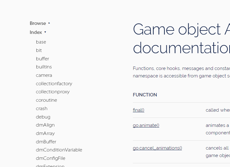
I never understood the previous groupings, and it also led to many extra questions on the forum about the api (people never understanding that we list the functions there)
Now, we list the modules / namespaces that exist. I like that 100x more.
I can agree that we should subgroup them into e.g “Script → Defold”, “Script → Lua”, “C++” or something similar, because currently, the list is very long.
makes using it quite hard for me.
Can I ask about the exact flow here, and perhaps we can make both views meet in a good compromise?
Yeah…to be honest I don’t like any of the style or organization changes. I assumed it was still under construction.
The massive amount of extra whitespace.
now the gui function list/table of contents takes up 11 pages on my screen…
The complete lack of color.
where did all the blue go? The warning icons are black, links don’t look like links…everything blends together more.
The old namespace categories were fine for me.
Even though the order was a bit funky, I liked it much better then other API references that use a sensible, alphabetical list. I don’t have any proof, but I think it was great for beginners—if you didn’t know what you were looking for, you could browse through the categories and find stuff you didn’t know about. The two you use the most (go, gui) were right at the top, the stuff for using components was grouped together, the lua stuff, platform-specific stuff, etc. Experienced users that know exactly what they want can use their browser’s search to get what they want.
Can I ask about the exact flow here, and perhaps we can make both views meet in a good compromise?
I think 90% of the issue for me is still the font weight and the lack of visual cues that help with visual parsing. It’s really hard to read for me and it throws off my focus. I don’t have perfect vision and the decrease in font weight just reduced contrast, making it harder for me to mentally recognise the letters. Thin font weights are cool as a title font, but they’re not appropriate as a body font, where the letters are many and smaller.
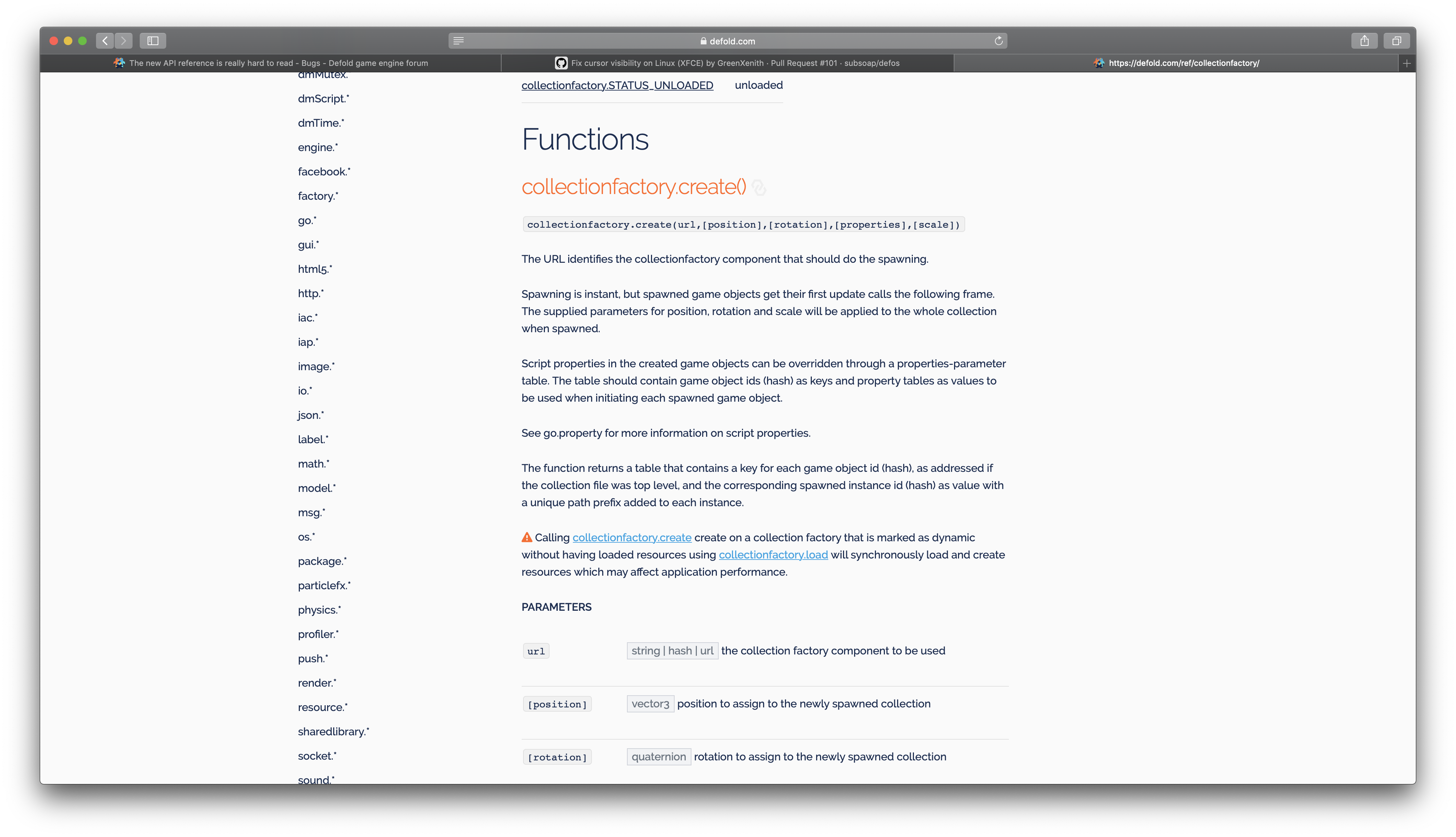
Similarly, the formatting matters. For example: Previously when I wanted to look for the argument types, I would just look for the code-formatted text. Now I have to skim-read the whole thing.
Relating to the categories. I don’t mind the alphabetic order, but mixing up Lua namespaces with native stuff is just confusing. When I’m looking to reference something, I already know if I’m looking for Lua or C++ stuff, and even though I have this information, have to mentally search through a list twice the size to the one I’m actually interested in. Previously, I could just do that visually. Now I have to use Cmd+F.
Thanks! This was a really fast change! All of these changes make it much, much better, though the font weight is still a problem for reading paragraphs and longer lines. (I’m saying this of the whole website, not just the API reference, but the API ref is where most of my interaction with the website goes)
I agree that a heavier font would be much more comfortable to read.
An idea about the categories. For the manuals you have collapsible menus. What if you added that for the API ref? Have one named “Index” with the alphabetical list, and another named “Browse” with the old categories. You could have the index open by default to make Mathias happy and allow the browser search to work.
Ahh…another little nitpick. Maybe it’s just me, but I don’t really like the .* at the end of the namespace links. Maybe it’s “technically” “correct”, but to me it’s extra visual clutter and makes them look less like menu buttons and more like plain text. All the function docs have it in there anyway, so it’s not like anyone could be confused.
(Also it doesn’t “technically” make sense for “base” and possibly the C++ ones?)
It would also be great if the page was responsive. What i mean is that before the recent change, when i made the browser window smaller, which i do most of the time, the menu at the side would collapse into a select box and the text would use the fully available width. However, now there are two wide white space columns on both sides and text in the middle which is not very readable as below.
If I am reading GUI/Box Nodes, the menu on the left side for GUI should be collapsed already, with Box Nodes ideally highlighted/differentiated to make it easier to spot where you are in the manual. Right now, the entire menu is reset (nothing collapsed) every time you select a specific topic.
So if I am trying to read the manual sequentially (as most first timers will do), I have to click on GUI again, double check/remember that I am on Box Nodes page, before I can select the next topic in the list which is Text Nodes. If GUI is auto-collapsed and Box Nodes is somehow highlighted as current page, it’s much easier to read and keep track of things.