The post aim is to explain how to properly setup a gui screen to scale with your window.
This post started with me getting frustrated with Adjust Mode and not always getting it to work as I thought it should. As I started to dive into it I wrote my thoughts and findings down, both for my future reference and for anyone else gain.
The manual for Adjust Mode and Anchors can be found a bit under GUI Properties
My scene looks like this. All nodes have Fit as their Adjust Mode (the Default).
This of course makes it not scale very well
I would want the top bar to scale with the width or height independently, i.e.I don’t need to to keep the aspect ratio so I set it to ![]() . One would think is should stretch now. But after rebuilding there is no visual difference.
. One would think is should stretch now. But after rebuilding there is no visual difference.
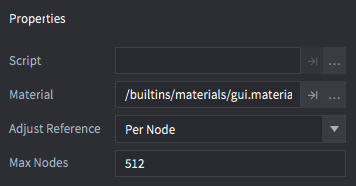
I remember that the Adjust Reference are on “Root (Deprecated)”, that’s probably not correct as we want to control the node by itself, so we change that to “Per Node”
Bet it will behave per node now! Reload and.. nope. Still doesn’t stretch it. Let us set the parent of our top bar to Stretch too.
Build and check! Now the top bar behaves like it should. (Would love the hear from the Defold Team why this is necessary.)
But everything else also moved oddly, maybe it should be on “Root (Deprecated)” after all?
No, then everything get’s the roots Adjust Mode (which means everything Stretch) - makes sense but definitely not what we want. So we change it back to “Per Node”.
Okay, so I guess we need to fix everything…
Starting with the “You found a sword!”, I don’t want it to scale and I want it centered. So it should be on Adjust Mode fit with both “X Anchor” “Y Anchor” set. (The anchor is in % so it shouldn’t really matter if you use Right or Left, it’s either 20% from the right or 80% from the left - same thing).
It worked! Yaay!
The health and Mana bar doesn’t move as I want them too either, would like them to be centered in the height of the top bar.
So we need to anchor them to the top, the top right Companion data I want to stay in the corner to we anchor that to the right.
I want the bottom part’s back plate to scale with the screen so I need to put the panels node to stretch as well as its parent.
It scales as it should, but now all its children are messed up.
How do I want them to behave, I guess I want them to keep their positions?
Let’s use anchors on them all!
Eh, not happy witht that. The “title box” and “list” aren’t ‘sticking together’.
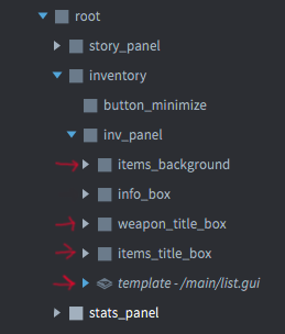
Checking the outline we see that all the nodes are siblings.
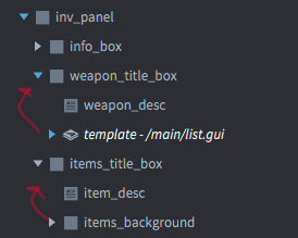
So we want to group the “title box” and “list” and have the anchor on the group node instead!
I put the lists as children to the title box and removed the childrens anchors.
And now they stick together!
Looking in this extreme situation I realize that I want the position of the the things to keep to the far left and far right and not be “10% in”.
So if we want to keep an “Absolute” position we can add a node that is to the far right of the screen (same screen position as the screen is wide). On that node we set “X Anchor”. We also remove the “X Anchor” on the children nodes.
And now they stay in their positions better.
Fin
And that wraps up this post! Thanks for reading, ask away if you got any questions!


