Generation ship game

An experiment in trying to further visualise the effects on the ship’s various stats as the journey progresses.

Not good! Even if the tags and the text were legible, it’s too much information to read and parse. Think I will scrap this and come up with something else.

1 Like

Had a great day yesterday and finished a bunch of mutation “skills”! These are negative traits that you are forced to pick from when your Mutation bar hits 100. The fewer crew you have on board, the faster the Mutation bar rises. You can also gain Mutation from destination events.

Hard to show off - so have something flashy instead! I’ve added some particle effects to distinguish the announcement of tech skills triggering (blue) and mutation skills triggering (green).

5 Likes

How about reducing the circles to just quickly fading blobs bursting out of the ship, being bigger/more opaque the higher the number? The exact value can be seen in the gui, this would give you a feel for what happened with just colourful splashes.

1 Like

Thanks for the suggestion! This is a good idea, and I’ve actually been thinking of something similar myself. Instead of size being the measure of quantity, it could be the number of particles generated. This would be juicier but potentially too busy.

It could be that a reduction in value causes a subtle shockwave out of the ship (kinda like the blue effect in the last video I posted), and an increase in value is a particle that is absorbed by the ship. Probably need a lot of experimentation to find something good.

It’s also been suggested to add a bit more juice to the HUD itself. Something like a little ping or flash whenever a bar changes value

2 Likes

I’ve added trauma! How does trauma differ from mutations?

Mutations are a function of crew size. The lower your crew population, the faster you gain mutations. Once your mutation bar reaches 100, you “get to” choose a mutation out of three options. The mutations offered are completely random.

Trauma comes exclusively from destination events, with negative effects (for example pirate raids or alien encounters). When the trauma bar reaches 100, you are automatically assigned (no choice) a trauma based on the tags of the destination that tipped the scale. For example, if your trauma bar maxes out during a drone attack (which would have the ROBOTICS tag) you might gain the trauma “Robophobia” which gives you further negative effects on destinations with ROBOTICS tags.

4 Likes

I finished the first build. It’s available on Patreon. Not saying that because I’m expecting anyone to sign up - it’s just the build schedule I’ve set for myself. Builds go up on Patreon first, then onto my newsletter with a one build lag, then finally anywhere else publicly (at my discretion of course) with a two build lag. (I might have to make an exception here to get feedback.)

Playtesting the first build left me a bit concerned about the state of the game. A core part of the experience was supposed to be evaluating different destinations and picking between them. Do I zigzag across the screen, spending fuel and gaining mutation, or do I go as directly as possible towards my destination? That’s what I hoped the thought process would be. I find in testing however, that it doesn’t really work that way. The cost of zigzagging (fuel, mutation, life support) is too long term and abstract. In practice I find that, whether it’s the best strategy or not, you simply end up picking all the “good” destinations in order, no matter what.

That’s boring!

So, for the past couple of days I’ve tried something else. With “less is more” as my guiding principle, I have simplified the game even further. I’ve flipped the perspective from top-down to first-person. Instead of traversing node to node, you now must pick only one from a set of destinations. The other are discarded.

Why do I think this might be better?

It forces you to compare good destinations to other good destinations. In the old system, you would simply go to each “acceptable” destination in turn. Now you have to pick the best one.

I think it might also strengthen the distance decision making, i.e. is it worth it to burn 5 extra fuel to reach this Tech cache, when I can go nearby and pick up a little bit of life support instead?

Finally, I think it will give me more control to design “encounters”. In the first build, destinations are individually generated at random. Hard to make something coherent. In the new setup, I can design the experience with more control. Perhaps your first three choices will be sets of only “good” destinations. This sets you up for the next choice which is one where you have to pick from only “bad” destinations.

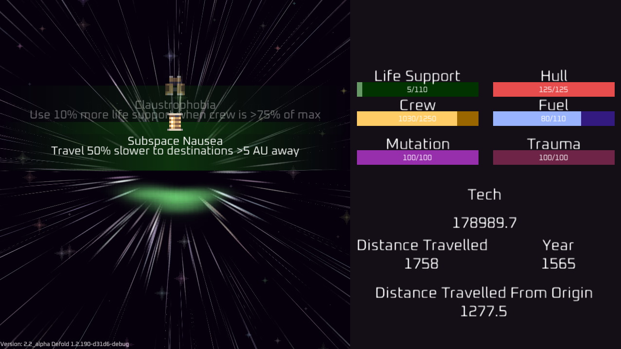
This is what it looks like. Obviously animations etc are just for illustration.

Why might it be worse?

It’s becoming ridiculously simple. You no longer need to plot out a desired path in your head (simple as that was before), you’re now just picking the best destination over and over. This is intended for Steam and Switch, and I’ve already had comments that it seems like a mobile game. It’s true that the input and gameplay is really simple, but the (mechanical, not theme) inspirations (Reigns and Luck be a Landlord ) for the game establish a precedent that simple input and gameplay does not preclude release on Steam.

In any case, this level of simplicity might just be too much.

There could also be other reasons I haven’t thought of.

Feedback?

I know it’s really hard to evaluate something like this without playing it, but I’d appreciate your thoughts anyway. What do you think? Does it make sense? Which do you prefer, based on my descriptions?

2 Likes

I’ve decided to make an exception and upload both builds here now. I need the feedback! So please, if you have the time, play both versions and let me know what you think of the change described in the previous post.

Version 1 - top down view, node based navigation.

Version 2 - first person view, choose single destination.

3 Likes

Hello Alex, I spent short bit of time playing both versions and have some feedback for you. First off I would like to say I can definitely see great potential in this becoming something worthy of playing on pc and or console. As you said some feedback was that “it seems like a mobile game”, I would agree with with this and would like to go into why and what another approach can be to maybe chip away at that sentiment leaving player experience at the forefront. Please take all of my feedback with a grain of salt , apologies for long post and if I go on any tangents in advance . :slight_smile:

Quickly would like to go over simple feedback on “Which do you prefer” before moving on. Without a doubt I would prefer the first person aspect, because I think this has the most potential to be something much more visually appealing while at the same time hopefully easier pairing it with the simplicity goal in your game design loop. It also has the potential to open up more game play aspects that I believe can immerse the players , i’ll come back to this later.

So why do I agree with “it seems like a mobile game” ? One of the main issues is not that it looks to simple that would be a cop out , to me it is the overall experience I am having while playing it. As we all know mobile games can be very casual in nature and abstract game play instead of a more immersive experience that the player can buy into at a more personal level, this is the gap to me. At the moment I think you have a really nice game loop for traveling/exploring and the basic management of the ship and crew. However I think at this point taking a step back and iterating over your game design to focus on player experience would be a great benefit going forward.

So what do I mean by this approach? I would say that it’s all about questioning the design to make sure its solid and make changes where needed. I know this is very early in development but I would start at the very beginning of the experience , I start the game and right away I have open space with starfields and some POI’s, then to the right I have a blocked out gui with lots of information, reviewing this tells me I think it represents a ship and crew etc. (Now I don’t know your overall vision or aesthetic goals , I am only sharing what I believe to be valuable honest constructive feedback ). So right away 2 issues here as a player it’s hard to tell what my role is and what are my goals? What is the reasoning the panel is to the right, is this only to feed information to the player? Let me go into detail of what I mean. But First I think you pointed out a good example. For instance the game Reigns you point out this game doing well on pc and is an inspiration, this is something to look at in more detail. So let’s look at this game’s description:

Sit on the throne as a benevolent (or malevolent) medieval monarch of the modern age and swipe your royal controller either left or right to impose your will upon the kingdom.

Although simplistic in visuals and input there is a layer beneath with complexity applied to player experience. The players is a medieval monarch right from the description. So when I play this game right away I take ownership of my kingdom and the power with every decision good or bad immersively I buy into the role and take ownership of the consequences. When the player is immersed in this role and feels rewarded and or defeated this experience is the goal of the game and I believe it’s a good recipe for success. So with the 2 simple issues I brought up I would ask questions. Who am I as the player? Am I a captain? am I a computer controlling the ship? am I a group of crew members that make all the decisions? On my screen I am peering into the depths of space but I don’t have a roll. This tells me that as a player I am not grounded in this universe, give the player a role allow them to get immersed and buy into this role then the notion of being a mobile like game will disappear for many potential players. For the hud block aesthetic wise can be adapted many different ways and may be your intentional goal. However I think you can further adapt it in such a way that a player can become even more immersed in the universe your presenting. I will go into more detail below in suggestions. Overall I think there are many great ways you can iterate the design of this game and take it onto a more positive grounded experience.

I have suggestions and can go on forever with them however I will try to cut them down to a few that may be hopefully useful. So I would like go back to the first experience of opening the game again and think about the first-person view which I love. The screen showing the vastness of space and blocked out hud doesn’t fully ground me as a player in this universe, so one thing I would think about is how to ground the player and the possibility of adapting the hud and open up space on the screen. Have you thought about iconizing each of the systems you have in the hud, for a simple example the “Life support” can be something like a heart and the “Hull” could be a shield and crew could be basic human silhouette etc. What if you framed a hud around the screen that represented a central command bridge of sorts , like the player is staring out into space from inside the ship. And let’s say there are crew computer screens that display these icons and the bars are in the screens background with the same color attributes. and if moused over more information is displayed. For PC and Console the icons don’t need to be large in scale and should free up a lot of space in the screen.

When the player clicks a POI you have a hud block that displays information about the POI, what if that was also part of the ship say a holographic screen of sorts opens up in the center of the window? One question I was asking myself while playing is how do I automatically have the information to these POI’s? What if you made it part of the game mechanics to scan these? and maybe additional cost on doing so. This aspect of the game could be really great if you wanted to for instance make certain POI’s unscannable until upgrades to scanner or things like that, I don’t want to go into a tangent so I will leave it at that. One last question before I end it. What does this ship and crew represent? Do we belong to a federation or are we a ragtag group of members, I think adding simplified politics to this ship and crew can open up the universe even more so to maybe even dangers. Imagine if you scan a POI and it says there is fuel and you need fuel so you go to this POI and when you get there the holographic screen pops up with a message that says you can get this much fuel but doing so you have to destroy a natural habitat of alien species and now you’ve given the player an opportunity to make decisions that can affect this universe and importantly given the opportunity for the player to become even more immersed in your game.

I think I went over some good points and I hope this feedback is good. I almost went overboard to illustrate the feedback but I think that was to much lol. I believe giving feedback is crucial in a community like this. Looking forward to watching this game progress!

~ cheers

7 Likes

Thank you for an incredible and detailed reply! This kind of feedback is gold. I truly appreciate the time you spent on this.

I think you have some very good points, and I agree with a lot of the suggestions you have made.

What I am trying to do with this is nail down the core gameplay mechanics. I will not be doing the art, so even though I have done a few particle effects here or there, all of the art is placeholder and not indicative of the quality or atmosphere that we will go for later.

I think, broadly speaking, most of the suggestions you have made are to do with narrative, polish, and graphics. Is that fair to say? In my mind, I don’t want to apply these before the core gameplay is solid. I feel like that could be like building a house on a bad foundation.

To be clear, here are some of the plans I have that are aligned with your suggestions:

  • HUD graphics are to be reminiscent of a ship control panel. It should be alive, too. I want things like sparks flying when you’re low on hull, maybe even things like cracks in the cockpit viewport.
  • I want distortions and weird effects to happen, the more traumas your crew has. This will be shader magic stuff mostly.
  • If we go for the first person view, I can imagine silhouettes of crew members standing looking out at space. Kind of like Crying Suns.
  • I think “you” (the player) will “be” each ship captain in a long list of captains (each run will be a few hundred years). Initial thought was that you would be the ship AI, but from looking around at other games that’s a really unoriginal idea, and it wastes the opportunity of playing into the human angle. The captain will be an avatar in the HUD, that ages until it is eventually replaced by a young captain, next in line. The captain can provide short comments in response to destinations, traumas, etc. I imagine that late generation captains will appear physically weirder and weirder the more “mutations” you pick up in your run.

The “why?” of the game isn’t clear yet, but I’m not overly concerned about that. It will be something relatively simple, like each ship is trying to reach an optimal habitable planet to colonise. Or they are science missions, to explore the galaxy. Regardless, I believe the overarching story (which will be intentionally abstracted and simplified) can come much later.

I am also thinking of various metagame things, like unlocking Tech upgrades, ships, captain archetypes, etc. I want both scenario type “missions” (reach X planet/whatever) and a freeplay endless mode. I also want to do a seed-based daily run that is the same for all players.

So yes, I absolutely agree with a lot of the comments you have made. My concern is whether or not the underlying game warrants all of this polish. If I can be crass, I don’t want to spend 1+ years polishing a turd! :grin:

What do you think, @MasterMind ? (And everyone else!)

5 Likes

Hey you’re very much welcome. 100% understandable! You should take precaution in making sure you have a solid core concept and always helps if you personally are really passionate about the work. With the info you provide here I can see a bigger picture of your concept and I should have elaborated more on the core gameplay mechanics after testing but kept it short. Which I think the current mechanics are a good foundation to build on, and as I stated I think this base game has great potential and I mean it. I do understand your concerns as well though.

My concern is whether or not the underlying game warrants all of this polish. If I can be crass, I don’t want to spend 1+ years polishing a turd! :grin:

Although we can never guarantee a successful result or that it doesn’t become a shiny turd either, I think it always may seem like bit of a gamble with so many variables at play. I also think despite the risk/reward, if well placed steps are taken the odds go up in your favor and seems like this is what you are doing , a good step.

Question:

  • Do you have any other specific concerns about the current core mechanics?

So about the top down view and pathing I agree that players will optimize the path and choose the best POI’s and that pattern will become boring . That is also why I like the first person as you said it’s a lot more random and refreshes the pallet so to say with each turn. With some surprises like events and things that could be a great way to keep the loop fresh and break up any patterns in the game loop.

All of these ideas are great and I am interested in this generation aspect with captains career lifetime, very cool. Oh and This:

I am also thinking of various metagame things, like unlocking Tech upgrades, ships, captain archetypes, etc. I want both scenario type “missions” (reach X planet/whatever) and a freeplay endless mode. I also want to do a seed-based daily run that is the same for all players.

This as is a very good idea , I believe players want to feel like they earned and own things that seem custom for them.

3 Likes

Thanks again for your comments!

First off, I’ve generated updated versions of both builds. These are better balanced, which make a huge difference to how the game “feels”. They also colour code the destinations (according to quality) in the world, which is a helpful shorthand for picking. Finally, and this is probably the most important, version 2.2 (i.e. the first-person view) now does the destination batching that I have mentioned previously. For this test version, you get three batches of random destinations (leaning towards good), followed by one batch of exclusively “bad”/“terrible” destinations. Think of the latter as a boss fight. I think it makes a huge difference in how the game plays, and is another strong point in favour of the first person view.

1.2 - top-down
2.2 - first-person

There is one thing that I have previously been planning, but left out of a “minimum viable product” because I considered it “scope creep”. However, now that I’ve tested these early builds I think it might be necessary. This is something I’ve nicknamed goals - basically incentives to not always pick the optimal destination. This could be things like “visit 10 PLANETS in x years” or “visit 3 SHIPs in a row”. I’m not entirely sure what the rewards for this should be, but I do think that it could switch things up. Can I push my luck, do I have the resources available to go for this suboptimal destination and fulfill my goal, or should I play it safe and try to achieve it later?

I might need to implement this and see how it changes things.

1 Like

Working on “Cryo Drift”.

This is essentially a “reroll” mechanic. If you don’t like the destinations on offer (perhaps they might even kill you!), you can put your ship in a cryo drift. This does the following:

  • Moves the ship towards your goal, but very slowly
  • Uses no fuel
  • Uses no life support (the crew is placed in cryo sleep)
  • Creates no mutations (the crew is sleeping, so no reproduction)

What’s the cost? Well, the cryo sleep isn’t perfect, so a lot of crew will perish. This has a delayed knock-on effect: Your mutation rate will ramp up much higher as you rebuild your ship population.

In this clip, I first use Cryo Drift to skip the available destinations. Notice how the crew population goes down. I then go to a destination as normal. Mutation is quite high!

5 Likes

Tech upgrades are now linked to actual destinations. This was always the plan - it just hadn’t been implemented yet. Instead, tech upgrades were triggered at random in early builds. What I didn’t expect was how big of an impact this change would have to the game feel! It makes destination choices much more interesting. Suddenly, going to a suboptimal destination is viable if it triggers a tech upgrade. Wonder if I should try to pursue this feeling further.

3 Likes

Just thinking out loud here.

I wonder if removing the cap on fuel and life support would make the game more fun. Often in the debug version you’ll have 97/100 and get a +10, just bumping you to 100. It feels kind of anticlimactic.

I’m not worried about balance, I would just adjust use rates and drop rates accordingly.

I also think it might support the difficulty scaling I have in mind. I want the early stages of a run to be about setting yourself up for the more difficult later parts. Building an engine, stockpiling resources, that kind of thing. If I remove the caps then this early part might be more fun and more meaningful. You can choose between stocking up on fuel/life support or picking up tech for upgrades.

Probably worth testing this.

2 Likes

I’ve now uncapped Fuel and Life Support. I haven’t playtested lots, but I get the feeling that it’s a good move.

Bonus: Tech cost is now projected in the HUD during the upgrade phase.

4 Likes

I have added the basic functionality for what I call “biomes”. You can think of these as “levels”. They are chunks of space with a theme, which will be reflected in both gameplay and graphics. Imagine one biome might be a near-Earth sector, full of research stations and trading convoys. A late game sector might be an alien graveyard, full of relics and technological artifacts.

The biomes will be the main way to ramp up difficulty. Early biomes will focus on resource stockpiling and tech upgrades. Late biomes will have very few resources, often most destinations will actively harm the player ship. At that point, it will be up to the player’s tech loadout to manage the inhospitable conditions.

3 Likes

I’ve been working a bit more on the biomes. A lot of changes are under the hood, but one you can see in a video clip is that the HUD now displays the biome (“sector” in game for now) and also the progress towards reaching the next one. The relevant change is in the bottom right of the screen.

3 Likes

I played a little and I think that the game has great potential. Never played this kind of games before, but figured it out very quickly. Even at an early stage of development, the game is very addictive. Definitely first-person view feels better. Over time, it gets boring (the endless struggle for Life Support), so the mentioned “goals” are very necessary. I’ll be watching this dev diary with interest!

5 Likes

Thank you so much for the feedback! It is very encouraging. I really appreciate the time you spent in the game.

I am close to finishing a huge update to the game, it will be interesting to hear what people think at that point.

4 Likes

Looks great!

2 Likes