Dash

Hi there,

I have released my first game made with Defold :grinning:. It’s still under Beta on Google Play. Feel free to give it a try!

Any suggestions on how to improve it and what I can add to make it better will be great!
Google Play Store | Community Project

9 Likes

Annoying but fun. I get totally confused and stressed out after a while. I want to tap on the left and right side of the screen to shift the colours in that direction instead of always to the left.

3 Likes

Totally agree with @britzl :wink:

2 Likes

Lol! :joy: What I can do maybe is to switch the direction the colors are shifting everytime the game starts.

What do you think? Or will it confuse the player more?

2 Likes

I agree with the previous speakers! :slight_smile: I think this is a neat little game. The confusion happens because you don’t know which way the colours flow. Maybe they could move vertically instead (stack the colours vertically) and slap an arrow on it to show which direction they’re travelling?

1 Like

I think it would help if the animation when the colours shift showed the movement direction more clearly.

The gameplay reminds me of O / > with the confusion and stress. You know what you have to do, but the brain often has other ideas =)

Got 112 points eventually.

2 Likes

Thank you so much for the feedback. I will definitely brink in the stack of colors with a little indicator to what direction the colors are traveling in the next release! :grinning:

1 Like

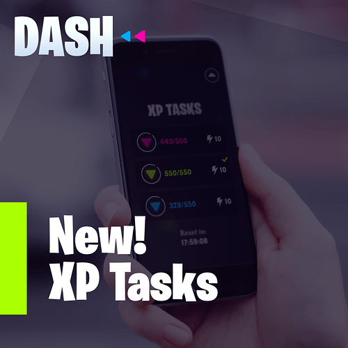
Introducing :zap: XP Tasks!

About XP Tasks:
You get 24 Hours to complete the tasks. You will get some extra XP for every task you complete.
Your XP Tasks’ progress will reset when the 24 Hours are over! :wink:

2 Likes

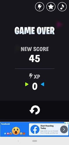
It’s fun! Two things:

No XP?! :frowning:

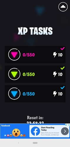
Ad covers the UI:

1 Like

Oops! Thank you so much for your feedback.

No XP?! :frowning:

You will only get XP if you completed the tasks. I did some changes to the save file but I don’t know why it is not saving your XP. Try clearing the game data and see if the issue still persist.

Ad covers the UI

I will fix this issue in the next release.

Ad covers the UI:

I have released a new update. This should fix the responsive issue. :grinning:

1 Like

Hi,

I have added my game to the community page.
Feel free to try it out: Community Project :wink:

1 Like

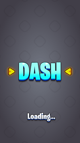
So I’m curently busy with a new look for Dash. Cartoonish and Simple at the same time.
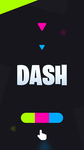
This is what I have so far for the loading screen.

Would still like to add more thing to the background so that it’s not that empty.:smile:

1 Like

Why not try a pattern? I find that “grounds” logos and punchy graphics well.

I was also thinking that a pattern could work. What do you think will work for a pattern?
Maybe a grid?

Your game, your pattern! Some inspiration:
https://www.google.com/search?q=seamless+pattern&client=ms-unknown&bih=757&biw=412&hl=en&tbm=isch&source=lnms&sa=X&ved=0ahUKEwjc94HErfHjAhV-UBUIHSeyB2wQ_AUIEigC

Could even have it scrolling slowly!

1 Like

Love the cartoonish look. Do let us know once you have an update out.

As for background, doesn’t the game already have some mild background patterns?

1 Like

Hi there,

I will definitely update the post once the update is released. I’m planning on changing the whole game from endless to level type.

As for background, doesn’t the game already have some mild background patterns?

That is basically just particles wondering off.

1 Like

Good idea on this. Just how the current hyper casual trend is. Gives the users a sense of accomplishment and progression.

Might be a personal thing, but I find this effect really nice. Gives the game world some depth.

1 Like

Yeah, also thought this looks great!

1 Like