I agree, sorry to hear this. Good luck!
@britzl, @selimanac thanks for kind wishes! It’s not so bad - from some angle of view losing job opens you new opportunities ![]() Anyway, I already have some offers + there will be a delay related to some bureaucracy before starting actually working in a new place, so I’ll have “legal” time to work on this game
Anyway, I already have some offers + there will be a delay related to some bureaucracy before starting actually working in a new place, so I’ll have “legal” time to work on this game ![]()
Added a new feature - “swoop down” by tap on the circle under the lever + made “Bouncy catapult” really bouncy ![]() Now gameplay is little more dynamic. Working on new bricks and materials currently.
Now gameplay is little more dynamic. Working on new bricks and materials currently.
You can check this new feature here - Bouncy Catapult King 1.3.10
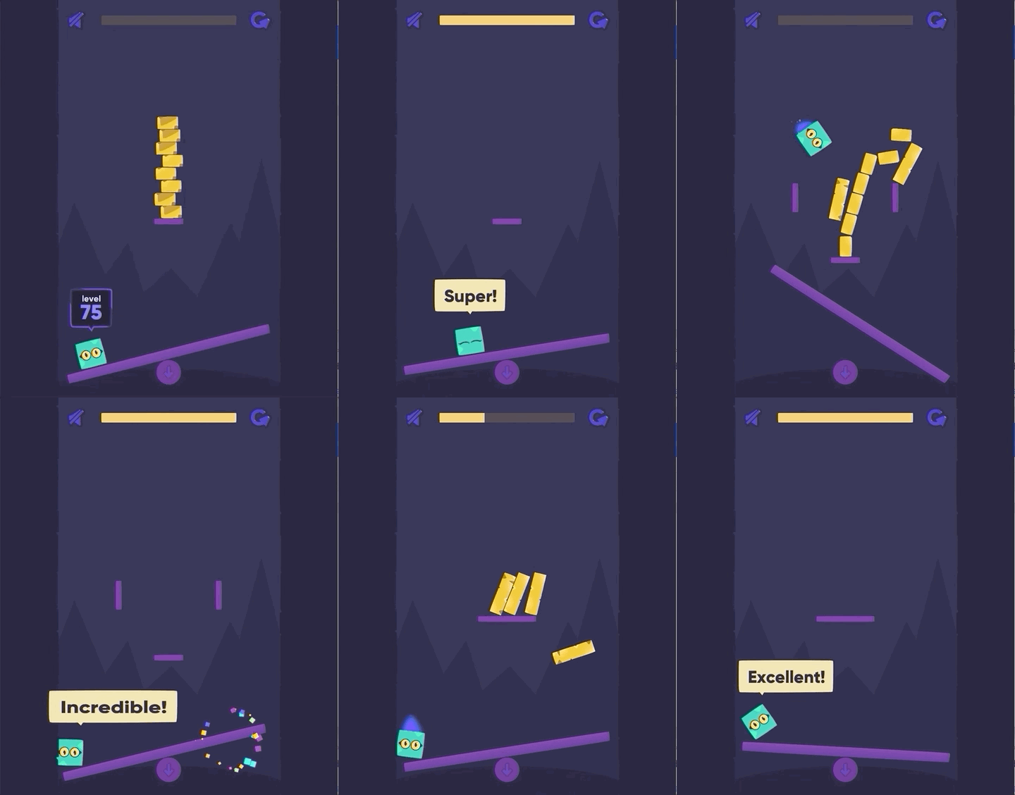
Great feature!
Looks great!
Another month passed - another update ready!
As always, you can check the HTML5 build here: Bouncy Catapult King 1.3.10
What’s new:
- New materials - stone and glass (or ice? how it feels?)
- New shapes of obstacles - circle, triangle, square
- 50 new levels + randomisation of level’s contents
- “Swoop down” feature
- More bounciness and dynamic in gameplay
- Level progress is shown right in the lever now! Diegetic UI, huh?
- Settings dialog
- Taptic engine support on iOS (check out my extention)
- Localization system! Currently only Russian and English supported, but more languages are on their way
- More damage from more powerful impacts (but unfortunately it’s not really sensible in the game)
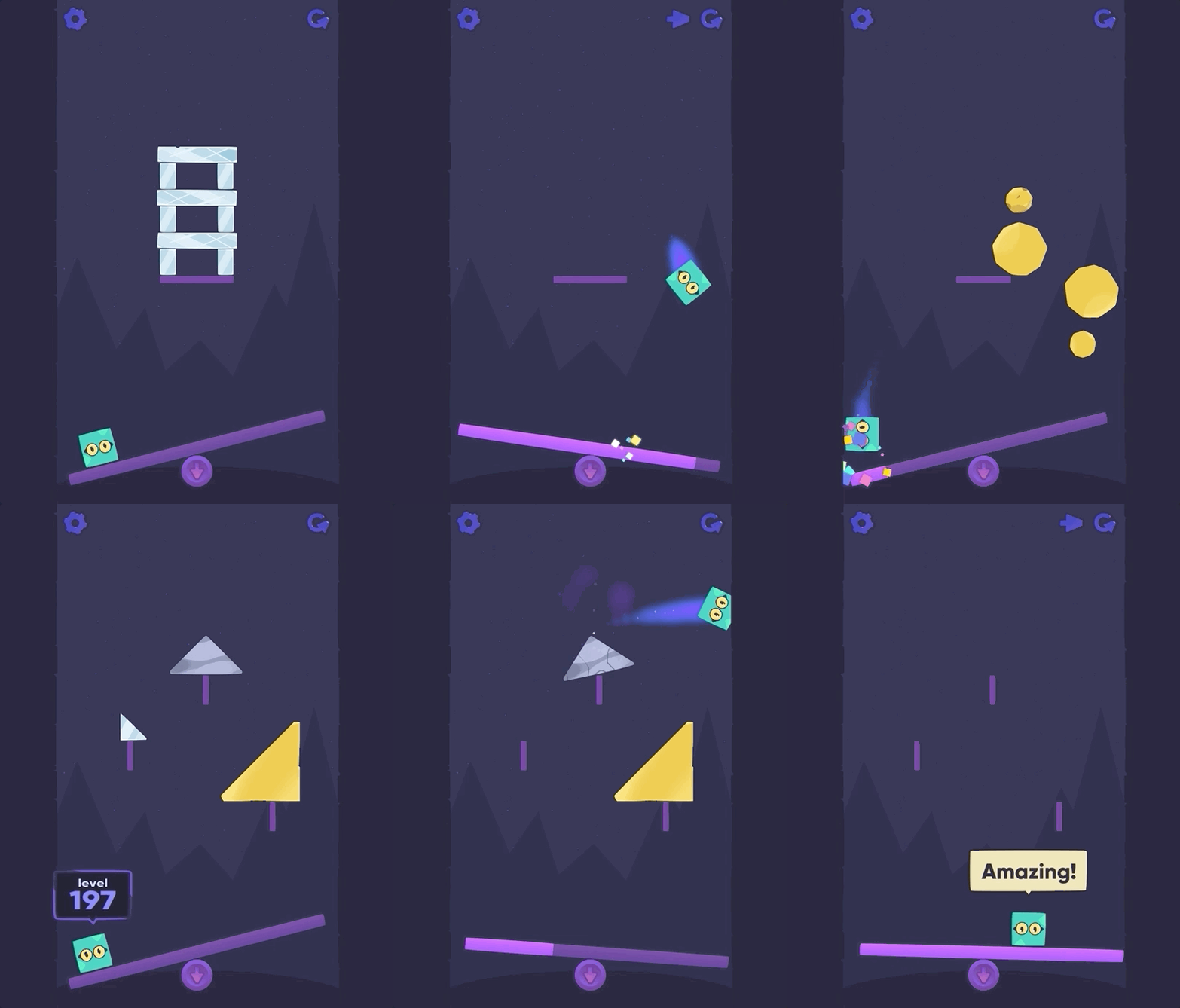
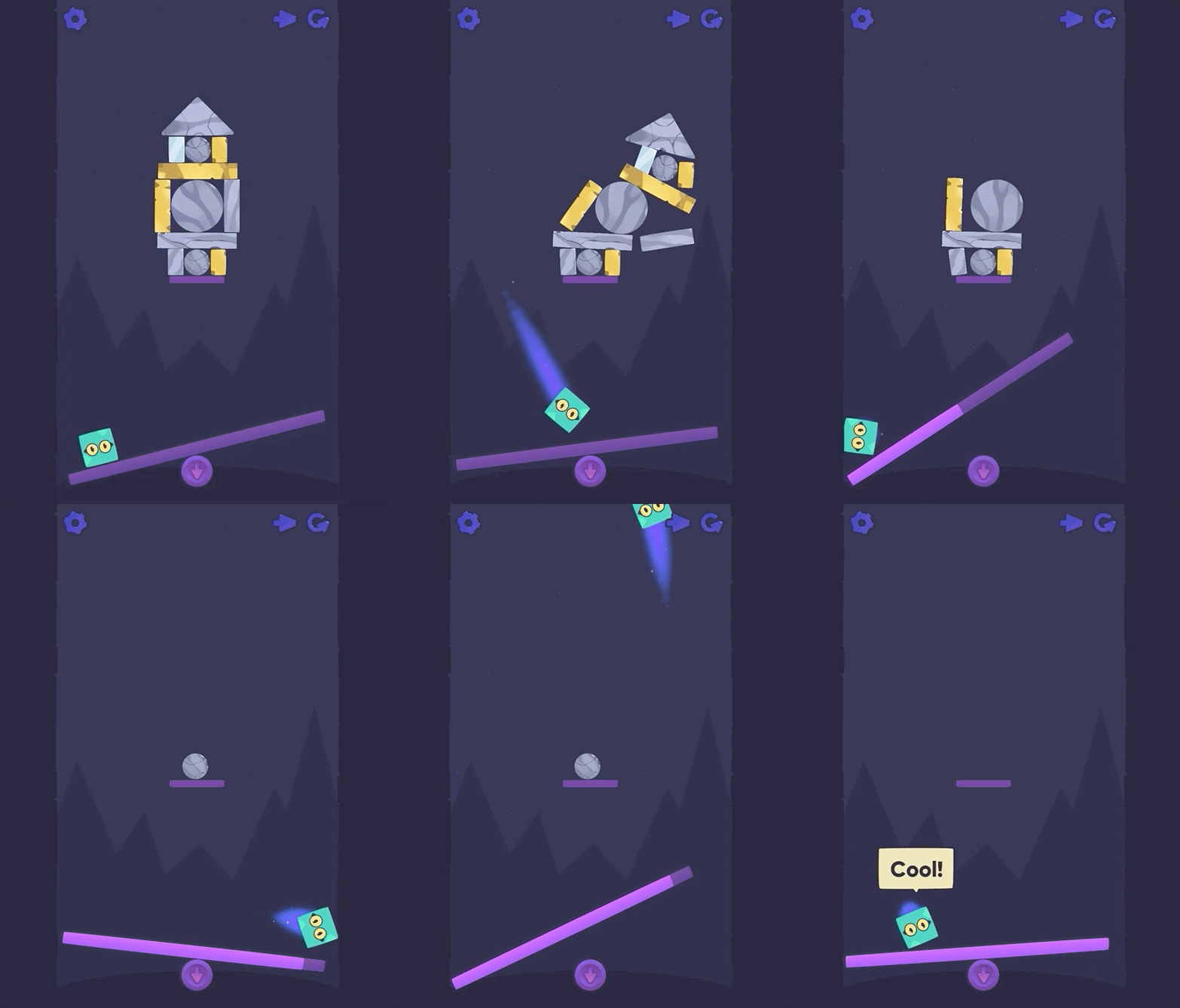
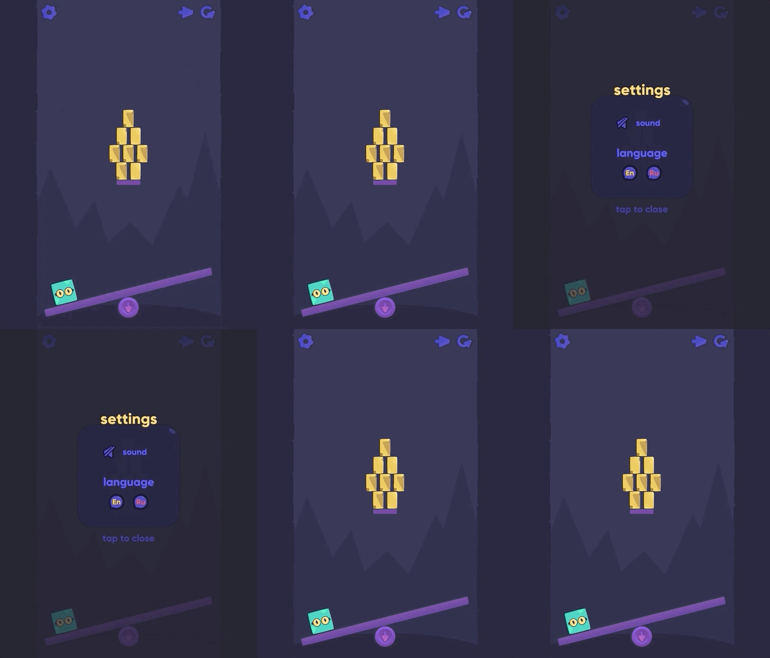

I think game is almost ready to be released as version 1.0, just thinking about adding new characters + some sort of coins/crystals to be collected on levels to unlock new characters for these coins, or release the game as is and add such characters and coins in the update…
I think the music is a little bit dissonant with the regular sound effects. Some nature ambiance might be better? Or at least lower music volume vs game volume some.
Might be better to start the player off with harder layouts sooner sprinkled in between easier ones.
How about adding some Angry Birds like antagonist characters to destroy?
You could apply some squash / stretch bounce to the character when bouncing, make the effect stronger the harder the impact. You can do this by animating the x and y scales slightly separately.
Character could make a happy face on victory so like ^ ^
Character could also make cute sounds
Add a hard mode where you have to beat levels within x number of inputs? Or have challenge levels inbetween others which require certain number of inputs to clear.
Hmm, it’s the first feedback about music style/volume, I’ll think about it. I hear this “jingle” dozens times everyday so I can’t adequately judge it now ![]()
The initial idea was to create a hyper-casual game and I’m trying to stick to this concept and do not overcomplicate gameplay and levels. And I want the game to be “forgiving” - it’s like a sandbox, game does not punish you, difficulty does not rise dramatically etc. If you return to game after some time you know exactly what to expect etc.
This will affect level-design dramatically, not sure about it. Plus a lot of work inventing such enemies themselves, it might be a bad idea on the current state and cause “infinite development” cycle. I’ll keep this idea for “Bouncy Catapult 2” ![]()
I thought about it, but there is a problem - character is spinning randomly so it’s hard to squash it in the right direction. Maybe put it into special container and rotate inner content but scale the parent container (which will always be oriented as it was initially), but I’m not sure how this will work with the physics (can I interact with collision object in inner container without affecting the parent? I guess I can’t). So just skipped this for now. Do think this might work?
Yes, different emotions are in the todo-list. And good hint about sounds, have not thought about it before.
Anyway, many thanks for the feedback, really appreciate it! ![]()
Hmmm… Maybe make invisible GO with collision object and sync another GO containing graphics with coordinates and rotation of this cillision object?.. Then I can have whatever hierarcy I want in this second GO and squash container in the needed direction… But not sure if this can cause some issues with synchronisation or performance
Yes, you could have a secondary child object which you squash / stretch where the sprite is. The physics collisions should provide you enough information to apply the animations so they look right. Test some simple thing and see how it looks.
My theory about casual games is that you obviously don’t want people to rage quit, but you still sometimes want challenge - or at least an illusion of challenge. “Hyper-casual” is kind of the wrong name, a ton of those “hyper-casual” games that get popular are super hard and unforgiving!
You could track real world time away from the game and if it’s took long force their current / next levels to be easy.
Overall your game is releasable now if you do not want to invest too much more. I think some levels were tricky enough to be called challenging they just come relatively later on. The hyper-casual market is way too challenging and brutally data driven itself for me personally to consider developing for so remember to not have your expectations too high, remember that you’ve most likely learned a ton and improve on skills that will help you with your next game! ![]()
To be honest I don’t have any expectations from this game at the moment. It was started as a project for gamejam to try Defold and maybe - make a good game, able to compete on hypercasual market. First goal was 100% reached, the second only by 50%. The game itself is quite good, I like it, my friends like it and from ~9000 installs during UA experiments it has shown promising retention rates (d1 45-50%) and session length (300 seconds+), but all UA tests (my own and by two HC publishers) gave unacceptable install costs. This game is not “marketable” in terms of normal hypercasual games distribution model.
The only hope now is featuring or organic growth. First one is possible (I already have some experience of being featured on Appstore), the second - it’s kinda meeting a unicorn ![]() Also I’d like it to be a well polished game I can point to in my portfolio, not just a prototype, that’s why I keep pushing it.
Also I’d like it to be a well polished game I can point to in my portfolio, not just a prototype, that’s why I keep pushing it.
So, I’m aware of the cruel market, it’s not my first released game and I don’t have high expectations. But thanks for taking care, I’d say the same for other developers with “shining eyes”
A small update:
- localization to 14 languages
- separate sounds for glass and marble bricks + sound for “dive down” effect!
Play here: Bouncy Catapult King 1.3.10
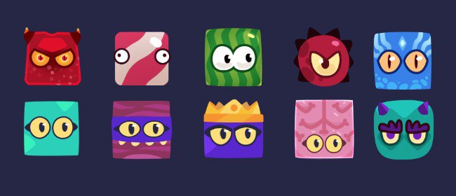
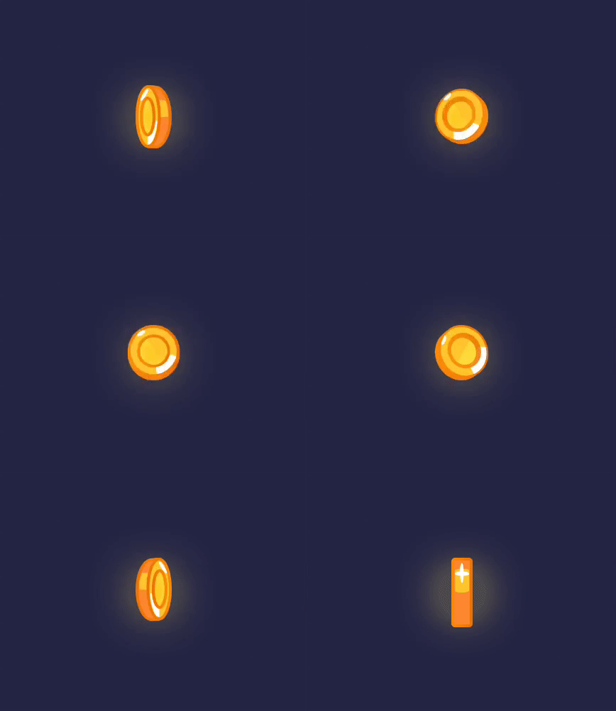
Currently working on new characters and some coins you’ll need to collect on the level and use to unlock such characters:
The Game is released world-wide on iOS now!
https://apps.apple.com/us/app/bouncy-catapult/id1450757809
Yes, it’s paid, don’t ask, it’s part of the Plan ![]()
But here are few promo codes for those who wanna try it. Enjoy!
(and put a comment if you used one of the codes, please)
- used
- HEF3TLW46L9T
- used
- KMX37WLFW64Y
- AAL4MPN46H4Y
- M6TJRMWX74KL
- JEE7TXREYTFR
- 9N9WRYJM947Y
- RMALM44HMPPJ
- used
P.S. it is actually a month ago version, so nothing really new there in comparison with the HTML5 build I’ve posted earlier.
I used code 3. Really looking forward to playing it!
237 Ratings
Woah! Congrats!
I used code 10. Looks great and works like a charm. Only problem is; It is not filling/fit the entire iPad screen.
Thanks @selimanac ! I don’t have an iPad, can you show how it looks there? In theory on more „square” screens there should be „walls” on the left and right sides of the screen.
It works this way because the game is based on physics and bouncing from walls is important part of the gameplay so I can’t change levels proportions and only can move the ceiling and keep the rest parts in the same proportions, and initial target proportions aim phones screens.
He-he, ratings are from the period when I was doing paid UA experiments on the free version of the game ![]() So it’s not exactly what it looks (there are no 237*X purchases of the paid version), but I hope others will have the same positive reaction while viewing the store page
So it’s not exactly what it looks (there are no 237*X purchases of the paid version), but I hope others will have the same positive reaction while viewing the store page
Screenshot is below. Maybe you can place the visible walls on the sides. Their heights can be half of the screen height or maybe less. Also you can fit the background color/image to the screen. Lazy solution but at least maybe gives a better feeling.
And also you can send me the testflight invitation if you want me to test it on ipad again.

