Great to hear man, well deserved!
3 Likes
Thank you baturinsky, but I don’t agree with you. maybe with game mechanics yes, but not with the game design.
One huge drawback is that I didn’t solve the problem of first 15 seconds and first 3 minutes in the game. so even if people make FULL 9 dots tile in the game they didn’t see the goal (why they need to continue doing that). and it’s a gamedesign issue. this is what I’m working on right now, and hope in week or 2 I’ll solve this issue.
Sims like this issue is the same complexity as to invent a new mechanics. so if someone has any ideas how to improve player experience in first minute I’ll be happy to hear that.
My thoughts are at least
- separate items which match with each others by shapes or colors
- recreate interface with huge level progress bar and create several tutorials levels where player need to learn how to make double tiles, and which tiles doesn’t match.
- Add leader board (maybe not on this, but for next version for sure)
5 Likes
I spent more than one week on following design. Tried to make it nice.
What you guys think if new version will looks like this
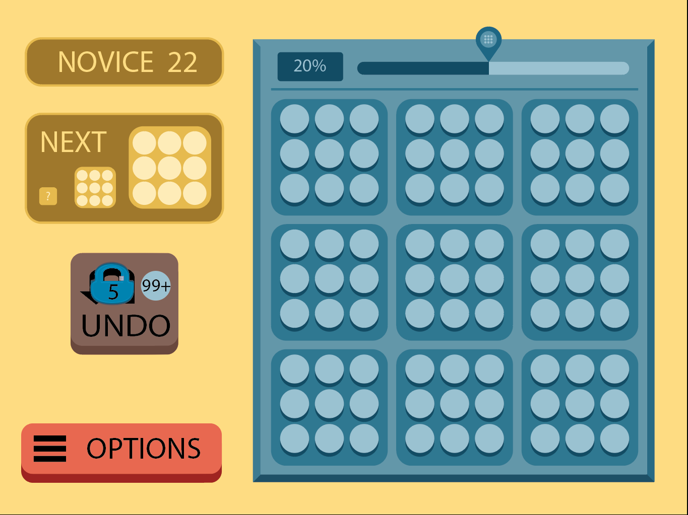
I’ll be happy to hear any comments.
thx.
1 Like
I personally prefer the “flat” design of the original game. This new design mixes beveled round and square boxes and I’m not sure I like it. The small shadows on the pips are nice though.
1 Like
agree. that beveled was mistake. actually just seated with my wife and we changed some stuff.
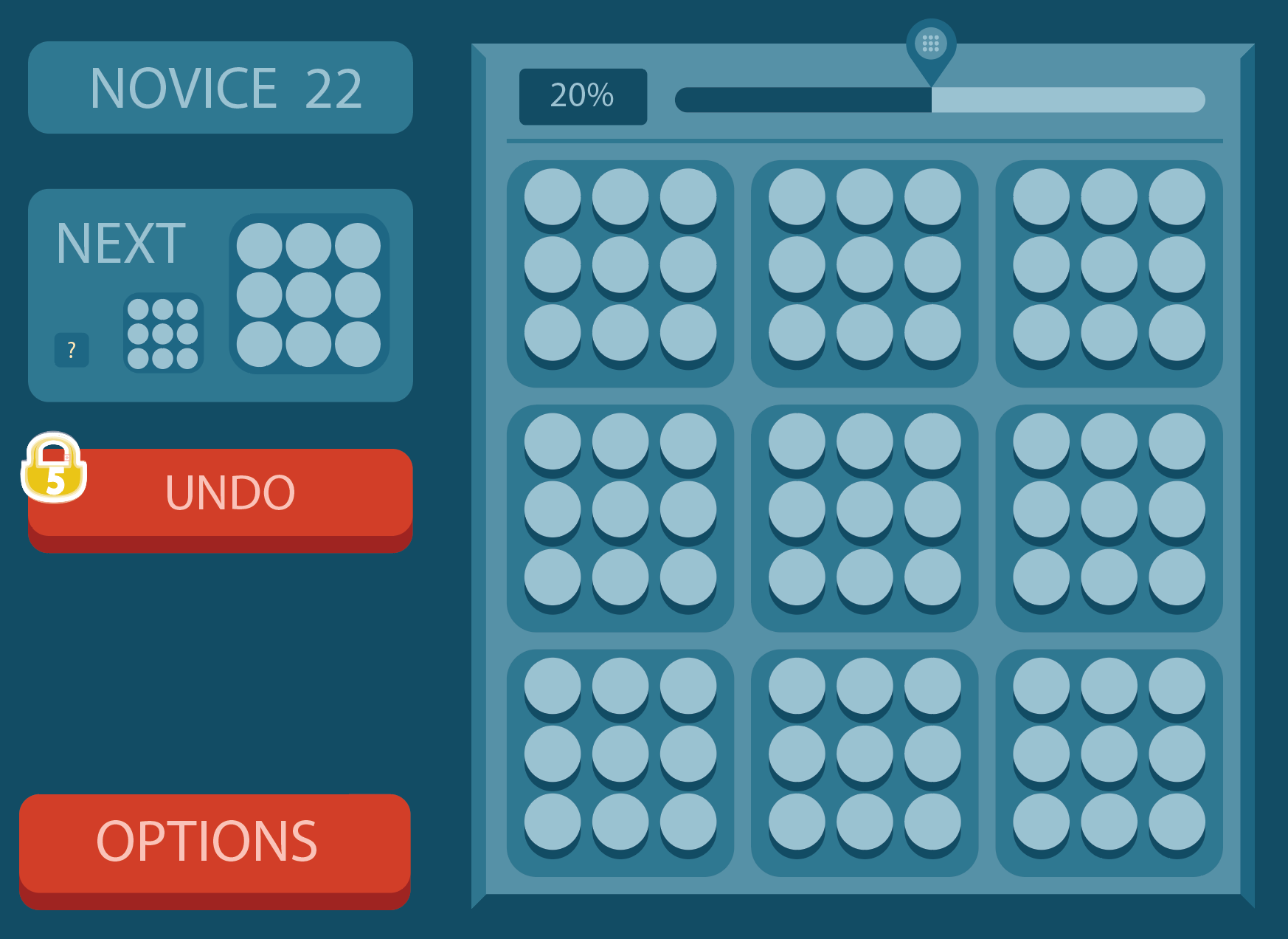
I hope it’s much close to flat design
1 Like
If the dark crescent under each dot is a shadow, and the board is seen from above, then the dots are not in the center of the square. This bothers me.
1 Like
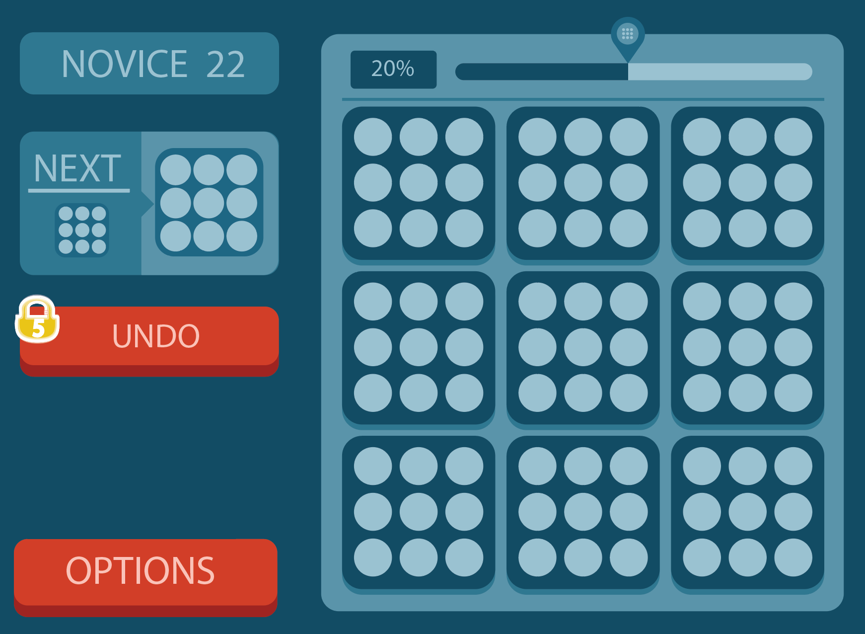
Better. Fewer colors and the boxes on the left have the same width!
Something that bugs me a bit though is that the board background feels like it has one perspective where I’m looking at it from directly above and I can see all four of the beveled edges, while the OPTIONS and UNDO button has another perspective where I look at those from above but “from an angle” so to speak.
1 Like
And as @jakob.pogulis said, the shadows under the dots and the board as seen from above doesn’t feel quite right.
1 Like
@jakob.pogulis yeah. this happens because previous screenshot was with cleared field. below one contains uncleared board. So dot’s has the same shadow offset and the same color as uncleared field. Some visual hack to make it works for cleared and uncleared field without any transitions from state to state.
I also removed 3d from the board.
8 Likes
Today i finished several new animations on the board. and then tried to record video using OBS which gave me wrong colors. and then i remembered about internal start_record and stop_record functions. and here you are, just 1 minute of coding, 1 for recording and one for uploading it to the youtube.
Hope you like it.
As usual if you know how to enhance these animations (i use just twins) let me know. With all of your advice and comments i’m doing this game much better.
Thanks.
9 Likes
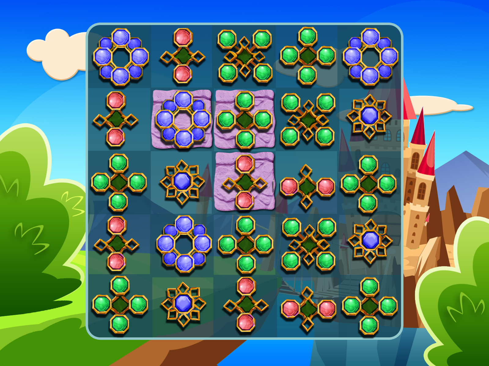
in this quick update, I just want to let everyone know that i didn’t give up this project. And moreover one cool artist joined me so right now i don’t need to think to much about graphic style. And this is really cool
here is one of the latest sketches.
8 Likes
Wow! I really liked the old minimalistic style but I think this new style might work really well too. The new style gives better visual clues as to which blocks to combine.
3 Likes
Same! I am normally fond of minimalistic functional design, but this new jewellery princesses and dragons style just makes so much sense somehow.
2 Likes
hope this animation will fit final sprites

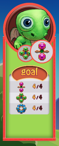
we are also planing to make almost 20 unique levels in a new game

upd1: just received first sprite pack. and sims animation is ok
https://forum.defold.com:/uploads/default/original/2X/2/221e10e10c49c402da4bcdb6a932a6a090eb71ed.mov
9 Likes
Super shiny! Maybe color code the tile backgrounds too while game pieces are on them so it’s that much clearer what pieces can be matched?
5 Likes
You right.
We are still working on this. Actually the whole board background element is missed there. I’ll show board update when it will ready. All dices must be well recognizable on the board.
Also. i fixed material setup so it won’t be blurry.
2 Likes
guys. do you have a good references in games how i can enhance tutorial steps.
I’m doing right now as on the video below, but just not sure is it ok or not. Can i just change some sprites and timing or maybe there is a better choice.
Maybe don’t show formula but play merge animation on gui layer as well ?
3 Likes
I think you should have a look at how Blossom Blast does their tutorials, personally I think they’re really good. Maybe @FredrikMalmer have something to add on the topic of tutorials?
3 Likes
I’ve seen blossom saga tutorial and it sims very similar what i do. actually candy crash and another king games is my references number 1, because i understand that their tutorial pass many AB tests which i can’t perform. and easiest just to trust some existing solutions.
By the way. Today I finished one gui script which handle tutorial steps and here is a first 3 steps from the first level. I think a bit later i’ll write short video with architecture overview of this “tutorial” solution because it was not so hard, and i’m pretty satisfied with this result
actually i added info about how I made this info in another thread you can find it here Is this possible to make gui_script parameter?
5 Likes