Thanks britzl 
#11: Organization
Well, I did. I also reorganized all the surviving items on my todo list in a way which has helped a lot with picking this project back up. I figured I’d talk a bit about that.
Design notes and task tracking
Way back when this was a game jam game I just had the whole thing in my head, then as I continued to work on it I maintained an increasingly elaborate .txt file full of notes, TODOs and finished tasks. At some point I admitted defeat and set up a proper task tracking kanban board on Trello. I’d used Trello for a few small projects at university and it was fine. I didn’t particularly like it, but it got the job done.
One major frustration I had at the time was design notes. Early on when I was working on the puzzle mechanics and level designs there were a lot of complex design problems to solve and I would often write long design documents for myself, laying out what the issue was and how I might go about solving it. These did not fill well at all on Trello, and I didn’t really know where to put them.
Around that time the developers of Ooblets wrote an article about how they use Notion. I tried it out, liked it immensely, and have since moved a lot of notes and documents over to it for various projects, including this one.
Notion has a really interesting ‘block-based’ editing style which I find works very well. A block could be a paragraph of text, an image, a table, some code, a bullet point, a checkbox, etc. A page is a collection of blocks, and blocks can easily be converted to other types. For example you might write a paragraph of text, then split it into separate sentences and make each one a checklist block; now you have a todo list.
Notion is available online, as a desktop app and as a mobile app. It’s free at the scale I’m using it, including collaborating with Andrew (he can access and make edits in the workspace). I’m not sponsored or anything, I just find it refreshingly good.
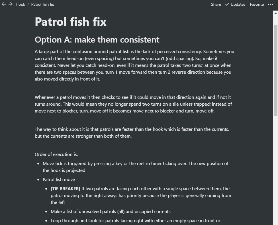
For example here is part of a design document I wrote when I was trying to solve the confusion playtesters felt around the moving patrol fish. Each heading, paragraph and bullet point is a block, and as I was writing them it was easy to rearrange the blocks, convert them, indent them, add new ones and delete others:
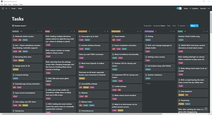
This document is a page within the workspace. This solved my design documents issue, but I didn’t want to be split between different solutions. Thankfully Notion also has kanban-board functionality, and I was even able to import my existing tickets from Trello. Several years later and after my big recent reorganization, this is what the board currently looks like:
You can see from the icons at the top right that Andrew also has access to this page, and I include his name on his tickets so he can search for them (you can assign tickets to members, but 95% of tickets would be assigned to me, so I don’t bother).
I created 6 columns: shelved, bugs, long term, short term, in progress and done. I also created 5 labels: code, art, design, audio and admin. I chose some colors that I liked. This way of organizing the tickets has helped a lot in reducing the noise and mental workload when I decide to sit down and work on something. There are a lot of things I need to do at some point but which it’s unhelpful to worry about now. By splitting my list into short term tasks and long term tasks I can still track everything and add notes and todos when I need to, but I can mentally put it all to one side and focus on what I need to do right now to make progress.
I also grouped lots of related small tasks into big single tickets with detailed checklists. This stops the board from having an overwhelming number of tasks on it, and it lets me get a lot of progress done in one area at a time as I rebuild familiarity with it. Andrew and I drag a ticket to the in progress column while we’re working on it, and to the top of the done column when it’s finished; this helps with communication and planning, and it also just feels good. Moving a ticket to done is a nice reward.
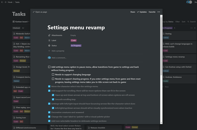
Each ticket is itself a separate page. They can be viewed as an overlay for quick edits, or expanded to their full form. Again I find the block-based editing works really well here; I can interleave paragraphs, checklists and images as and when I need to. As an example here is the main ticket I’m currently working on:
Cut features
As you can see from the number of tickets in each column, I cut about as much work as I’ve already done. Talk about feature creep! The biggest and most painful thing to cut was the flowing water. I spoke a little about this mechanic in devlog #08: (Work)flow: art. Flowing water took several months of work because there were extremely complex design problems to solve and it required massive tech rewrites; the gameplay was changing from ‘each movement tick, the hook can cause one interaction to occur’ to ‘each movement tick, the hook and every flowing water tile can cause one or more possibly-conflicting interactions to occur within a series of multidirectional dependency chains spread throughout the level’. It’s probably the most complex problem I’ve solved so far in 4 years as a professional game programmer.
The kicker was, it wasn’t fun. Turns out this was very much a “so preoccupied with whether or not they could, they didn’t stop to think if they should” kind of scenario. What I should have done was hacked in some debug functionality that allowed me to move around creatures manually, so that I could simulate the flowing water mechanic by hand and see if I could make some interesting puzzles with it. Even a paper prototype may have helped.
I’m sure many interesting puzzle games have and will be made using mechanics similar to the flowing water, but it just doesn’t fit with this game’s existing mechanics. The player movement, the basis of all the puzzles, is centred around working out what path to take and when. Every step matters, but flowing water forces the player along a specific path. The design constraints which make most of the levels work now conspire against the flowing water. With only a limited number of steps before having to reel in, the inability to cross your own line, and the very small play area in each level, there simply wasn’t enough space to make when and where you enter a flow be an interesting decision. Try as I might I was only able to design levels where the flows were inconsequential, obvious or tedious.
The main impetus for creating the flowing water mechanic in the first place was to increase the level count from 30 to 50 without beginning to recycle ideas. After a year’s hiatus I was able to come back to the game with fresh eyes and realize I really didn’t need more levels. I am happy with 30 levels, and with the mechanics and ideas they present.
Not everything in the shelved column is necessarily gone forever. For example I’d love to release the game on Switch, itch and Steam. But that is longer than long term; the goal is to finish the game and release it on Android and iOS. Anything else is just a distraction not yet worth thinking about.
Many of the other cut features were ideas for mechanics, twists or app features. Everything that remains is focused on polishing what is already there, because I no longer feel it isn’t enough. In fact I think it’s pretty good.
What’s next
I’m really enjoying working on this hobby project again now that the scope is contained and I have a solid grasp on what work remains and what quality bar I’m aiming for. I previously felt an immense pressure when working on the game which has since dissipated over the hiatus. It’s very chill now; I just chip away at it when I feel like it. My free time is my own, and it is equally OK whether or not I choose to spend it working on this game. I have no release date whatsoever in mind, and I’m going to keep it that way for as long as possible. I just want to enjoy the remainder of the ride.
That said, I’m keeping the details of those tickets in the screenshot to myself for now, and a few of the juicier tickets just so happen to have been cropped out of the image  . I’m sure I’ll be writing devlogs about them in due time.
You can follow me on Twitter @rhythm_lynx
Such a sweet and neat game with such a big and cozy story. Thanks for this devlog!
#12: Localizing a low resolution pixel art game
Languages
This game supports 12 languages: English, French, Italian, Spanish, German, Brazilian Portuguese, Russian, Japanese, Simplified Chinese, Traditional Chinese, Korean, and Arabic. I only know English. The game has a resolution of 128x128 pixels. I chose this set of languages because it has very broad coverage and includes some interesting learning opportunities.
The European languages are fairly easy because they use the same Latin alphabet as English so I can tell what is legible and can actually read the text to quickly spot mistakes. Russian is an interesting twist because it uses the Cyrillic alphabet but the font and word sizes are about the same so the layout still doesn’t change much, and many of the glyphs are still recognizable to me. The Asian languages were totally alien to me; glyphs, spacing, font size, the density and length of text. I knew these would be difficult because some glyphs are very densely detailed, meaning the minimum number of pixels needed to keep things legible is considerably higher compared to the Latin languages. Arabic is not only a different alphabet, it has the additional complications that its glyphs look different based on their neighbours, and that it runs from right-to-left instead of left-to-right.
I knew that there were two variants of Chinese, Simplified and Traditional, and that it’s a good idea to support both if you’re supporting either. I didn’t know that there are multiple variants of Traditional Chinese. The translators recommended the Taiwan variant because the population is much larger and readers of other Traditional Chinese variants can read the Taiwan variant.
Changing the name
The name of the game has changed. The game jam prototype will remain “Hook, Line and Thinker” but the full game is now titled “Curious Fishing”.
There were a couple of reasons for this. The old name is very long and awkwardly includes a comma. People usually misremembered it as the phrase it’s a pun of, “hook, line and sinker”. That base phrase is also not particularly something I want to invoke because it generally refers to someone being tricked or conned. The title being a long pun also made it completely untranslatable, meaning there either had to be a different name per language or a secondary name that all non-English languages used. I would much rather have a single name used in all languages.
What I liked about the name “Hook, Line and Thinker” is that it perfectly describes the game; you, the thinker, move your hook on a line to solve puzzles. But it was too unwieldy. I really like the new name “Curious Fishing”. It’s short, unique, memorable and ties into the gameplay. “Fishing” describes the core mechanic and context of the gameplay, while “Curious” is both an adjective suggesting something unusual about the fishing, as well as a prescriptive verb for how the player will feel, for what they will do.
Once I decided to change the name, I had to find a new one. It needed to be something that wasn’t already in use, for example my first choice was to simply shorten the name to Hook, but there is already a somewhat recent puzzle game named Hook. Here is a selection of some other name ideas; I kept tossing ideas into a huge list whenever I thought of new ones, until something eventually stood out.
I actually came up with the name Curious Fishing in *checks notes* 2019 (fuck) but I wanted to confirm that it translated well before publicly committing to the change, and I knew the final translation pass would be done near the end of the project once all the English text was locked in.
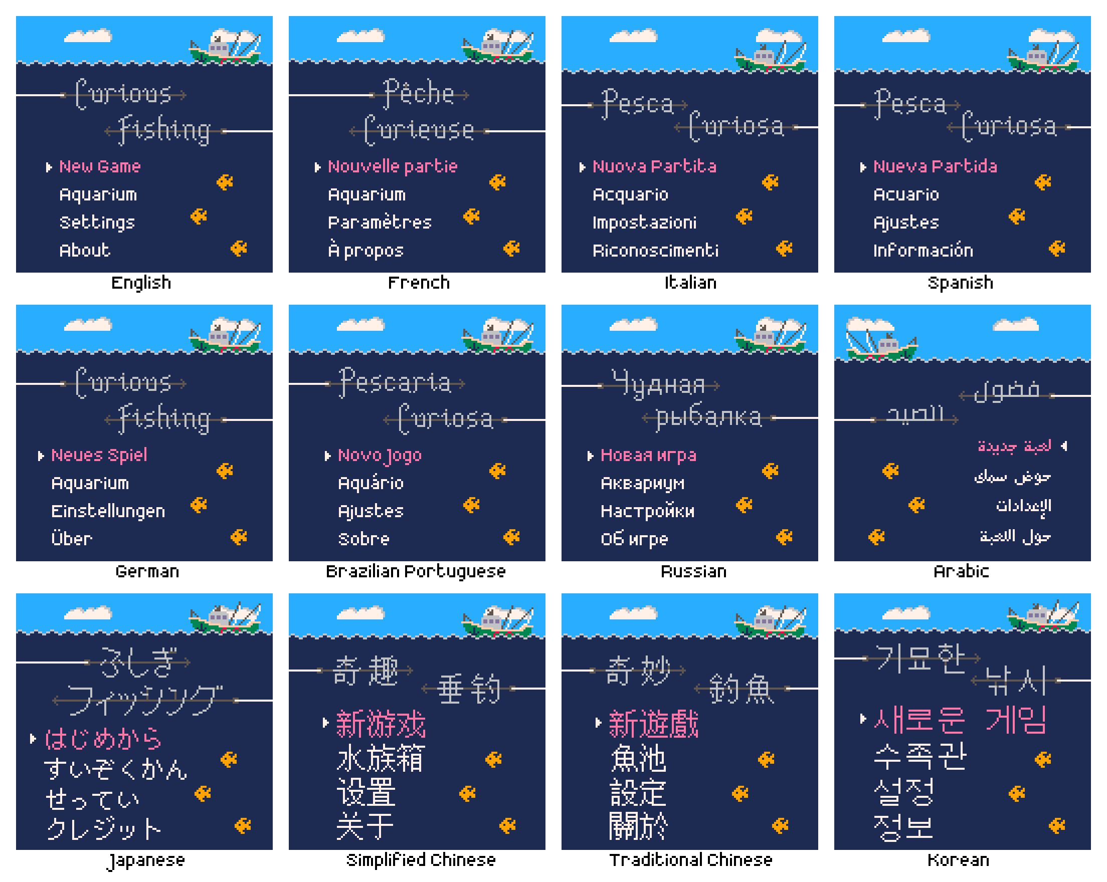
Here is the name of the game in each language. German uses the English title, on the recommendation of the translator (this is apparently standard practice).
As I had hoped, “Curious Fishing” was easily translatable to each language, both the phrase and the concepts it conveys. I asked the translators what the literal meaning of each title was, roughly:
| Language | Title | Literal meaning |
|---|---|---|
| English | Curious Fishing | Curious Fishing |
| French | Pêche Curieuse | Literal translation of “Curious Fishing” |
| Italian | Pesca Curiosa | Literal translation of “Curious Fishing” |
| Spanish | Pesca Curiosa | Literal translation of “Curious Fishing” |
| German | Curious Fishing | This is the English title |
| Brazilian Portuguese | Pescaria Curiosa | Literal translation of “Curious Fishing” |
| Russian | Чудная рыбалка | The name is a wordplay as it can be read in two ways. The first meaning is “Wonderful/Amazing Fishing”, the other one is “Funny/Curious/Wacky Fishing” |
| Japanese | ふしぎフィッシング | The literal meaning is roughly “Mysterious Fishing” but can also be interpreted as “Curious Fishing” |
| Simplified Chinese | 奇趣垂钓 | The literal meaning is roughly “Interesting and amazing fishing” |
| Traditional Chinese | 奇妙釣魚 | The literal meaning is roughly “Marvellous fishing” |
| Korean | 기묘한 낚시 | The literal meaning is roughly “Curious Fishing” |
| Arabic | فضول الصيد | The literal meaning is roughly “The inner passion and love of fishing” |
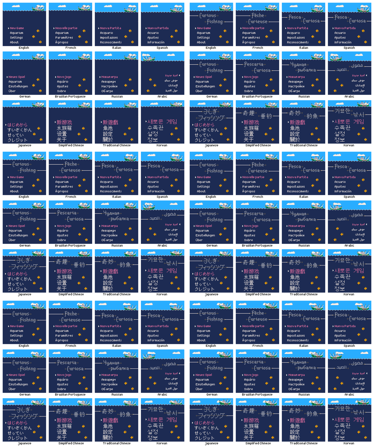
For most text I could use existing fonts made by native speakers, trusting in their legibility at low resolution. For the title logos however I had to draw them by hand, in a larger size stylised to look like two fishing hooks coming in from opposite sides of the screen. For the Latin languages this was fairly easy because I could be confident that the glyphs I drew had the intended meaning. For the other alphabets I used the main text font as well as the language filter and preview text in Google Fonts to see the title text in a variety of styles. This provided a reference that I could use to get a feel for what the most important characteristics of each glyph were. If you speak one of these languages, let me know how I did! The most important thing is that the title logo is legible in each language; ideally it also looks a little spiky, a little like a fishing hook.
The clouds and creatures are usually randomised, but I used a fixed seed here so it was the same in each language. You can see that I had to adjust the height of the waves and boat to fit the larger text for some languages such as Korean.
Content
Besides the title, what text was there to translate? In the final translation pass there were 112 strings totalling 508 words in English. There is no narrative and where possible the game presents information visually to minimize the word count. Here’s an interesting comparison:
Because each glyph conveys more individual meaning, the Asian logographic languages require far fewer glyphs to present the same amount of information, although they require larger glyphs as a result (felt keenly at such a low resolution). German is famously verbose and meets that expectation here, but surprisingly Spanish has the longest text overall.
Of the 112 translated strings, only 32 are actually in use in the game, amounting to just 51 English words, 10% of the English word count. Some of the unused text is future-proofing for features I may want to add in the future, for example achievement names and descriptions in case I ever release the game on a storefront that supports or requires them. The remainder is meta-text such as the store page description.
Implementation
Fonts
The text rendering is not done using fonts, or at least not at runtime. Each string in each language is baked into a sprite and the game displays those at runtime instead. There are two reasons for this. One is that it avoids having to use Defold’s UI text rendering system; by having everything go through sprites I’m able to leverage the work detailed in devlog #5 for pixel-perfect sprite scaling. The second reason is that the size of the font files is larger than the entire rest of the game, so loading them for runtime use would more than double the size. According to the build report the game is around ~5.4 MiB, ~5 MiB of which is audio. The total size of the four fonts on disk is ~7 MiB, mostly due to the Asian logographic languages since they contain thousands of glyphs.
| Language | Font |
|---|---|
| English | Crazy Pixel |
| French | Crazy Pixel |
| Italian | Crazy Pixel |
| German | Crazy Pixel |
| Spanish | Crazy Pixel |
| Brazilian Portuguese | Crazy Pixel |
| Russian | Crazy Pixel |
| Japanese | PixelMplus |
| Simplified Chinese | Wen Quan Yi Bitmap Song |
| Traditional Chinese | Wen Quan Yi Bitmap Song |
| Korean | Wen Quan Yi Bitmap Song |
| Arabic | Arapix |
I’m using the Crazy Pixel font for all the European languages, a font I really like and find very clean. I installed Crazy Pixel on my machine and would copy+paste the translated strings directly into the text tool of an image editor, crop each to even dimensions then save it out as a .png. All the individual text sprites are recombined in Defold into a single texture atlas.
For the other fonts it was difficult to get them to render at the base resolution and without any aliasing. I ended up opening each font in FontForge, using the metrics window as a preview, then screenshotting that and scaling it down to the base resolution. This manual sprite baking process was time consuming and would start to hurt my wrists if I did too many in a sitting, but over time all the text was baked. If there were significantly more text in the game it would have been worthwhile to create a tool that took the fonts and strings and baked them out for me, but I’m getting better at recognising when to not over-engineer things and just keep it simple when appropriate.
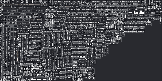
After baking, each string in each language is now an individual sprite, all of which are then grouped together into a single 1024x512 text sprite atlas in Defold. This also includes the hand-drawn title logo in each language. Here is a preview of the text sprite atlas, some text looks a bit weird due to sprite border extrusion in the atlas, which reduces artifacting at runtime.
Layout
The naming convention for the text sprites uses the ISO language code as a prefix to a descriptive name, for example EN-MainMenu-NewGame, FR-MainMenu-NewGame etc. There are 6 main screens in the game: title (main menu), level select, gameplay, aquarium, settings and about. Each of these screens has a manager script which among other things will adapt the screen’s layout to match the current language (except the aquarium which contains no text). For example the title screen will send a play_animation message to the sprite representing the “New Game” text, telling it to play the MainMenu-NewGame sprite with the current language’s code as a prefix.
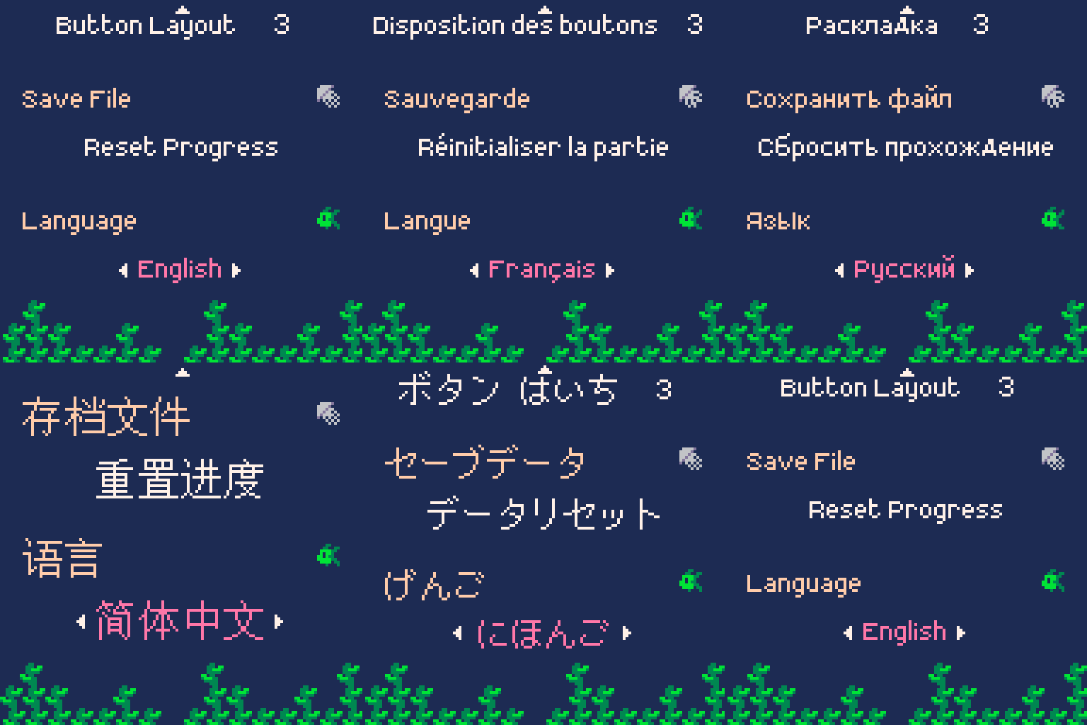
Some screens like the settings and about screen (containing the credits) are programmatically laid out at runtime, using different parameters for each language. Others like the gameplay and level select are manually laid out, with only certain elements being repositioned based on the language. In devlog #4 Bootstrapping, menu transitions and level loading I said that for some screens there was a different collection for each language, such as settings_english.collection, settings_french.collection etc. Back then I was manually laying out the text, but eventually I found it much better to have a single collection per screen and to assign the sprites and adjust the layout in code.
I found that every individual sprite had to have even dimensions to avoid artifacting, so for example if a text sprite was 39 pixels wide I would add a transparent column of padding pixels and bake it out at 40 pixels wide. To make things easier to align, all sprites for a particular language have the same height, meaning additional padding rows, and again ensuring an even height. Without padding and border extrusion the text sprite atlas would be even smaller.
In some cases it was necessary to know how wide a text sprite was in order to position something adjacent to it, or to accurately position it relative to something else. I needed to know the width to update the layout, but in that same function was where the text sprites were assigned to match the current language. I found that after setting a sprite with a play_animation message, trying to read the size of the sprite with go.get("#sprite", "size") would still report the size of the previous sprite. There didn’t seem to be a way to get the width of the sprite in the same frame as setting it, because the animation_done callback message would occur on the next frame, meaning 1 visible frame where the layout was wrong. This feels like a very basic operation and was quite frustrating. In the end I resorted to the stupid, simple solution of a function like this:
function get_text_sprite_width(lang, sprite_id)
	if sprite_id == "MainMenu-About" then
		if lang == LANG_ENGLISH then		return 26	end
		if lang == LANG_SPANISH then		return 50	end
		if lang == LANG_FRENCH then			return 38	end
		if lang == LANG_GERMAN then			return 20	end
		if lang == LANG_ITALIAN then		return 62	end
		if lang == LANG_RUSSIAN then		return 34	end
		if lang == LANG_ARABIC then			return 36	end
		if lang == LANG_CHI_SIMP then		return 28	end
		if lang == LANG_CHI_TRAD then		return 30	end
		if lang == LANG_KOREAN then			return 30	end
		if lang == LANG_JAPANESE then		return 58	end
		if lang == LANG_BRAZ_PORT then		return 26	end

	elseif sprite_id == "MainMenu-Aquarium" then
		if lang == LANG_ENGLISH then		return 38	end
		if lang == LANG_SPANISH then		return 32	end
		if lang == LANG_FRENCH then			return 38	end
		if lang == LANG_GERMAN then			return 38	end
		if lang == LANG_ITALIAN then		return 38	end
		if lang == LANG_RUSSIAN then		return 42	end
		if lang == LANG_ARABIC then			return 38	end
		if lang == LANG_CHI_SIMP then		return 44	end
		if lang == LANG_CHI_TRAD then		return 28	end
		if lang == LANG_KOREAN then			return 46	end
		if lang == LANG_JAPANESE then		return 72	end
		if lang == LANG_BRAZ_PORT then		return 32	end

	-- continue for several hundred lines…
	end

	local name = sprite_id
	if sprite_id == nil then name = "(nil)" end
	print("ERROR: width of sprite "..name.." for language "..get_language_prefix(lang).." unknown")
	return 0
end
I was expecting Chinese to have the largest text due to the density of its glyphs, but Korean turned out to be the difficult one. On the title screen I had to push up the waves to make enough space. The gameplay screen is a bit cramped but I wasn’t able to make more space there, I think it’s fine really. Working at such a low resolution meant I had to manually check and adjust every screen in every language, shifting things around by pixels for maximum legibility.
Text animation
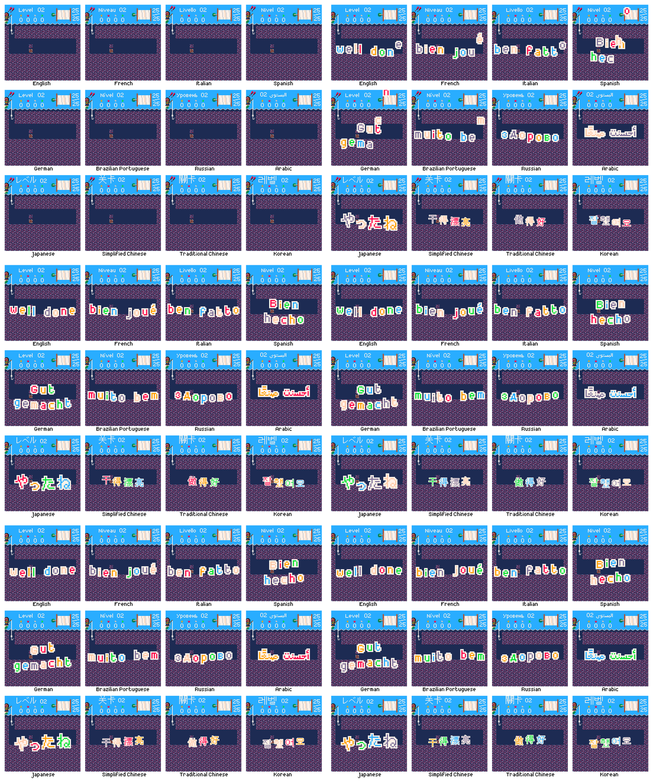
When you complete a level there is a celebratory ‘well done’ animation using colorful, moving, individual letters. This also had to be localized. I wanted all text in the game to be localized so that you can experience it fully without knowing any English at all. With only a couple of exceptions for specific strings in specific languages where the translator recommended keeping the English, this has been achieved.
For these animations to work, I split each message into individual glyphs, then made two sprites for each; the foreground letter, and the solid backing. There are several possible messages in each language, requiring a total of 110 unique glyphs, so 220 sprites including the backing. Required glyphs:
abcdefghijklmnoprstuvwyz
BDGNRS
'
éü
бвгдзийкнпы
きくしぜたっねやろんアクジステリー
亮做好干录得感持支新游漂玩紀纪謝谢錄
감기니다레로록사새서셔어요운이잘주플합해했
أحسنت صنعًا شكرًا على اللعب رقم قياسي جديد
The core of the animation is driven by a hand-written data table defining the glyphs and animation parameters for each language, as well as the x- and y-advance to space things out legibly. Each glyph is eased in following a delay sequence before oscillating on a sine wave offset by its x coordinate.
The glyphs for most languages are 2x scaled, but the Chinese and Korean messages were too large so remain 1x. Arabic needed special handling. Glyphs in Arabic appear differently depending on their neighbours; this means that animating individual characters would render the text meaningless. So I baked each individual word instead, and after falling in sequence they oscillate together, maintaining the language’s strong text base throughline.
Right-to-left languages
Not all languages follow the same direction. English and many of the others supported by the game flow from left-to-right, top-to-bottom. Some languages like Japanese and Chinese can flow vertically from top-to-bottom, right-to-left, but are also commonly written horizontally left-to-right, so that is done here. Arabic however is always horizontal right-to-left.
For some screens this required no or minimal extra work to support. Multiplying a few x-offsets by -1 if the current language is Arabic, for example, to move the opposite way. Mercifully the same 0-9 number system, with larger values on the left (e.g. “128”, the 1 represents the largest value), is still understood; in fact this is known as the Arabic numeral system and originates from this language.
The most changes needed were for the settings menu. The direction of a language influences how people perceive other quantities. For example in a left-to-right language, ‘time’ and ‘progress’ are generally perceived as moving from left to right. When presented with a volume slider and no other information, it seems natural that volume increases when the slider is moved to the right, and decreases when moved to the left; in fact it feels actively wrong the other way around. But these directions are not inherent to these abstract concepts, there is no ‘correct’ direction. In right-to-left languages, ‘time’ and ‘progress’ are generally perceived as moving from right to left. A volume slider here would naturally increase volume when moved to the left. This concept is known as bidirectionality. For the settings menu this meant that numeric values that were increased by pressing right and decreased by pressing left, had to instead decrease on right and increase on left.
For a while I intended to take this further. In every level the hook starts in the top-left of the screen, and you generally move rightwards. This was an unconscious design decision; it simply felt natural to me to move to the right to make progress. I experimented with flipping the gameplay horizontally so that in Arabic you start on the top-right and generally move leftwards, because I thought that this might feel more natural for native speakers, feel more like making progress. There are three reasons I abandoned this:
- I don’t actually know if this would be preferable for native Arabic speakers, and I don’t know any to ask them or playtest
- I don’t know of any other games that do this. Even if this were on some level preferable, Arabic players may in fact be more familiar with moving left-to-right to progress, based on other video games
- It was a non-trivial amount of work and created many bugs, so it wasn’t justifiable. It would have been considerably easier to do this in Unity, where negative scales are allowed, so to horizontally flip something you just give it an x-scale of -1. Unfortunately this isn’t allowed in Defold, so in order to horizontally flip something you have to rotate it 180° about the y-axis. This in turn reverses the z-ordering of everything, so then you have to also negate or otherwise sort all the z coordinates, and remember to do this whenever a new object is created. No thank you
Cost and timeline
I live in the UK, so although services may be priced in $USD or €EUR I’m ultimately charged in £GBP.
In 2017 I spent $60 USD on a license for the Arapix font as this was the only pixel-art font I could find that supported Arabic, and is made by native speaker who is a professional font designer so I can be reasonably confident that it is actually legible. At the time this converted to £47.89. The other fonts were all free.
Also in 2017 I did a first pass on localization. I used LocalizeDirect, they charge per-word and at the time there were only around ~75 words so this cost €114.99 which converted to £102.63 at the time.
I did the final localization pass in 2022, again with LocalizeDirect. As mentioned above, the word count was ~500 this time as this included text for potential future features like achievements, as well as meta-text like the store page description of the game. This also included all the text from the first pass again; some had changed, some was the same, but I wanted to have everything translated together for consistency. This cost €582.92 which converted to £501.74 at the time.
This gives a total cost of £652.26. At the time of writing in July 2022 that converts to around $773.22 USD or €766.56. This does not include the labour cost for the considerable amount of time I’ve spent organizing and implementing the localization.
Why do all this work?
One of the primary motivations for this project has been to allow me to gain experience in areas of game development I haven’t worked on professionally yet. Although during the course of development I have now worked on a couple of games supporting the standard EFIGS (English, French, Italian, German, Spanish), I hadn’t when I started this, and also wasn’t particularly involved in that work, just fixing a few bugs here and there. This is also why I wanted to go beyond EFIGS and support non-Latin languages and even right-to-left languages; I knew these would present further challenges, all of which I was interested in solving.
There is of course also the practical concern, the reason any commercial game is localized. Doing so expands your potential audience dramatically. Many, many more people will be able to play my game now than if it were English-only. That’s a nice feeling, and obviously economically valuable. That said, I probably won’t break even anytime soon, if ever.
I will talk more about my launch plans in another post, but an important point to remember is that I own this game. I can do whatever I want with it, such as porting the game to any number of platforms, including those not yet in existence. The game is tied to the Defold engine, but not particularly tightly, so if in 15 years time I want to release Curious Fishing on some new platform, and Defold has since been discontinued or doesn’t support the platforms I’m interested in, it would be relatively straightforward to move to a different engine or custom framework. For every platform I release the game on, I will be able to launch in several markets thanks to the game and store page description being localized. It’s a multiplier. I intend to maintain this game, not to let it bit-rot or become lost; I want it to remain playable for as many people as possible for as long as possible. The variety of supported languages (Latin, non-Latin, large size, right-to-left) and standardised form (baked sprites) ensures that adding additional languages in future if desired should be relatively straightforward.
Trivia
Finally, a few random interesting facts I learned:
- Jellyfish is ‘medusa’ in Italian and Spanish and ‘méduse’ in French, like the snake-haired monster of Greek mythology
- In German all nouns are capitalized. So “big fish, little fish” is “großer Fisch, kleiner Fisch”
- In Russian only the first letter of the title of a piece of media is capitalized, not the first letter of each word like in English. So “Curious Fishing” becomes “Чудная рыбалка” not “Чудная Рыбалка”
- In French certain punctuation such as ? and ! is preceded with a space. “Confirmer ?” “Amuse-toi bien !”
- In Spanish certain punctuation such as ? and ! are flipped and wrapped around the text. “¿Seguro?” “¡Guardado!”
- Although it may be different sizes or orientations, the question mark ? is widely understood across many languages and alphabets
- Although other languages may have their own symbols, the numerals 0-9 read left-to-right are widely understood across many languages and alphabets
- In Russian “quotation marks” are «like this»
- In Japanese “quotation marks” are 「like this」
- In Chinese “quotation marks” are 《like this》
Closing thoughts
Localizing the game into 12 languages, including non-Latin and right-to-left languages, was a tremendous amount of work. Due to the low resolution, much of it was tedious, requiring me to check every screen in every language and minutely adjust things. But much of it was also fascinating, and I learned a lot of practical information and skills in the process. Now that it’s finally done, I’m really happy with it. It’s very cool. And I will feel the benefits every time someone who otherwise wouldn’t have been able to play my game gets to enjoy it. Like the pixel-perfect resolution scaling (devlog #5), this adds a great deal of future-proofing to the game, hopefully making it something that many people can enjoy for a long time to come.
Thanks so much for reading this longer devlog.
Follow me on Twitter @rhythm_lynx for occasional progress updates
Follow me on itch rhythmlynx.itch.io to be notified when I release something
Thank you for sharing this update! I’m really pleased to see this game moving closer to release.
I look forward to hearing more about your plans!
Thanks for adding the Korean translation. However, the Korean font feels quite strange. Because the “Wen Quan Yi Bitmap Song” font is rarely used in Korea.
These are the fonts that are often used in pixel art games in Korea.
NeoDunggeunmo : https://github.com/neodgm/neodgm/blob/main/README.en.md
galmuri : https://github.com/quiple/galmuri
That’s a great recommendation! For a non-native speaker it is hard to tell if a font is good or bad.
Thank you very much for the feedback and recommendations! As britzl says, it’s very hard to judge the style of a font when you aren’t familiar with the alphabet. I will take a look at those fonts to see if they would fit better
This is interesting. For me it always worked both ways. So depending on current language layout in the system I would put one of variants)
Very nice and interesting devlog. Thank you!
I’ve looked into these alternative Korean pixel art fonts but I’ve decided I’m going to stick with Wen Quan Yi Bitmap Song for now.
The NeoDunggeunmo font is too large to fit in this game’s resolution. The Galmuri font is very nice looking, but I didn’t even check to see whether or not it fits because it’s based on the Nintendo DS font and Nintendo are known to be litigious so for me it’s not worth the risk.
On a practical note I also shouldn’t really commit to a non-trivial amount of work based on feedback from a single person, especially when that feedback is aesthetic in nature (for all I know someone else might say the font looks good). I do really appreciate the feedback, but my priority is very much finishing what’s already there so I can finally release the game. If after release other Korean players also commented that the font looked strange, that would help to verify and justify that this was a change potentially worth doing.
I read through your latest technical update, haven’t seen this thread before. Really appreciate it, it’s always great to see the decision making process and some explanations.
Side note, I think it’s cool you tried polishing the game as much as possible and making it available to audiences outside English. You get a lot of experience that way in areas most devs don’t concern themselves with. I know you mentioned this in your post but yeah just had to reiterate it myself 
Thank you! I’m glad it proves interesting. Yes it’s been a tremendous learning experience, despite already working full time at a game studio
#13: Release!
Curious Fishing has finally been released! You can play it completely free in your browser!
If you could share the game or retweet me I’d really appreciate it!!
I think the game takes about ~2-4 hours if you want to complete all 30 levels and haven’t played the game before. Progress is saved automatically, but not across devices.
The game can be controlled using a mouse, keyboard or gamepad on Windows, OSX or Linux. It can also be controlled with a touchscreen on iOS or Android using the on-screen buttons. By default the game will be landscape on desktop and portrait on mobile, see the website for details on how to change these.
The game will detect your system language on first boot. The language can then be changed in the settings screen. Supported languages are English, French, Italian, German, Spanish, Russian, Brazilian Portuguese, Japanese, Korean, Simplified Chinese, Traditional Chinese and Arabic.
The final build size is a whopping ~4.87 MiB, with ~4.57 MiB (~94%) of that being audio. Textures account for ~145 KiB (~3%) and code/gameobjects/collections are ~128 KiB (~2.6%).
Both myself and Andrew the audio designer are very happy with the game. We hope you enjoy it! Please feel free to leave feedback or comments here or on the itch page. Also if you complete the game, it’d be interesting to know roughly how long it took you - it’s hard to judge how long it will take to complete a puzzle game when you know all the solutions!
Why HTML5?
Way back in the original game jam, the game was built in PICO-8. To play the game you needed PICO-8 yourself, or you could play the exported HTML5 web build.
Part of the motivation to move to Defold was to release the game on iOS and Android. This mobile version is what was submitted to the Defold GDC Competition and later demoed weeklong at GDC 2017, with coverage by TouchArcade (which happened to occur during the one GDC talk I went to, so Andrew stepped in to demo the game). I also participated in the Big Indie Pitch at GDC, rapidly demoing and pitching the game to journalists and receiving feedback.
Everything about the feedback people gave, the impressions of the journalists, the Apple and Google back-ends: it all screamed that this game did not belong here. This was a small offline singleplayer premium game by a single developer. Where was my monetisation strategy, ad networks, retention plan, microtransactions? Where were my analytics, player tracking, content updates, live services? The Apple and Google backends required massive effort, ever-changing requirements, and expensive hardware that becomes rapidly out of date. It was all incredibly draining and unenjoyable and none of it made the actual video game better in any way.
What about desktop platforms, Windows, OSX, Linux? I have limited experience with OSX and Linux and the market share compared to Windows is very small, so it wouldn’t make sense to commit to supporting them. A premium release on Windows would probably need additional features like fullscreen and resolution options and key rebinding. It would also require distribution, potentially requiring SDK integrations such as with Steam, and support for their expected features like achievements and cloud saves. All that work, while cutting out OSX, Linux, iOS and Android.
Defold supports Nintendo Switch now, and releasing the game there would be awesome. But this and other storefronts like Steam are also covered below under ‘Why is the game free?’.
So, HTML5. With some extra work to reuse the existing mobile support, I was able to make a single build which is playable on Windows, OSX, Linux, iOS and Android. Fantastic. I’m also easily able to distribute the game by embedding it on a custom stylized itch page, a storefront I’m very familiar with and supportive of.
Why is the game free?
This is not at all the primary reason, but just on a practical level it’s not currently possible to embed a HTML5 game on itch while also having a required upfront payment price. Premium HTML5 games simply don’t exist.
The primary reason the game is free is simple: taxes. I have always lived and worked in the UK and taxes here are automatically deducted by your employer. It’s not something I’ve ever really had to think about, or have needed much understanding of. However in order to sell Curious Fishing as a premium title on, say, Steam and Nintendo Switch, I would have to form a company as a legal entity for tax purposes, then pay taxes on sales as a self-employed individual, in addition to my primary employment taxes. That would be a tremendous amount of hassle and admin, every year, for what would almost certainly be a trivial amount of sales. It simply isn’t worth it. In the future if I have other games to sell or have gone full time independent, it may become more worthwhile.
I do think the game is worth money. It is a level of quality and completeness that I would feel comfortable charging money for. Thanks to itch there is a ‘support this game’ button on the page, a kind of pay-what-you-want donation. This money is held by itch until I request a payout. Taxes for this are handled by itch at the time of payout, so it’s way less hassle. If nothing else I’m able to defer setting up tax stuff to the point in time (if ever) when there is a worthwhile payout available, rather than having to do it all upfront in order to be able to distribute the game. And again, this will almost certainly only ever be a trivial amount of money anyway.
Selling the game, as opposed to accepting donations, also comes with a much stronger commitment of maintenance, especially for desktop or console platforms or more commercial storefronts like Steam. This is another point in favour of the HTML5 build; having a single build using well established web technology that is basically guaranteed to be supported for many years to come. The bulk of maintenance work is on the companies creating browsers, rather than on me having to respond to the latest Windows version inevitably breaking everything, or Apple killing something fundamental, or whatever.
If I were to summarise the scope issues of this game, the reason it took so long, I would say that it started as a hobby project, then I tried to treat it as an indie project, before finally going back to being a hobby project again. And I don’t have to monetise a hobby project, I’m allowed to just have fun and learn things. Curious Fishing is more useful to me as a thing that is freely and easily accessible than it would be as a thing behind a paywall that very few would bother to climb.
I may well sell some version of this game on some platform at some point in the future. For now I just want to make it available to play and move on to making something else.
In the very first devlog, written over four and a half years ago, I said this:
I’ve given this game a lot and it’s given me a lot back. I’m very grateful for that. Ultimately I just want to make the game as good as I know I can make it, in the hopes that a few people out there in the void will appreciate it.
Well, I have finally shouted into the void. Time to see if the void shouts back.
Will there be more devlogs?
Yes  I’m planning to write at least one more, exploring why this game took so long to make. I also have some other miscellaneous notes that could maybe be pulled together, we’ll see.
Follow me on Twitter @rhythm_lynx to see what I work on next.
Follow me on itch rhythmlynx.itch.io to be notified when I release something. Apparently it should only take me 6 years or so.
Congratulations on your game release! It’s a very fun game to play, well done! 
Thank you!
Refold could have been an option to help with all of this?
One way to do this is to use PlayFab+Paypal. You can make the base game a demo, and pay a one time price to to unlock the game/use PlayFab to authenticate and reunlock in the future based on the same e-mail address. Easy to setup.
I can understand the concerns on taxes/things not being worth the hassle. That is also why working with established partners can help, because then you can simply be paid a royalty and not have to worry about company structure.
Depending on the country you’d still have to pay taxes on those royalties wouldn’t you?
Yes, we can help with the release of Curious Fishing on Nintendo Switch. And if you really do not want to go through the hassle of setting up your own company but still would like to see the game on Switch we could agree to donate all earnings to a non-profit of your choice.
If in UK then I believe you can make £1,000 per year without declaring it. Beyond that, you would need to self-assess for tax which is very easy to do (1-2 hours per year). Not sure where Connor is based and regardless I would confirm separately anyway as I’m not qualified to give financial advice (I’ve let my chartered accountancy membership lapse for good reason  ).
).

