Curious Fishing [15 devlogs, complete]

#8: (Work)flow: art

For the past few months I’ve been working on underwater currents: flowing water that pushes creatures and hook alike. I call them flows because currents was too confusing during loop iteration. I’m definitely going to write a post or two about both the design and technical challenges of this feature, because there were a lot of both. But I’ve just wrapped the feature with some nice art and I thought I’d write about my pixel art workflow.

I originally started the game in PICO-8 and so inherited the 128x128 pixel resolution and the excellent 16 color palette from there. Many of the game’s sprites were first made in some form in PICO-8 and some have remained untouched in the ~2.5 years since then, such as the crab.

pico8

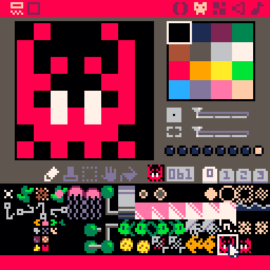
The PICO-8 pixel art editor is suitably simple. You have a few banks of sprites, a few colors, a few tools and no layers. These restrictions were what enabled me to start drawing pixel art in the first place; when the blank page is this small it’s a lot less scary. Drawing at this resolution often feels more like solving a puzzle than artistic expression: how do you make a 2-frame crab animation in an 8x8 space with just one shade of red?

With the move to Defold and the need for larger, more complex pixel art I shifted to paint.net because I already knew how to use it, it was still simple and it had layers. It doesn’t do animations at all, but neither does my game for the most part! I’m now transitioning to what has become the industry standard for pixel art and for good reason: Aseprite. Aseprite does do animations as well as tiling and many other features, it’s great but I’m still quite slow and clunky with it.

How hard could it be?

OK so there’s only 16 colors and an 8x8 space and I need to make an animation for flowing water. There can’t be that many options, right? Well there’s actually many more constraints than that, because it needs to fit in with the many existing sprites using up that limited palette, it can’t be too distracting because this is a puzzle game, plus you need to be able to tell which direction a flow will push a creature while the creature is on top of it and blocking it from view. Hmm.

My first thought was a particle system. When the player enters a flow they lose movement control until the flow spits them out or becomes blocked; I figured some rapidly moving pixels would help convey the strength of the current. I had a quick go at messing with Defold’s particle effects editor but I’ve never used it before and knew it would be quicker for me to try the effect I had in mind by rolling my own ‘emitter’ which just moves sprites along and respawns them when they go too far. I stuck some flows in level 1 for quick access and fiddled with the speeds and number of particles until I had this:

That’s pretty much what I envisioned and I think it does look reasonably like a torrent of water. But it’s almost literally noise. The random, rapid movement was far too eye-catching and distracting. I wanted something more regular, so I quickly made a UV scrolling shader and drew several variations of an 8x8 sprite to wrap around. The Shadertoy tutorial was helpful here in showing me how to pass a timer value into the shader.


In case you’re wondering about the colors, I have a debug flag set so that a random avatar and case palette is chosen at startup so that I’m constantly confronted with the different designs and can tweak them if I see something I don’t like.

Note that we’re no longer pixel-perfect at a resolution of 128x128 (there’s sub-pixels in the scrolling) but this was just a quick temporary test. The larger waves looked less like water and more like conveyor belts so those were out straight away. I liked the intensity that the more densely packed waves had and how clear the boundaries were but they were too noisy with creatures on top of them; trying to focus on the creatures became uncomfortable.

I used ScreenToGif to record these quick tests so I could put them all side by side and assess things altogether, as well as make sure I’m not trying the same things over and over again. Having all these GIFs lying around is what prompted me to write this devlog! Anyway, it was becoming clear that small waves were the way to go. So far all the designs I’d tried were completely behind the sea creatures. Most of the creature sprites touch all four boundaries of their 8x8 sprites which meant that the flow sprites had to as well so that a little bit of them would be visible around the edges e.g. under a fish’s tail. What if the flow went in front of the creatures instead? Then it could be smaller and go straight down the middle. After a few variations the best bet was this:

I really like the simplicity of this design, it makes the flow system as a whole very clear and easy to understand. It doesn’t really look like water any more though - it looks like UI, plus I really don’t like obstructing the sea creatures like this. The creatures are riding the flow, it makes sense for them to be on top. This is just a flow test level btw, not an actual puzzle.

I went back to having the flow fully behind the creatures and after some more tweaks and color explorations I settled on this for the final version:

I think this has the best balance between all the different factors:

  • Very clear which direction flow is moving
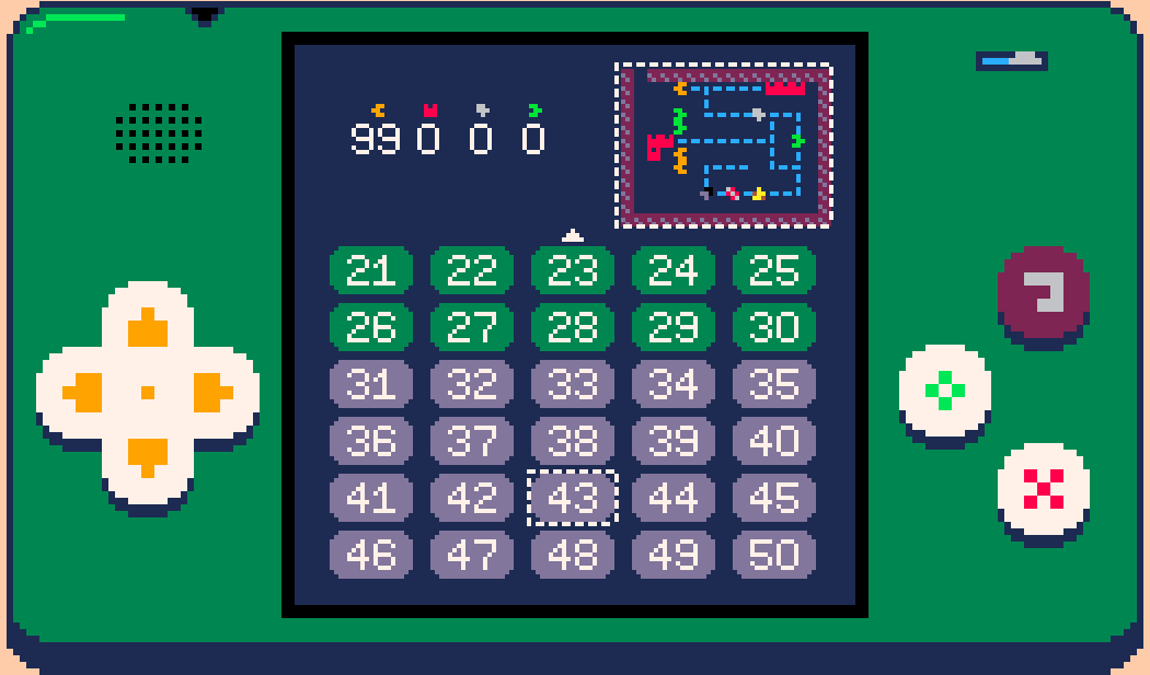
  • Can’t be confused with anything else as this is the only use of light blue underwater (this is useful both in the game and for the minimap on the level select menu)
  • You can tell what direction a creature occupying a flow will be pushed next tick thanks to the small gaps around the creature sprite edges and the vividness of the light blue (if you’re ever unsure you can always move then undo it anyway)
  • It’s at least suggestive of a flowing underwater current, which with this resolution and palette is pretty good
  • Not too distracting or eye-catching
  • Not so noisy that it makes looking at creatures occupying flows uncomfortable
  • Easy to see even on dim phone screens

There were also some happy accidents:

  • Flow waves go either side of the line when the hook is pushed through them
  • A 2x2 loop produces a whirlpool effect in the middle

Downsides:

  • If a position is surrounded on multiple sides by flows it can be hard to distinguish whether it is part of the flow system or not
  • Dense winding paths with multiple directions next to each other are difficult to parse

The 3x3 minimap tiles were quite straightforward as I already knew I wanted it to be a dashed line. I did try animating it to show the direction of flow but didn’t like the effect.

Time flows gently ever on

From start to finish this was around ~7 hours of work for a single 8x8 sprite. Small sprites don’t usually take much more than an hour but there was no obvious approach so I ended up trying several things, plus there was an unusually long set of requirements/restrictions since flows interact with every other system in the game. Quite happy with it.

Follow me on Twitter @rhythm_lynx

17 Likes

Great art! :smiley: Again, very useful diary, thanks for that :wink:

Didn’t you want to try larger minimap and fewer level selection buttons?

3 Likes

Good question! For a long time there were only 30 levels and having the minimap tiles be 3x3 worked out perfectly to show all 30 levels without any scrolling. I also really like the fact that the game is still pretty legible at 3x3. Now that I’ve introduced scrolling anyway, I could resize the minimap in future if I need some space for something else but I don’t see a reason to atm. Levels are distinctive and recognizable enough at that resolution.

5 Likes

Hello! It’s been a while but this project is not dead!

The last significant period of work was in March 2019, with just a few maintenance commits since then. In the last year I have changed jobs and cities for the second time since starting this project, and there have been several other important life events, not to mention world events. As this is a (mostly) solo project done entirely in my spare time, it takes a back seat whenever I don’t have time or energy to spare (particularly the latter). Some of the periods of highest productivity on the game have been during times where I didn’t enjoy my day job and needed a creative outlet, but wasn’t so unhappy that I had no energy or motivation. These periods were also when the scope of the game tended to creep up; from small game jam, to maxing out PICO-8’s memory limits, to premium multi-platform Defold mobile game, to ever-increasing numbers of levels and features (both gameplay and app).

Not only have there been significant life events, I have finally found myself in a job that I thoroughly enjoy and which pushes me creatively. As such I’ve felt less of a need to spend my own time outside of work toiling away. I still very much intend to finish and ship this game, but I’m not going to even pretend to know when that will be any more, or to put too much negative pressure on myself to deliver.

The important thing is that a hiatus is not a cancellation. I really appreciate those who have been following along with the project and giving such encouraging feedback. The next time I sit down and look at this thing I’ll be critically assessing the todo list and making significant cuts. I am very happy with the actual gameplay as it stands now and have been for a long time. I struggled mentally and morally with the idea of people paying money for this game; I felt I needed to add significantly more content for it to be worth the small fee I intend to charge, to not feel like a scam. I no longer feel this way. I think it’s a good game, I’m proud of it, and I’ve put a significant amount of time and energy into it. My friend Andrew has also put significant time and energy into the audio for the game and is rightly proud of his work, but he is dependent on me to actually finish and ship this thing for the world to hear it. The game has value, and I will charge for it appropriately. Plus, in all likelihood, very few people will buy the game, so this was all purely theoretical guilt anyway.

To summarise, I still intend to finish this game. I don’t know when that will be. The project has been on hiatus for a little over a year now. I’d like to come back to it soon. Thank you for showing an interest, and thanks especially to the Defold team for believing in the game enough to fly us out to GDC and to put us in the splash screen; it means a lot!

10 Likes

#09: Interview with sound designer Andrew Dodds

I recently read an article called A Swimmer’s View of Abzû by Hannah Nicklin, published in Issue #1 of A Profound Waste of Time. As a game developer and avid swimmer Hannah had a unique experience playing Abzû and decided to interview friends and relatives who were also avid swimmers about their own experiences with the game. One part in particular stood out to me:

Opening a new avenue of communication in a relationship sounded exciting. As noted in devlog #1 History and Motivations, my friend Andrew Dodds joined me early on in Hook’s development to create music and sound effects for what was, at the time, still a fairly small-scope PICO-8 game. We had spoken in the past about writing a devlog about his contributions and an interview seemed like a fun and engaging way to put words to paper. Through this interview I learnt a lot about Andrew’s process and about how a sound designer approaches a problem. I hope you find this as fascinating as I did!

Can you talk a little about who you are and what your background in audio is?

Hi, I’m Andrew Dodds and I’m a Sound Designer. My day to day involves creating sound effects and implementing them into games or syncing them with video.

I’d like to think I have a diverse background in audio. I worked my way through being a more engineering based sound person, working on stuff like the Commonwealth Games, BBC and STV productions as a freelancer. I then moved onto games at Abertay, where I met an incredibly talented programmer called Connor [editor’s note: I objected but he said I had to leave this in], which led me down the path of making some fun and interesting games. I’ve used different game engines, audio middleware, and countless other tools to make sound effects and music for games.

I currently work at a company called Krotos Audio where we make audio software. Our stuff has been used on Strangers Things, Game of Thrones, Avengers: Age of Ultron, and many others. I spend my time creating libraries of audio content (foley, swords, magic, weapons and many others) for use in the games and film/tv industries.

What do you do on the project? How did you come to join the team?

I create all the sound effects and music. I ended up joining the team when I saw Connor’s version of the game from a game jam. I’d played through it and thought it was really exciting, charming and fun. The whole time I seemed to have this sea shanty, chiptune music in my head and all these fun 8-bit style sound effects. The style and character of the game felt like it was already exuding the sound and I wanted to be the one to add it to the game. So I messaged Connor and told him all this, and he got me on the team as the sound designer.

I’d like to ask you about each of the 5 music tracks in turn. Let’s start with the title screen / menu song. What kind of feeling were you going for? Were there any particular inspirations? The use of white noise for ocean waves is really effective and pretty.


A 30s clip from music_menu

The whole song started around the waves and the idea of what a wave is. I liked the animation of the boat rocking up and down and the feel of the title screen as a whole, so thought some gentle wave sounds would be a good introduction to the game. I created this in PICO-8 using its noise generator and some filtering. As the sequencer steps through I increase and decrease the notes to get the rising and falling pitch. I do the same for the volume giving it that flowing sound.

With the gentle waves setting the mood I wanted the music to follow that. The title screen looks relaxing, so I kept the pace of notes slower. I faded in one layer of music at a time, building it up just like a wave rising. I liked the idea of falling and rising notes just like the waves, so I used some arpeggios to climb and descend the C major scale. It kept everything happy sounding and it was pleasant to loop.

At the end I added a lead so the song would go somewhere. I wanted it to rise all the way up the scale and then back down through a couple of octaves. This is just another extension of the same idea. Then the music fades out layer by layer until only the waves remain. This completes the full loop of the music in PICO-8 and from the waves, the song starts again.

Whenever a level is started the game will alternately play one of two songs (except boss levels, which we’ll get to later). Did knowing that these songs could potentially play on any level affect the design process?

Not really. Basically, I was just thinking about how all the songs I made for the game fitted the theme and style of the original title music. So as long as it stuck to the falling and rising arpeggios and it felt like the music fitted the style of the visuals, I was happy. Really though, I feel like all the music I made for Hook are melancholy sea shanties, which I really like since most of my music is quite melancholy. It feels like I made it, it comes from me but at the same time fits the game.

Both gameplay songs (known simply as game1 and game2) have some structural similarities: they feature strong melodies with accompanying harmonies, and are slightly over 1 minute long with a noticeable shift around the halfway mark. Players will hear these songs on loop longer than any other pieces since they play during the core gameplay, is this what led to the two-halves structure – a way to give the player some contrast and respite from each half?


A 30s clip from music_game1

Yeah that is exactly what it was! There were also the restrictions of PICO-8 and that I only had 64 blocks of 4 bars to create 5 tracks. It meant I needed to keep the songs short, but there also needed to be some kind of movement and change, instead of always repeating itself. So I made 2 distinct sections and ensured that they moved away from each other and back together at the end. Again, all because of that wave idea, I had the layers and the music ebb and flow.

Is there anything else you’d like to say about these songs? I particularly enjoy the tremolo at the end of the long notes in game1’s melody, and the bassline in game2.


A 30s clip from music_game2

Yeah, I think that they were really fun to make as it is not a medium I was used to. With everything being essentially 8 bit, I had very few tones to work with. I noticed very quickly that notes would clash a lot easier than on other instrumentation, so I had to be quite careful with how I did the harmonies. It ended up having a really nice effect where the different layers have some notes overlap. This results in them getting a little lost for a beat and then another layer will change revealing that other note. It seemed to make the sum of all the parts much richer than the component parts.

To add to what you are saying about the tremolo, PICO-8 has these minimal effects you can add to every note. They include things like fading, tremolo, slides, and a few others. They were a really nice way to make the music feel a little bit more alive, than just having static notes. Overall I enjoyed all the stuff I made, but my favourite to make was music_game2, as I feel that is the point I began to hit my stride with the music system in PICO-8.

The music that plays on boss levels is noticeably more up-beat and has a stronger driving rhythm compared to the other songs. It helps a lot in making the bosses feel special and stand out. Was it hard to balance this more intense music with the relaxed feel of the rest of the soundtrack, or was it a refreshing change of pace for you? The song feels very layered and complex, despite adhering to the same 4-channel restriction and ~1 minute runtime.


A 30s clip from music_boss

It was definitely a fun change of pace. I knew I wanted something different to stand out and show that this was a more difficult and important level. I made a real conscious effort to make it more engaging and brighter, as you may get stuck on these levels for a while. I didn’t want it to be too repetitive and annoying. The level may take as long as 10 mins to figure out and the track loops round every 1min 6s, meaning you were possibly going to hear it 10 times or more. It had to be fun. I also think this song reflected my mood after working on the game for a while. I was excited and happy to be working on the game and I’d got most of the other sounds done. This felt like the accumulation of work and it kind of came together really easily and naturally.

The layers compliment each other and harmonise well. The bass octave note pattern makes it feel upbeat, bouncy, and fuller than the other tracks. Also the low melody line is around the same notes as the bass, they are just using a different waveform in PICO-8. I noticed that if you combine the sine and organ waveforms it gives them a richer tonality that is greater than the individual parts. This makes the melody and bass feel like a chord at some stages rather than just a couple of layers of notes playing. Then with all of that mix going on with the low and mid notes, the highs kind of shine through, and feel like an extra bit on top of this fuller sound.

The fifth and final song in the game is for the credits sequence. The melody moves a lot here, becoming almost melancholic towards the end, like a goodbye. You make strong use of those arpeggios again here, too. How did your approach for this song differ compared to the others?


A 30s clip from music_credits

The method of approach was very similar to the other songs. I felt it was an important part of working in PICO-8 and the melodies and style I was working with to be considering everything around the arpeggios. The only thing that changed was the feeling and mood on this song. It was the end of the game and that was a good feeling to be able to finish it up and complete it, but also sad that we were done with it. That led to the more melancholic goodbye tone. A lot of the games I played when I was a child, with all the 8-bit music, always seemed to sign off on a rather sombre note. I think it was a portion of that and my mood that made it feel like a fitting way to end it.

As a sound designer, what’s your most desired audio feature that Defold is missing?

I would like to see more controls that people who work in audio are familiar with. Just now it is very bare bones and relies heavily on the programming. The system allows me to cue up and trigger sounds, but unless I write the code, or get a programmer to do it for me, adjustment of levels, real-time controls, and even sequential or random triggers of multiple sounds in a container, it’s all done through coding. Attaching some kind of simple audio UI and folder structuring system for the sounds you want in the game would be really helpful. Luckily in Hook, I was working with motifs and sounds that triggered with some form of repetition expected. Showing variety or audio depth, such as multiple footstep sounds and surfaces, with the tool would take more time from a programmer to set up how all these sounds will trigger, than the sound designer. It would make the team work smoother, like hooking up Wwise to Unity. It gives a lot more creative control to the sound designer, and they can focus on making the game sound, rather than trying to explain to the programmer how they want the sounds to trigger and fade in.

What’s your process for designing a new sound effect for Hook? Does that differ from how you create sound effects for other projects?

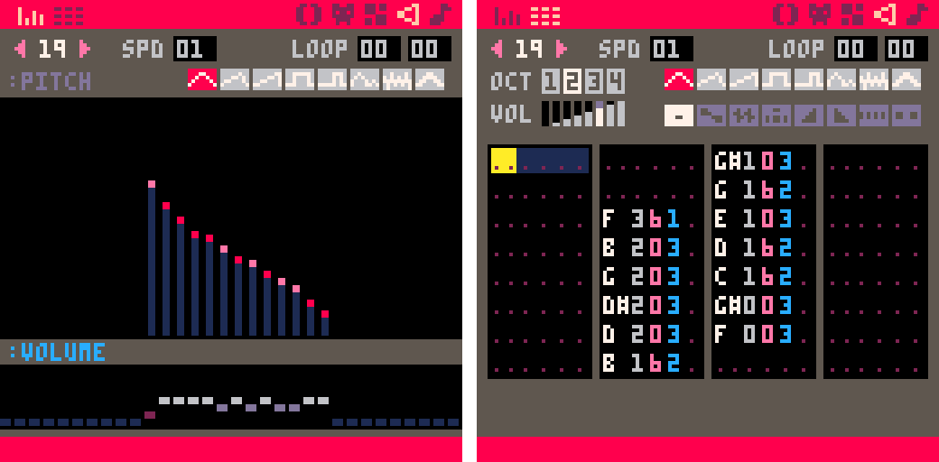
A lot of the general idea is the same for the way I’m thinking about it and dealing with feedback, but in PICO-8 my approach to making the SFX was a little different. The main thing was the brief. The goal was to make the SFX sound like they were underwater and fit the visuals and animations. With this in mind PICO-8 has 2 views where you can work with the sound, one where you can draw in the sound like a bar graph and another which is the same as the music chart. For SFX I would start with drawing them in as it felt very natural. If you started high and drew down to low, you would get a descending note chromatic progression, and vice versa if you drew low to high. This made it easy to get the character of the sound and make them fun and gestural. I could experiment with the rising and falling patterns, leave gaps to create stuttering effects, or be really random with the pattern and see what came out.

After this I would focus on getting the tonality to match the visual/animation more accurately. I did this by changing the waveforms for the different notes in the pattern. This created a richer and more designed feel for each of the SFX, and made them more unique for the visual. For example the crab breaking a debris block is a mixture of a couple of low sine notes to give the low end impact, then noise waveform starting from high pitch and descending to low pitch, and at the end another couple of sine notes descending in pitch as well. This allowed me to give it the crisp breaking sound that fitted the animation, but at the same time the sine waveform immediately after it dampens the harshness, making it feel more underwater.


The break_debris sound effect


The break_debris sound effect in PICO-8’s pitch mode and tracker modes.

After I had a pattern and tone I liked, I could then use the playback speed, same as the music BPM control, to change the pace and feel of the sound. This allowed me to sync the SFX with the visual better.

Lastly, I had to make sure the SFX didn’t clash with the music. Working with SFX that are more musical in tonality, since they are all still made with the same waveforms as the music, meant using notes that were dissonant could make a positive sound really jarring and off. I had to make sure all my positive SFX were in the key of C like the music. All my negative sound effects are either dissonant with C or if they were too harsh, some other notes that made it clear that something was wrong. This is quite fiddly to do in the SFX drawing section, so I did this the music editor view. Since all the notes in here are named, I could easily see which note was the wrong one and correct it.

How have you found dealing with the restrictions imposed by PICO-8? For instance the range of waveforms available, the 4-track limit for music, the tracker-style tooling.

I quite enjoyed the restrictions that PICO-8 has. It made me have to think a bit differently about my approach to the sound design as a whole. I think it also made me realise I could over-think my design at times, when I have unlimited tracks and sounds to play with. At the time I think it helped me progress and get more in tune with SFX and music working together, as well as thinking about pitches, tonality, and harmonies to make it all work as a cohesive whole. Also the limitation made it easier to embody the characteristic of the visual style and what we expect audibly from games of this genre. I think that the way PICO-8 does the visual graph for making SFX made it easier to do though. I didn’t need to know the code behind the scenes too deeply to get the results I wanted, so it was really fun to work with it. Lastly, it was nice to work with audio in an older style, it gave me appreciation for what I have and can make now.

What does the audio pipeline for Hook look like? Walk me through the process from needing a new sound effect to having it in the game.

Through other questions I have kind of answered the majority of this, the final part is how I get the sound out of PICO-8 and into Defold.

Once the sounds are all created I can render them to WAVE files out of PICO-8. I will then mix and master the effects in a DAW [Digital Audio Workstation]. My preference is Reaper here. Due to certain limitations with not being able to use Wwise or FMOD for this project, I actually do all the mixing in the DAW. This way I can get all the SFX and music lined up and see how they play together. I basically have a mock-up with the music and then simulating the process of the level and the order the sounds will typically play in. I then mix all the SFX and music to this and it seems to mimic the game pretty well.

After this, I render all the sounds out of the DAW and then I import them into Defold. From there Connor has set up code to trigger them in-game. I can then playtest the game and check to ensure all the SFX and music are working well together. If I make adjustments to the SFX or music, I just make sure to render them with the same name as the sound before. That way when I import them into Defold, it just overwrites the previous one.

How do you make something sound “aquatic”? Do you have any favourite techniques that you used in Hook? Are there any you wanted to use but couldn’t because of technical or aesthetic limitations?

It was all to do with using the sine waveform as it’s the most soft sounding of all the waveforms. I noticed in PICO-8 it has a very muted and muffled sound in general and if you combined it with different amounts of the other waveforms, it would make them seem less harsh. This became my go-to technique for the design. It was kind of similar to when you are layering in a Digital Audio Workstation doing more modern style sound effects. The combination of different elements makes different results, but in PICO-8 you cannot layer. As a result the closest you can get is changing the waveforms right after one another and adjusting the speed of the SFX playback. This yielded the best and most interesting sounding results. It’s like the layering was slightly syncopated, but by such a small amount your ears don’t realise. This gives the SFXs a bit more meat and allowed me to experiment and find ways to get a characteristic sound for an object, but then smooth it over with the sine wave to make it more underwater sounding.

As I mentioned above, the limitation came with not being able to layer several sounds together to achieve the effect you want. I needed to think more abstract and suggest elements of the sound that fit the object, or animation, in game. It works for the art style though and the limitation honestly helped keep me on track. I didn’t see it as I couldn’t make something, more how can I make it this way?

If you had to pick one, what would be your favourite sound effect and favourite piece of music in Hook?

Hard choice for both… I think for SFX, it is the sound as you hook a fish or creature and then that first part of the hook being reeled in. I just feel like the little bloop noises are quite satisfying. I know that is cheating on choosing but it’s the combination of those two sounds that set the tone for the rest of the game. And for music is a toss up between music_game2 and music_boss. I think music_boss just pips it.


From both of us, thank you very much for reading!

You can follow Andrew on Twitter @doddsy91
You can follow me on Twitter @rhythm_lynx

9 Likes

#10: Audio tech

The previous devlog was about 1 audiophile. This devlog is about 23 audio files.

At the time of writing there are 18 sound effects in the game:

  • break_debris
  • collect_fish
  • crab_snip
  • cut_stingers
  • drop_fish
  • grab_fish
  • hook_move
  • invalid_move
  • kill_fish
  • level_restart
  • level_start
  • level_win
  • menu_move
  • menu_select
  • reel_in
  • sponge_absorb
  • squid_ink
  • undo

We may need a few more but probably not many. All of these are between 0.1 to 0.2 seconds except level_restart at 0.4s and level_win at a lavish 1 second. Each sound effect file is between 5KB to 7KB except level_win at 12KB.

There are 5 pieces of music:

  • music_menu: 1m 54s, 888KB
  • music_game1: 1m 3s, 527KB
  • music_game2: 1m 10s, 576KB
  • music_boss: 1m 6s, 554KB
  • music_credits: 1m 24s, 730KB (work in progress)

As you might expect music_menu plays during most menus including the title screen, level select, aquarium and settings screen; the two exceptions are the about screen where music_credits plays instead and the pause menu which doesn’t interrupt the gameplay music. Speaking of gameplay music, every time you enter a level the music alternates between music_game1 and music_game2 except of course the boss levels which play music_boss.

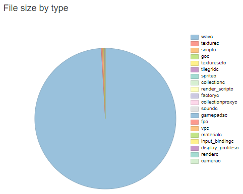
Originally all of the audio was stored as .wav files. Since the number of other assets is pretty low and the textures are all incredibly low resolution pixel art, when I bothered to generate and check a build report I discovered that audio accounted for literally 99% of the build size:

before

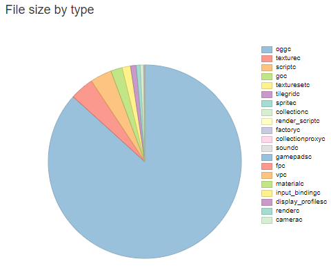
Changing from .wav to .ogg dramatically reduced file sizes without a noticeable drop in audio quality (helped by the retro nature of the sounds). Audio now accounts for a slightly more modest 87% of build size (the 5 music tracks account for 85% by themselves):

after

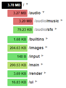
This dropped my Android release build from ~60MB to ~8.5MB! Turns out build reports are pretty useful, thanks Defold. Overall the content of my project amounts to ~3.8MB of the build, with audio being ~3.3MB of that:

build_structure

Implementation: sound effects

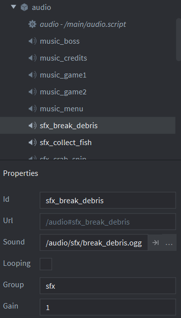
I’ve said this before but one of the pleasures of this project is not having to care at all about loading and unloading assets or general memory management (so long as we don’t leak, we’re good). All audio and textures are just kept in memory at all times. In the bootstrap main.collection there is an audio game object with an audio.script component and 23 sound components - one for each audio file.

All the sound effects belong to the ‘sfx’ group and do not loop. Triggering a sound effect is as simple as sending a message to the audio game object:

msg.post("main:/audio", "play_sfx", { sound = "break_debris" })

This message is then handled in the audio.script on_message function:

if message_id == hash("play_sfx") then
	if not self.played_this_tick[message.sound]
	and (message.sound ~= "reel_in" or self.reel_timeout <= 0) then
		msg.post("#sfx_"..message.sound, "play_sound")
		self.played_this_tick[message.sound] = true
		if message.sound == "reel_in" then
			self.reel_timeout = MAX_REEL_TIMEOUT
		end
	end
end

When the hook was the only thing that could trigger sound effects it wasn’t possible to have the same sound triggered multiple times in one frame. When I added flowing water I encountered an issue where for example two flows would push two crabs into two debris on the same tick, causing the break_debris sound to be triggered twice in the same frame and play much louder than usual. Now the self.played_this_tick table prevents sounds that have already fired from firing again and is reset each frame in the update loop.

There is also a timeout applied specifically to the reel-in sound effect as it’s the only one which can fire rapidly enough to become monotonous. A comparison without and with the timeout:

Implementation: music

The only difference for music sound components is that the group is set to ‘music’ and looping is ticked. Triggering a music change is done through a similar message:

msg.post("main:/audio", "crossfade", { music = "music_boss" })

The handling of this message is slightly more complex though. Sound effects are ‘fire and forget’ but music is continuous - we don’t want to play multiple songs at once nor do we want to immediately cut from one song to another; we want to fade the current song out then fade the next song in. This can be heard in the video above showing the reel-in sound effect timeout, when the music transitions from music_menu to music_game1 after the level selection menu.

if message_id == hash("crossfade") then
	if self.current_music ~= message.music then
		self.crossfading = true
		self.crossfade_target = message.music
		self.crossfade_time = 0
	end
end

During the update loop we first fade out the original song, then when the transition can’t be heard we cut it and start the new song, then fade that up to full volume. Fading is achieved by linearly interpolating the music group gain from 1 to 0 or from 0 to 1.

if self.crossfading then
	if self.crossfade_time < HALF_CROSSFADE_LENGTH then
		-- during the first half we're fading out the original music
		self.crossfade_time = self.crossfade_time + dt
		if self.crossfade_time >= HALF_CROSSFADE_LENGTH then
			msg.post("#"..self.current_music, "stop_sound")
			self.current_music = self.crossfade_target
			self.crossfade_target = nil
			msg.post("#"..self.current_music, "play_sound")
		end
	else
		-- during the second half we're fading in the new music
		self.crossfade_time = self.crossfade_time + dt
		if self.crossfade_time >= CROSSFADE_LENGTH then
			self.crossfade_time = CROSSFADE_LENGTH
			self.crossfading = false
		end
	end
	local start_gain, ratio = 1, self.crossfade_time / HALF_CROSSFADE_LENGTH
	if self.crossfade_time >= HALF_CROSSFADE_LENGTH then
		start_gain, ratio = 0, (self.crossfade_time - HALF_CROSSFADE_LENGTH) / HALF_CROSSFADE_LENGTH
	end
	local end_gain = 1 - start_gain
	local gain = vmath.lerp(ratio, start_gain, end_gain)
	sound.set_group_gain("music", gain * g_save_data.music_volume / MAX_VOLUME)
end

I guess technically this isn’t a crossfade, since we’re not actually playing both songs at once. For a true crossfade you’d want to be altering the gains on the sound components themselves rather than on the group; since they both belong to the ‘music’ group they can’t be faded independently using my approach.

Implementation: volume sliders

In the settings screen there are separate volume sliders for sound effects and music, these are just directly setting the gain on the ‘sfx’ and ‘music’ groups. The only gotcha here was that in right-to-left languages such as Arabic (which we support) the sliders need to be mirrored so that they run from right to left (moving the slider to the left increases the volume).

Code

Here is the entire audio.script file in the hopes that someone finds it useful. I wrote most of this code over 2 years ago but I don’t think there’s been any major audio changes for Defold since then.

audio.script
MAX_VOLUME = 10
local HALF_CROSSFADE_LENGTH = 0.6
local CROSSFADE_LENGTH = 2 * HALF_CROSSFADE_LENGTH
local MAX_REEL_TIMEOUT = 0.2

function set_music_volume(volume)
	if volume < 0 then volume = 0 end
	if volume > MAX_VOLUME then volume = MAX_VOLUME end
	g_save_data.music_volume = volume
	sound.set_group_gain("music", g_save_data.music_volume / MAX_VOLUME)
end

function set_sfx_volume(volume)
	if volume < 0 then volume = 0 end
	if volume > MAX_VOLUME then volume = MAX_VOLUME end
	g_save_data.sfx_volume = volume
	sound.set_group_gain("sfx", g_save_data.sfx_volume / MAX_VOLUME)
end

function init(self)
	sound.set_group_gain("master", 1)

	-- TODO: fade music in during startup, don't abruptly play
	self.current_music = "music_menu"
	msg.post("#"..self.current_music, "play_sound")
	
	self.crossfading = false
	self.crossfade_time = 0
	self.crossfade_target = nil
	
	self.played_this_tick = {}
	self.reel_timeout = 0
end

function update(self, dt)
	if self.crossfading then
		if self.crossfade_time < HALF_CROSSFADE_LENGTH then
			-- during the first half we're fading out the original music
			self.crossfade_time = self.crossfade_time + dt
			if self.crossfade_time >= HALF_CROSSFADE_LENGTH then
				msg.post("#"..self.current_music, "stop_sound")
				self.current_music = self.crossfade_target
				self.crossfade_target = nil
				msg.post("#"..self.current_music, "play_sound")
			end
		else
			-- during the second half we're fading in the new music
			self.crossfade_time = self.crossfade_time + dt
			if self.crossfade_time >= CROSSFADE_LENGTH then
				self.crossfade_time = CROSSFADE_LENGTH
				self.crossfading = false
			end
		end
		local start_gain, ratio = 1, self.crossfade_time / HALF_CROSSFADE_LENGTH
		if self.crossfade_time >= HALF_CROSSFADE_LENGTH then
			start_gain, ratio = 0, (self.crossfade_time - HALF_CROSSFADE_LENGTH) / HALF_CROSSFADE_LENGTH
		end
		local end_gain = 1 - start_gain
		local gain = vmath.lerp(ratio, start_gain, end_gain)
		sound.set_group_gain("music", gain * g_save_data.music_volume / MAX_VOLUME)
	end
	
	for k,v in pairs(self.played_this_tick) do
		self.played_this_tick[k] = false
	end
	self.reel_timeout = math.max(0, self.reel_timeout - dt)
end

function on_message(self, message_id, message, sender)
	if message_id == hash("crossfade") then
		if self.current_music ~= message.music then
			self.crossfading = true
			self.crossfade_target = message.music
			self.crossfade_time = 0
		end
	
	elseif message_id == hash("play_sfx") then
		if not self.played_this_tick[message.sound]
		and (message.sound ~= "reel_in" or self.reel_timeout <= 0) then
			msg.post("#sfx_"..message.sound, "play_sound")
			self.played_this_tick[message.sound] = true
			if message.sound == "reel_in" then
				self.reel_timeout = MAX_REEL_TIMEOUT
			end
		end
	end
end

If you want to use and extend this code for your own projects please feel free! Here are a couple of changes I would recommend:

  • For crossfading music, manipulate the gain on the sound components individually instead of their shared group gain so that a true crossfade is possible rather than fading completely out then in.
  • This code doesn’t handle the case of requesting a music transition while a crossfade is already in progress; this isn’t possible in Hook and I’ll never finish the game if I spend time solving problems I don’t have. You would want to start fading out the currently playing music from whatever volume it was at when the new request arrived.
  • The global volume setting functions should probably be replaced with a ‘set_volume’ message. These functions are called when save data is loaded during startup and when the volume sliders are changed in the settings screen, which is in a different collection. I didn’t really understand Defold’s message passing architecture when I was writing the save data system so I used global functions instead as I ran into problems trying to send messages between objects in different collections, some of which are loaded through proxies. There’s probably a cleaner solution but this works fine for me.

You can follow the game’s sound designer Andrew Dodds on Twitter @doddsy91
You can follow me on Twitter @rhythm_lynx

16 Likes


Even the forum software was like “who are you again?” :sweat_smile:

15 Likes

Welcome back Connor. Really great posts!

5 Likes

Thanks britzl :slightly_smiling_face:

Awesome devlog!

@britzl: maybe this should go in some sort of episodic posts on Defold’s weblog?

#11: Organization

Well, I did. I also reorganized all the surviving items on my todo list in a way which has helped a lot with picking this project back up. I figured I’d talk a bit about that.

Design notes and task tracking

Way back when this was a game jam game I just had the whole thing in my head, then as I continued to work on it I maintained an increasingly elaborate .txt file full of notes, TODOs and finished tasks. At some point I admitted defeat and set up a proper task tracking kanban board on Trello. I’d used Trello for a few small projects at university and it was fine. I didn’t particularly like it, but it got the job done.

One major frustration I had at the time was design notes. Early on when I was working on the puzzle mechanics and level designs there were a lot of complex design problems to solve and I would often write long design documents for myself, laying out what the issue was and how I might go about solving it. These did not fill well at all on Trello, and I didn’t really know where to put them.

Around that time the developers of Ooblets wrote an article about how they use Notion. I tried it out, liked it immensely, and have since moved a lot of notes and documents over to it for various projects, including this one.

Notion has a really interesting ‘block-based’ editing style which I find works very well. A block could be a paragraph of text, an image, a table, some code, a bullet point, a checkbox, etc. A page is a collection of blocks, and blocks can easily be converted to other types. For example you might write a paragraph of text, then split it into separate sentences and make each one a checklist block; now you have a todo list.

Notion is available online, as a desktop app and as a mobile app. It’s free at the scale I’m using it, including collaborating with Andrew (he can access and make edits in the workspace). I’m not sponsored or anything, I just find it refreshingly good.

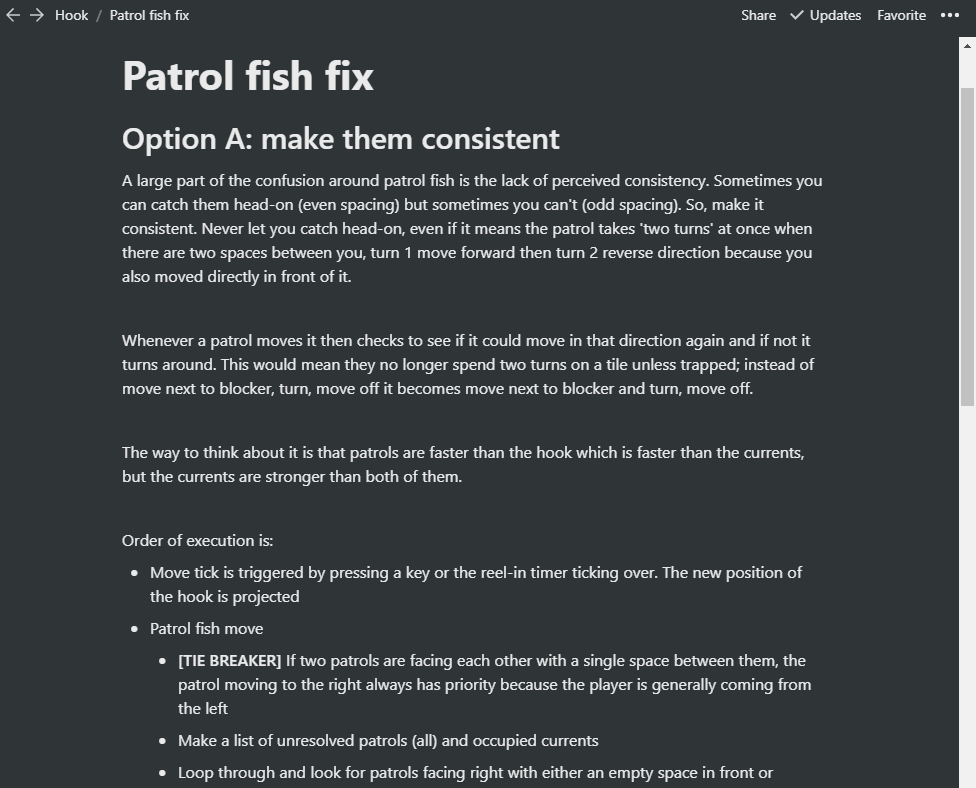
For example here is part of a design document I wrote when I was trying to solve the confusion playtesters felt around the moving patrol fish. Each heading, paragraph and bullet point is a block, and as I was writing them it was easy to rearrange the blocks, convert them, indent them, add new ones and delete others:

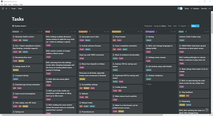
This document is a page within the workspace. This solved my design documents issue, but I didn’t want to be split between different solutions. Thankfully Notion also has kanban-board functionality, and I was even able to import my existing tickets from Trello. Several years later and after my big recent reorganization, this is what the board currently looks like:

You can see from the icons at the top right that Andrew also has access to this page, and I include his name on his tickets so he can search for them (you can assign tickets to members, but 95% of tickets would be assigned to me, so I don’t bother).

I created 6 columns: shelved, bugs, long term, short term, in progress and done. I also created 5 labels: code, art, design, audio and admin. I chose some colors that I liked. This way of organizing the tickets has helped a lot in reducing the noise and mental workload when I decide to sit down and work on something. There are a lot of things I need to do at some point but which it’s unhelpful to worry about now. By splitting my list into short term tasks and long term tasks I can still track everything and add notes and todos when I need to, but I can mentally put it all to one side and focus on what I need to do right now to make progress.

I also grouped lots of related small tasks into big single tickets with detailed checklists. This stops the board from having an overwhelming number of tasks on it, and it lets me get a lot of progress done in one area at a time as I rebuild familiarity with it. Andrew and I drag a ticket to the in progress column while we’re working on it, and to the top of the done column when it’s finished; this helps with communication and planning, and it also just feels good. Moving a ticket to done is a nice reward.

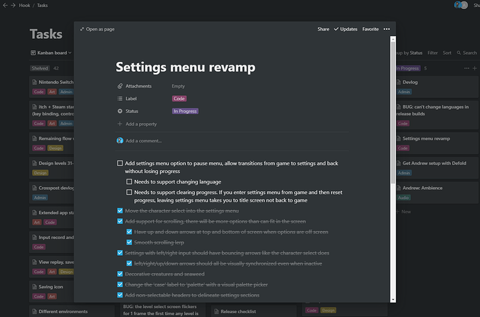
Each ticket is itself a separate page. They can be viewed as an overlay for quick edits, or expanded to their full form. Again I find the block-based editing works really well here; I can interleave paragraphs, checklists and images as and when I need to. As an example here is the main ticket I’m currently working on:

Cut features

As you can see from the number of tickets in each column, I cut about as much work as I’ve already done. Talk about feature creep! The biggest and most painful thing to cut was the flowing water. I spoke a little about this mechanic in devlog #08: (Work)flow: art. Flowing water took several months of work because there were extremely complex design problems to solve and it required massive tech rewrites; the gameplay was changing from ‘each movement tick, the hook can cause one interaction to occur’ to ‘each movement tick, the hook and every flowing water tile can cause one or more possibly-conflicting interactions to occur within a series of multidirectional dependency chains spread throughout the level’. It’s probably the most complex problem I’ve solved so far in 4 years as a professional game programmer.

The kicker was, it wasn’t fun. Turns out this was very much a “so preoccupied with whether or not they could, they didn’t stop to think if they should” kind of scenario. What I should have done was hacked in some debug functionality that allowed me to move around creatures manually, so that I could simulate the flowing water mechanic by hand and see if I could make some interesting puzzles with it. Even a paper prototype may have helped.

I’m sure many interesting puzzle games have and will be made using mechanics similar to the flowing water, but it just doesn’t fit with this game’s existing mechanics. The player movement, the basis of all the puzzles, is centred around working out what path to take and when. Every step matters, but flowing water forces the player along a specific path. The design constraints which make most of the levels work now conspire against the flowing water. With only a limited number of steps before having to reel in, the inability to cross your own line, and the very small play area in each level, there simply wasn’t enough space to make when and where you enter a flow be an interesting decision. Try as I might I was only able to design levels where the flows were inconsequential, obvious or tedious.

The main impetus for creating the flowing water mechanic in the first place was to increase the level count from 30 to 50 without beginning to recycle ideas. After a year’s hiatus I was able to come back to the game with fresh eyes and realize I really didn’t need more levels. I am happy with 30 levels, and with the mechanics and ideas they present.

Not everything in the shelved column is necessarily gone forever. For example I’d love to release the game on Switch, itch and Steam. But that is longer than long term; the goal is to finish the game and release it on Android and iOS. Anything else is just a distraction not yet worth thinking about.

Many of the other cut features were ideas for mechanics, twists or app features. Everything that remains is focused on polishing what is already there, because I no longer feel it isn’t enough. In fact I think it’s pretty good.

What’s next

I’m really enjoying working on this hobby project again now that the scope is contained and I have a solid grasp on what work remains and what quality bar I’m aiming for. I previously felt an immense pressure when working on the game which has since dissipated over the hiatus. It’s very chill now; I just chip away at it when I feel like it. My free time is my own, and it is equally OK whether or not I choose to spend it working on this game. I have no release date whatsoever in mind, and I’m going to keep it that way for as long as possible. I just want to enjoy the remainder of the ride.

That said, I’m keeping the details of those tickets in the screenshot to myself for now, and a few of the juicier tickets just so happen to have been cropped out of the image :wink: . I’m sure I’ll be writing devlogs about them in due time.

You can follow me on Twitter @rhythm_lynx

13 Likes

Such a sweet and neat game with such a big and cozy story. Thanks for this devlog!

3 Likes

lol. lmao.

1 Like

#12: Localizing a low resolution pixel art game

Languages

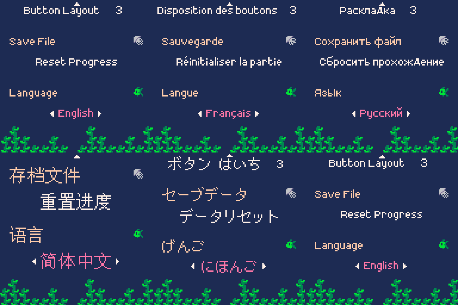
This game supports 12 languages: English, French, Italian, Spanish, German, Brazilian Portuguese, Russian, Japanese, Simplified Chinese, Traditional Chinese, Korean, and Arabic. I only know English. The game has a resolution of 128x128 pixels. I chose this set of languages because it has very broad coverage and includes some interesting learning opportunities.

The European languages are fairly easy because they use the same Latin alphabet as English so I can tell what is legible and can actually read the text to quickly spot mistakes. Russian is an interesting twist because it uses the Cyrillic alphabet but the font and word sizes are about the same so the layout still doesn’t change much, and many of the glyphs are still recognizable to me. The Asian languages were totally alien to me; glyphs, spacing, font size, the density and length of text. I knew these would be difficult because some glyphs are very densely detailed, meaning the minimum number of pixels needed to keep things legible is considerably higher compared to the Latin languages. Arabic is not only a different alphabet, it has the additional complications that its glyphs look different based on their neighbours, and that it runs from right-to-left instead of left-to-right.

I knew that there were two variants of Chinese, Simplified and Traditional, and that it’s a good idea to support both if you’re supporting either. I didn’t know that there are multiple variants of Traditional Chinese. The translators recommended the Taiwan variant because the population is much larger and readers of other Traditional Chinese variants can read the Taiwan variant.

Changing the name

The name of the game has changed. The game jam prototype will remain “Hook, Line and Thinker” but the full game is now titled “Curious Fishing”.

There were a couple of reasons for this. The old name is very long and awkwardly includes a comma. People usually misremembered it as the phrase it’s a pun of, “hook, line and sinker”. That base phrase is also not particularly something I want to invoke because it generally refers to someone being tricked or conned. The title being a long pun also made it completely untranslatable, meaning there either had to be a different name per language or a secondary name that all non-English languages used. I would much rather have a single name used in all languages.

What I liked about the name “Hook, Line and Thinker” is that it perfectly describes the game; you, the thinker, move your hook on a line to solve puzzles. But it was too unwieldy. I really like the new name “Curious Fishing”. It’s short, unique, memorable and ties into the gameplay. “Fishing” describes the core mechanic and context of the gameplay, while “Curious” is both an adjective suggesting something unusual about the fishing, as well as a prescriptive verb for how the player will feel, for what they will do.

Once I decided to change the name, I had to find a new one. It needed to be something that wasn’t already in use, for example my first choice was to simply shorten the name to Hook, but there is already a somewhat recent puzzle game named Hook. Here is a selection of some other name ideas; I kept tossing ideas into a huge list whenever I thought of new ones, until something eventually stood out.

Hooked Get Hooked Fiendish Fishing
Puzzle Fishing Genius Fishing Ingenius Fishing
Unusual Fishing Peculiar Fishing Eccentric Fishing
Inquisitive Fishing Reel Smart Reel Smarts
Reely Smart Reel Clever Reely Clever
Marine Mystery Abnormal Aquatics Astute Aquatics
Advanced Aquatics Alternative Aquatics Abstract Aquatics
Adept Aquatics Applied Aquatics The Art of Aquatics
The Art of Fishing The Angler’s Art

I actually came up with the name Curious Fishing in *checks notes* 2019 (fuck) but I wanted to confirm that it translated well before publicly committing to the change, and I knew the final translation pass would be done near the end of the project once all the English text was locked in.

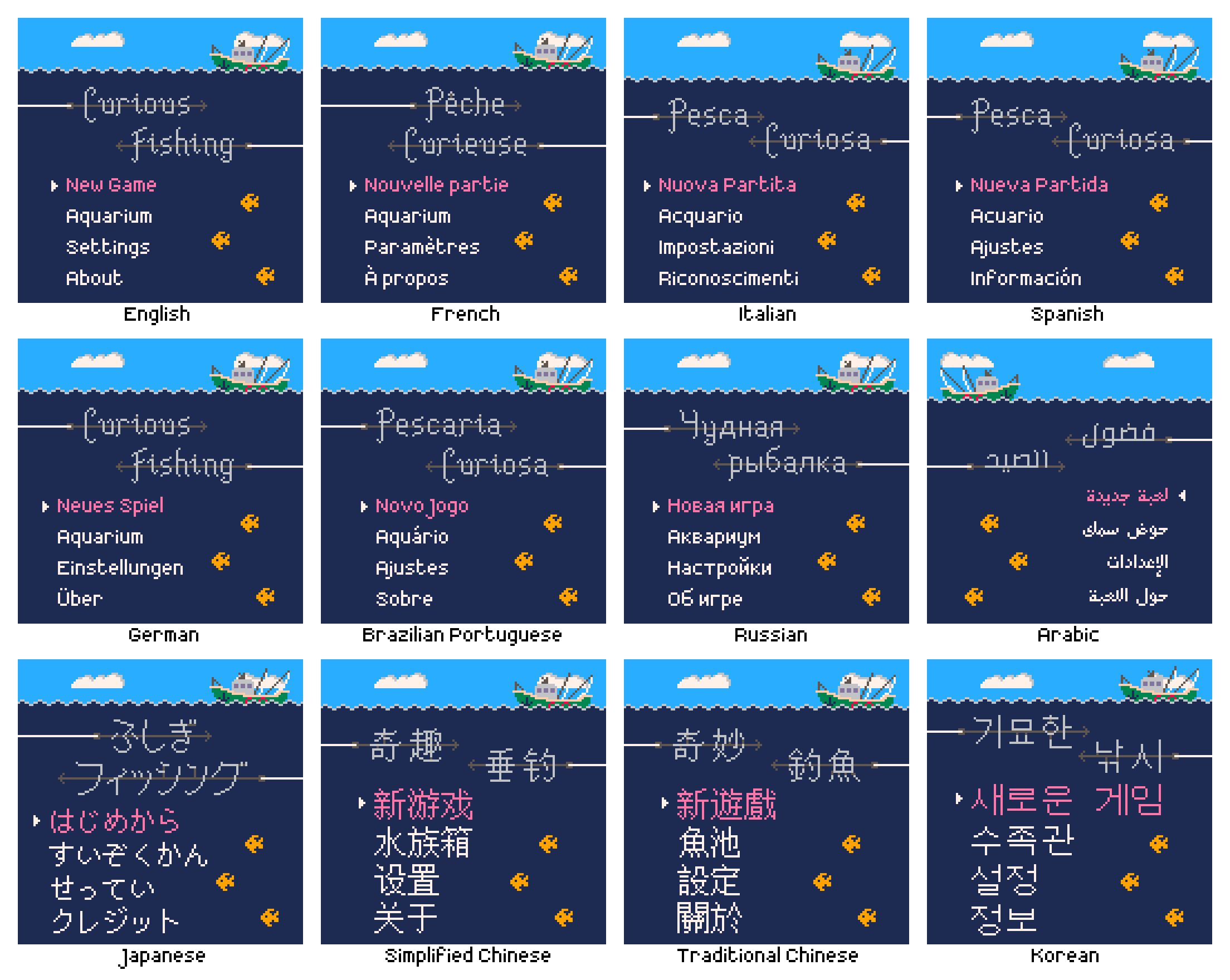
Here is the name of the game in each language. German uses the English title, on the recommendation of the translator (this is apparently standard practice).

As I had hoped, “Curious Fishing” was easily translatable to each language, both the phrase and the concepts it conveys. I asked the translators what the literal meaning of each title was, roughly:

Language Title Literal meaning
English Curious Fishing Curious Fishing
French Pêche Curieuse Literal translation of “Curious Fishing”
Italian Pesca Curiosa Literal translation of “Curious Fishing”
Spanish Pesca Curiosa Literal translation of “Curious Fishing”
German Curious Fishing This is the English title
Brazilian Portuguese Pescaria Curiosa Literal translation of “Curious Fishing”
Russian Чудная рыбалка The name is a wordplay as it can be read in two ways. The first meaning is “Wonderful/Amazing Fishing”, the other one is “Funny/Curious/Wacky Fishing”
Japanese ふしぎフィッシング The literal meaning is roughly “Mysterious Fishing” but can also be interpreted as “Curious Fishing”
Simplified Chinese 奇趣垂钓 The literal meaning is roughly “Interesting and amazing fishing”
Traditional Chinese 奇妙釣魚 The literal meaning is roughly “Marvellous fishing”
Korean 기묘한 낚시 The literal meaning is roughly “Curious Fishing”
Arabic فضول الصيد The literal meaning is roughly “The inner passion and love of fishing”

For most text I could use existing fonts made by native speakers, trusting in their legibility at low resolution. For the title logos however I had to draw them by hand, in a larger size stylised to look like two fishing hooks coming in from opposite sides of the screen. For the Latin languages this was fairly easy because I could be confident that the glyphs I drew had the intended meaning. For the other alphabets I used the main text font as well as the language filter and preview text in Google Fonts to see the title text in a variety of styles. This provided a reference that I could use to get a feel for what the most important characteristics of each glyph were. If you speak one of these languages, let me know how I did! The most important thing is that the title logo is legible in each language; ideally it also looks a little spiky, a little like a fishing hook.

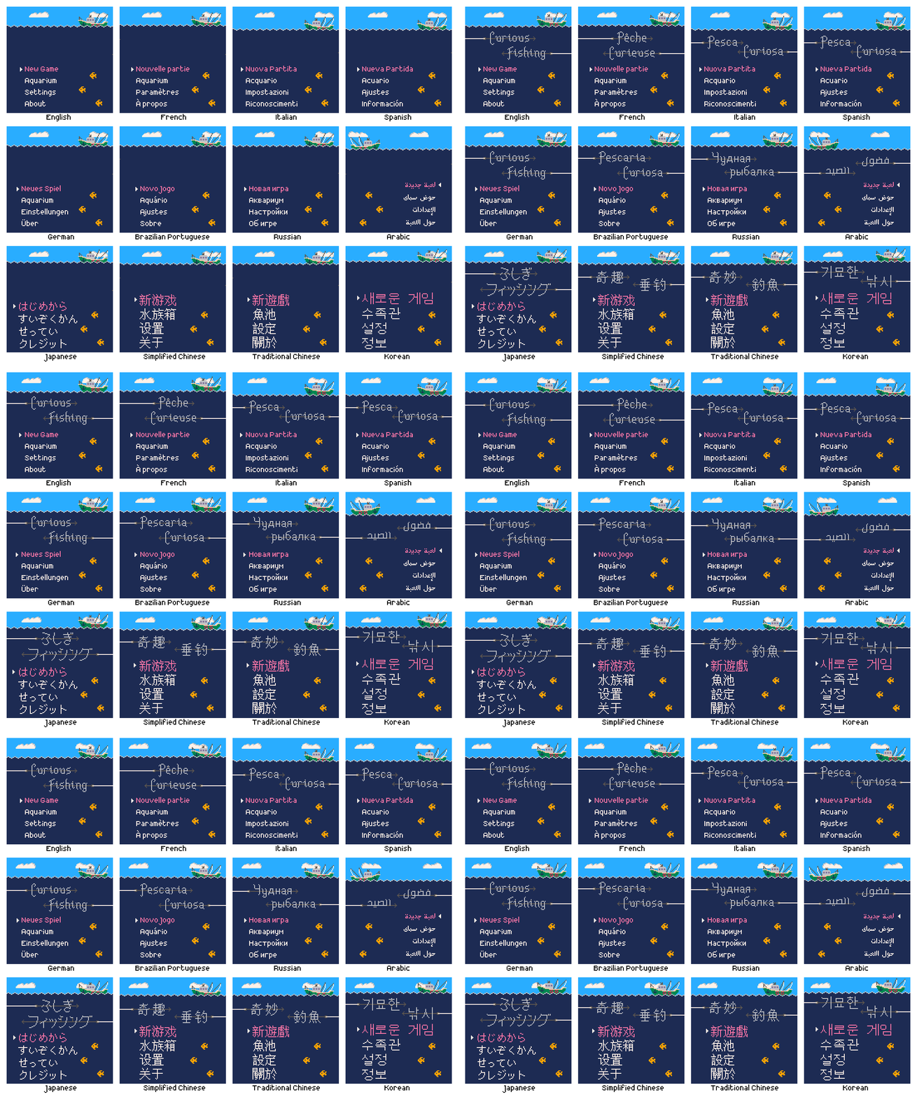
The clouds and creatures are usually randomised, but I used a fixed seed here so it was the same in each language. You can see that I had to adjust the height of the waves and boat to fit the larger text for some languages such as Korean.

Content

Besides the title, what text was there to translate? In the final translation pass there were 112 strings totalling 508 words in English. There is no narrative and where possible the game presents information visually to minimize the word count. Here’s an interesting comparison:

ISO Code Language Word count Character count
EN English 508 (100%) 2767 (100%)
FR French 527 (104%) 3213 (116%)
IT Italian 502 (99%) 3162 (114%)
DE German 570 (112%) 3334 (120%)
ES Spanish 483 (95%) 3363 (122%)
PT-BR Brazilian Portuguese 453 (89%) 2669 (96%)
RU Russian 426 (84%) 2691 (97%)
JA Japanese 189 (37%) 1695 (61%)
ZH-CN Simplified Chinese 120 (24%) 950 (34%)
ZH-TW Traditional Chinese 127 (25%) 916 (33%)
KO Korean 437 (86%) 1619 (59%)
AR Arabic 488 (96%) 2779 (100%)
4830 29158

Because each glyph conveys more individual meaning, the Asian logographic languages require far fewer glyphs to present the same amount of information, although they require larger glyphs as a result (felt keenly at such a low resolution). German is famously verbose and meets that expectation here, but surprisingly Spanish has the longest text overall.

Of the 112 translated strings, only 32 are actually in use in the game, amounting to just 51 English words, 10% of the English word count. Some of the unused text is future-proofing for features I may want to add in the future, for example achievement names and descriptions in case I ever release the game on a storefront that supports or requires them. The remainder is meta-text such as the store page description.

Implementation

Fonts

The text rendering is not done using fonts, or at least not at runtime. Each string in each language is baked into a sprite and the game displays those at runtime instead. There are two reasons for this. One is that it avoids having to use Defold’s UI text rendering system; by having everything go through sprites I’m able to leverage the work detailed in devlog #5 for pixel-perfect sprite scaling. The second reason is that the size of the font files is larger than the entire rest of the game, so loading them for runtime use would more than double the size. According to the build report the game is around ~5.4 MiB, ~5 MiB of which is audio. The total size of the four fonts on disk is ~7 MiB, mostly due to the Asian logographic languages since they contain thousands of glyphs.

Language Font
English Crazy Pixel
French Crazy Pixel
Italian Crazy Pixel
German Crazy Pixel
Spanish Crazy Pixel
Brazilian Portuguese Crazy Pixel
Russian Crazy Pixel
Japanese PixelMplus
Simplified Chinese Wen Quan Yi Bitmap Song
Traditional Chinese Wen Quan Yi Bitmap Song
Korean Wen Quan Yi Bitmap Song
Arabic Arapix

I’m using the Crazy Pixel font for all the European languages, a font I really like and find very clean. I installed Crazy Pixel on my machine and would copy+paste the translated strings directly into the text tool of an image editor, crop each to even dimensions then save it out as a .png. All the individual text sprites are recombined in Defold into a single texture atlas.

For the other fonts it was difficult to get them to render at the base resolution and without any aliasing. I ended up opening each font in FontForge, using the metrics window as a preview, then screenshotting that and scaling it down to the base resolution. This manual sprite baking process was time consuming and would start to hurt my wrists if I did too many in a sitting, but over time all the text was baked. If there were significantly more text in the game it would have been worthwhile to create a tool that took the fonts and strings and baked them out for me, but I’m getting better at recognising when to not over-engineer things and just keep it simple when appropriate.

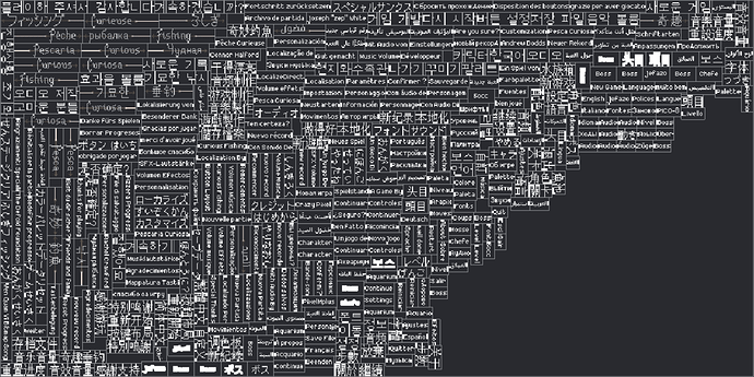
After baking, each string in each language is now an individual sprite, all of which are then grouped together into a single 1024x512 text sprite atlas in Defold. This also includes the hand-drawn title logo in each language. Here is a preview of the text sprite atlas, some text looks a bit weird due to sprite border extrusion in the atlas, which reduces artifacting at runtime.

Layout

The naming convention for the text sprites uses the ISO language code as a prefix to a descriptive name, for example EN-MainMenu-NewGame, FR-MainMenu-NewGame etc. There are 6 main screens in the game: title (main menu), level select, gameplay, aquarium, settings and about. Each of these screens has a manager script which among other things will adapt the screen’s layout to match the current language (except the aquarium which contains no text). For example the title screen will send a play_animation message to the sprite representing the “New Game” text, telling it to play the MainMenu-NewGame sprite with the current language’s code as a prefix.

Some screens like the settings and about screen (containing the credits) are programmatically laid out at runtime, using different parameters for each language. Others like the gameplay and level select are manually laid out, with only certain elements being repositioned based on the language. In devlog #4 Bootstrapping, menu transitions and level loading I said that for some screens there was a different collection for each language, such as settings_english.collection, settings_french.collection etc. Back then I was manually laying out the text, but eventually I found it much better to have a single collection per screen and to assign the sprites and adjust the layout in code.

I found that every individual sprite had to have even dimensions to avoid artifacting, so for example if a text sprite was 39 pixels wide I would add a transparent column of padding pixels and bake it out at 40 pixels wide. To make things easier to align, all sprites for a particular language have the same height, meaning additional padding rows, and again ensuring an even height. Without padding and border extrusion the text sprite atlas would be even smaller.

In some cases it was necessary to know how wide a text sprite was in order to position something adjacent to it, or to accurately position it relative to something else. I needed to know the width to update the layout, but in that same function was where the text sprites were assigned to match the current language. I found that after setting a sprite with a play_animation message, trying to read the size of the sprite with go.get("#sprite", "size") would still report the size of the previous sprite. There didn’t seem to be a way to get the width of the sprite in the same frame as setting it, because the animation_done callback message would occur on the next frame, meaning 1 visible frame where the layout was wrong. This feels like a very basic operation and was quite frustrating. In the end I resorted to the stupid, simple solution of a function like this:

function get_text_sprite_width(lang, sprite_id)
	if sprite_id == "MainMenu-About" then
		if lang == LANG_ENGLISH then		return 26	end
		if lang == LANG_SPANISH then		return 50	end
		if lang == LANG_FRENCH then			return 38	end
		if lang == LANG_GERMAN then			return 20	end
		if lang == LANG_ITALIAN then		return 62	end
		if lang == LANG_RUSSIAN then		return 34	end
		if lang == LANG_ARABIC then			return 36	end
		if lang == LANG_CHI_SIMP then		return 28	end
		if lang == LANG_CHI_TRAD then		return 30	end
		if lang == LANG_KOREAN then			return 30	end
		if lang == LANG_JAPANESE then		return 58	end
		if lang == LANG_BRAZ_PORT then		return 26	end

	elseif sprite_id == "MainMenu-Aquarium" then
		if lang == LANG_ENGLISH then		return 38	end
		if lang == LANG_SPANISH then		return 32	end
		if lang == LANG_FRENCH then			return 38	end
		if lang == LANG_GERMAN then			return 38	end
		if lang == LANG_ITALIAN then		return 38	end
		if lang == LANG_RUSSIAN then		return 42	end
		if lang == LANG_ARABIC then			return 38	end
		if lang == LANG_CHI_SIMP then		return 44	end
		if lang == LANG_CHI_TRAD then		return 28	end
		if lang == LANG_KOREAN then			return 46	end
		if lang == LANG_JAPANESE then		return 72	end
		if lang == LANG_BRAZ_PORT then		return 32	end

	-- continue for several hundred lines…
	end

	local name = sprite_id
	if sprite_id == nil then name = "(nil)" end
	print("ERROR: width of sprite "..name.." for language "..get_language_prefix(lang).." unknown")
	return 0
end

I was expecting Chinese to have the largest text due to the density of its glyphs, but Korean turned out to be the difficult one. On the title screen I had to push up the waves to make enough space. The gameplay screen is a bit cramped but I wasn’t able to make more space there, I think it’s fine really. Working at such a low resolution meant I had to manually check and adjust every screen in every language, shifting things around by pixels for maximum legibility.

Text animation

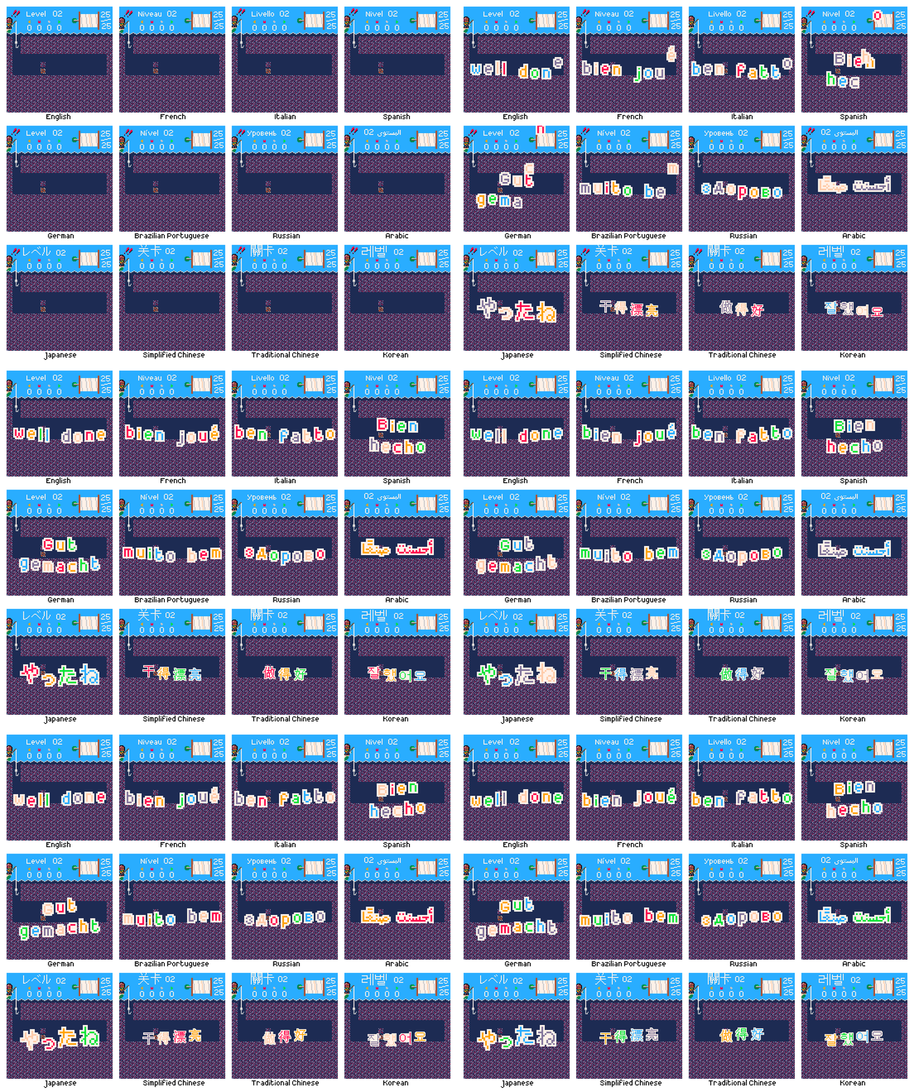
When you complete a level there is a celebratory ‘well done’ animation using colorful, moving, individual letters. This also had to be localized. I wanted all text in the game to be localized so that you can experience it fully without knowing any English at all. With only a couple of exceptions for specific strings in specific languages where the translator recommended keeping the English, this has been achieved.

For these animations to work, I split each message into individual glyphs, then made two sprites for each; the foreground letter, and the solid backing. There are several possible messages in each language, requiring a total of 110 unique glyphs, so 220 sprites including the backing. Required glyphs:

abcdefghijklmnoprstuvwyz
BDGNRS
'
éü
бвгдзийкнпы
きくしぜたっねやろんアクジステリー
亮做好干录得感持支新游漂玩紀纪謝谢錄
감기니다레로록사새서셔어요운이잘주플합해했
أحسنت صنعًا شكرًا على اللعب رقم قياسي جديد

The core of the animation is driven by a hand-written data table defining the glyphs and animation parameters for each language, as well as the x- and y-advance to space things out legibly. Each glyph is eased in following a delay sequence before oscillating on a sine wave offset by its x coordinate.

The glyphs for most languages are 2x scaled, but the Chinese and Korean messages were too large so remain 1x. Arabic needed special handling. Glyphs in Arabic appear differently depending on their neighbours; this means that animating individual characters would render the text meaningless. So I baked each individual word instead, and after falling in sequence they oscillate together, maintaining the language’s strong text base throughline.

Right-to-left languages

Not all languages follow the same direction. English and many of the others supported by the game flow from left-to-right, top-to-bottom. Some languages like Japanese and Chinese can flow vertically from top-to-bottom, right-to-left, but are also commonly written horizontally left-to-right, so that is done here. Arabic however is always horizontal right-to-left.

For some screens this required no or minimal extra work to support. Multiplying a few x-offsets by -1 if the current language is Arabic, for example, to move the opposite way. Mercifully the same 0-9 number system, with larger values on the left (e.g. “128”, the 1 represents the largest value), is still understood; in fact this is known as the Arabic numeral system and originates from this language.

The most changes needed were for the settings menu. The direction of a language influences how people perceive other quantities. For example in a left-to-right language, ‘time’ and ‘progress’ are generally perceived as moving from left to right. When presented with a volume slider and no other information, it seems natural that volume increases when the slider is moved to the right, and decreases when moved to the left; in fact it feels actively wrong the other way around. But these directions are not inherent to these abstract concepts, there is no ‘correct’ direction. In right-to-left languages, ‘time’ and ‘progress’ are generally perceived as moving from right to left. A volume slider here would naturally increase volume when moved to the left. This concept is known as bidirectionality. For the settings menu this meant that numeric values that were increased by pressing right and decreased by pressing left, had to instead decrease on right and increase on left.

For a while I intended to take this further. In every level the hook starts in the top-left of the screen, and you generally move rightwards. This was an unconscious design decision; it simply felt natural to me to move to the right to make progress. I experimented with flipping the gameplay horizontally so that in Arabic you start on the top-right and generally move leftwards, because I thought that this might feel more natural for native speakers, feel more like making progress. There are three reasons I abandoned this:

  • I don’t actually know if this would be preferable for native Arabic speakers, and I don’t know any to ask them or playtest
  • I don’t know of any other games that do this. Even if this were on some level preferable, Arabic players may in fact be more familiar with moving left-to-right to progress, based on other video games
  • It was a non-trivial amount of work and created many bugs, so it wasn’t justifiable. It would have been considerably easier to do this in Unity, where negative scales are allowed, so to horizontally flip something you just give it an x-scale of -1. Unfortunately this isn’t allowed in Defold, so in order to horizontally flip something you have to rotate it 180° about the y-axis. This in turn reverses the z-ordering of everything, so then you have to also negate or otherwise sort all the z coordinates, and remember to do this whenever a new object is created. No thank you

Cost and timeline

I live in the UK, so although services may be priced in $USD or €EUR I’m ultimately charged in £GBP.

In 2017 I spent $60 USD on a license for the Arapix font as this was the only pixel-art font I could find that supported Arabic, and is made by native speaker who is a professional font designer so I can be reasonably confident that it is actually legible. At the time this converted to £47.89. The other fonts were all free.

Also in 2017 I did a first pass on localization. I used LocalizeDirect, they charge per-word and at the time there were only around ~75 words so this cost €114.99 which converted to £102.63 at the time.

I did the final localization pass in 2022, again with LocalizeDirect. As mentioned above, the word count was ~500 this time as this included text for potential future features like achievements, as well as meta-text like the store page description of the game. This also included all the text from the first pass again; some had changed, some was the same, but I wanted to have everything translated together for consistency. This cost €582.92 which converted to £501.74 at the time.

This gives a total cost of £652.26. At the time of writing in July 2022 that converts to around $773.22 USD or €766.56. This does not include the labour cost for the considerable amount of time I’ve spent organizing and implementing the localization.

Why do all this work?

One of the primary motivations for this project has been to allow me to gain experience in areas of game development I haven’t worked on professionally yet. Although during the course of development I have now worked on a couple of games supporting the standard EFIGS (English, French, Italian, German, Spanish), I hadn’t when I started this, and also wasn’t particularly involved in that work, just fixing a few bugs here and there. This is also why I wanted to go beyond EFIGS and support non-Latin languages and even right-to-left languages; I knew these would present further challenges, all of which I was interested in solving.

There is of course also the practical concern, the reason any commercial game is localized. Doing so expands your potential audience dramatically. Many, many more people will be able to play my game now than if it were English-only. That’s a nice feeling, and obviously economically valuable. That said, I probably won’t break even anytime soon, if ever.

I will talk more about my launch plans in another post, but an important point to remember is that I own this game. I can do whatever I want with it, such as porting the game to any number of platforms, including those not yet in existence. The game is tied to the Defold engine, but not particularly tightly, so if in 15 years time I want to release Curious Fishing on some new platform, and Defold has since been discontinued or doesn’t support the platforms I’m interested in, it would be relatively straightforward to move to a different engine or custom framework. For every platform I release the game on, I will be able to launch in several markets thanks to the game and store page description being localized. It’s a multiplier. I intend to maintain this game, not to let it bit-rot or become lost; I want it to remain playable for as many people as possible for as long as possible. The variety of supported languages (Latin, non-Latin, large size, right-to-left) and standardised form (baked sprites) ensures that adding additional languages in future if desired should be relatively straightforward.

Trivia

Finally, a few random interesting facts I learned:

  • Jellyfish is ‘medusa’ in Italian and Spanish and ‘méduse’ in French, like the snake-haired monster of Greek mythology
  • In German all nouns are capitalized. So “big fish, little fish” is “großer Fisch, kleiner Fisch”
  • In Russian only the first letter of the title of a piece of media is capitalized, not the first letter of each word like in English. So “Curious Fishing” becomes “Чудная рыбалка” not “Чудная Рыбалка”
  • In French certain punctuation such as ? and ! is preceded with a space. “Confirmer ?” “Amuse-toi bien !”
  • In Spanish certain punctuation such as ? and ! are flipped and wrapped around the text. “¿Seguro?” “¡Guardado!”
  • Although it may be different sizes or orientations, the question mark ? is widely understood across many languages and alphabets
  • Although other languages may have their own symbols, the numerals 0-9 read left-to-right are widely understood across many languages and alphabets
  • In Russian “quotation marks” are «like this»
  • In Japanese “quotation marks” are 「like this」
  • In Chinese “quotation marks” are 《like this》

Closing thoughts

Localizing the game into 12 languages, including non-Latin and right-to-left languages, was a tremendous amount of work. Due to the low resolution, much of it was tedious, requiring me to check every screen in every language and minutely adjust things. But much of it was also fascinating, and I learned a lot of practical information and skills in the process. Now that it’s finally done, I’m really happy with it. It’s very cool. And I will feel the benefits every time someone who otherwise wouldn’t have been able to play my game gets to enjoy it. Like the pixel-perfect resolution scaling (devlog #5), this adds a great deal of future-proofing to the game, hopefully making it something that many people can enjoy for a long time to come.

Thanks so much for reading this longer devlog.

Follow me on Twitter @rhythm_lynx for occasional progress updates
Follow me on itch rhythmlynx.itch.io to be notified when I release something
18 Likes

Thank you for sharing this update! I’m really pleased to see this game moving closer to release.

I look forward to hearing more about your plans!

2 Likes

Thanks for adding the Korean translation. However, the Korean font feels quite strange. Because the “Wen Quan Yi Bitmap Song” font is rarely used in Korea.

These are the fonts that are often used in pixel art games in Korea.
NeoDunggeunmo : https://github.com/neodgm/neodgm/blob/main/README.en.md
galmuri : https://github.com/quiple/galmuri

4 Likes

That’s a great recommendation! For a non-native speaker it is hard to tell if a font is good or bad.

2 Likes

Thank you very much for the feedback and recommendations! As britzl says, it’s very hard to judge the style of a font when you aren’t familiar with the alphabet. I will take a look at those fonts to see if they would fit better

This is interesting. For me it always worked both ways. So depending on current language layout in the system I would put one of variants)

Very nice and interesting devlog. Thank you!

1 Like

I’ve looked into these alternative Korean pixel art fonts but I’ve decided I’m going to stick with Wen Quan Yi Bitmap Song for now.

The NeoDunggeunmo font is too large to fit in this game’s resolution. The Galmuri font is very nice looking, but I didn’t even check to see whether or not it fits because it’s based on the Nintendo DS font and Nintendo are known to be litigious so for me it’s not worth the risk.

On a practical note I also shouldn’t really commit to a non-trivial amount of work based on feedback from a single person, especially when that feedback is aesthetic in nature (for all I know someone else might say the font looks good). I do really appreciate the feedback, but my priority is very much finishing what’s already there so I can finally release the game. If after release other Korean players also commented that the font looked strange, that would help to verify and justify that this was a change potentially worth doing.

2 Likes