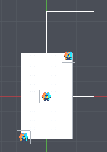
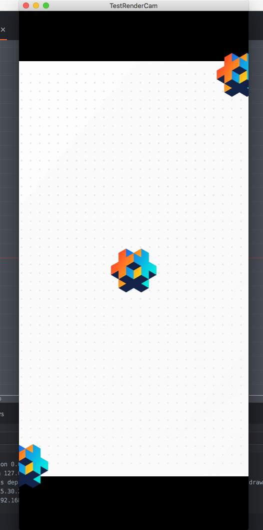
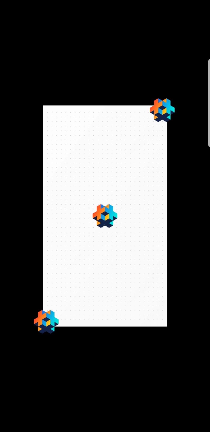
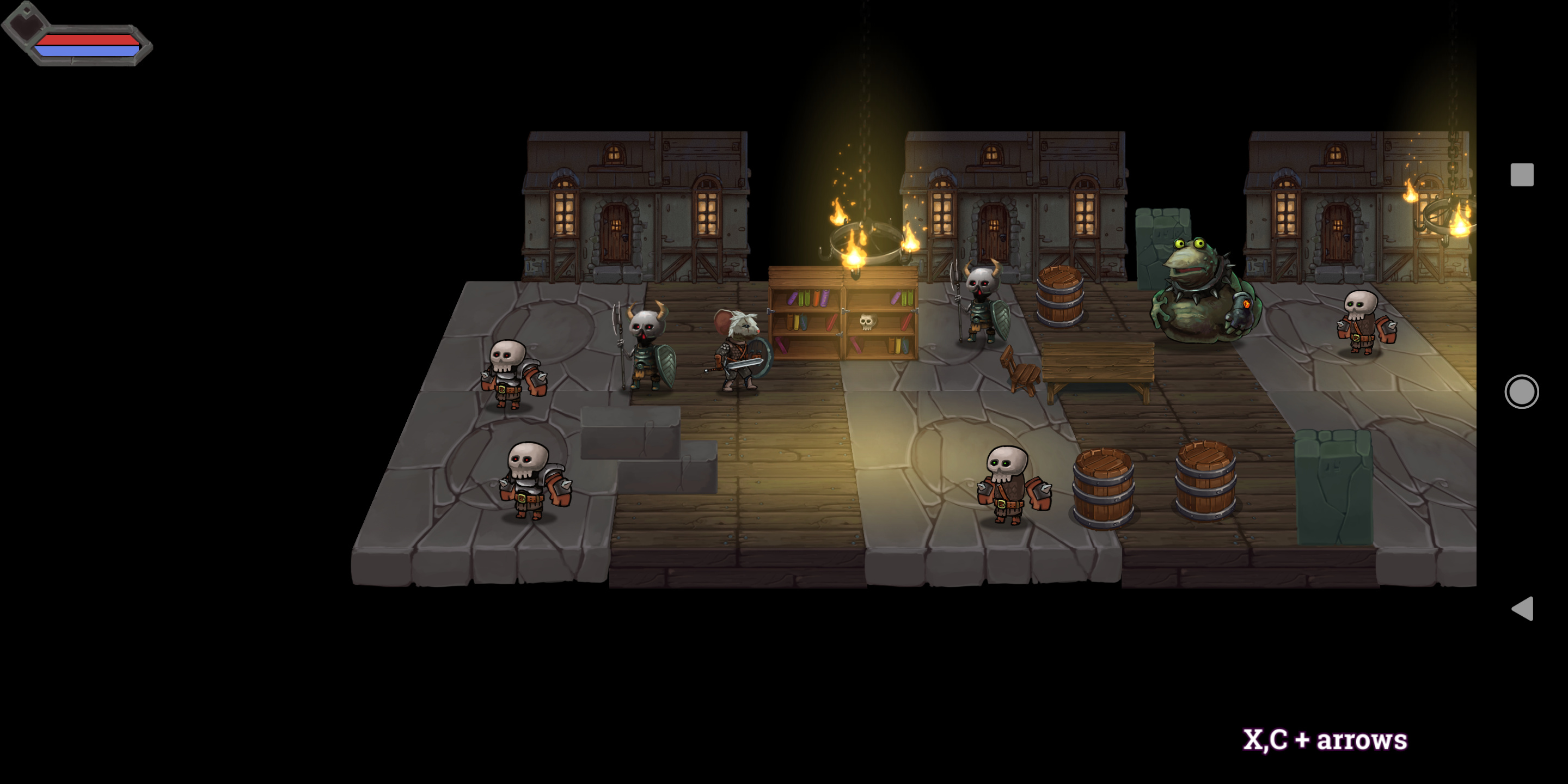
The background’s width is almost the same with the screen’s width (I added the Gui go to visualize the size). I expect it will stay that way when I resize the windows. And it did on desktop:
Sorry, went AWOL for a couple days. Hmm, could be a bug. Is this when you run it on the phone from the editor, or if you bundle and install it on the phone? Can you send me your test project? (zipping the project files and uploading to the forum is easiest.)
I’m still trying to figure out exactly why it’s behaving different on mobile than on desktop, but I think if, on your camera, you check “Use View Area”, and set the “View Area” X to the width you want, then it will behave the way you want.
[Edit] If you don’t check that, then the camera uses the current width of the window, which I guess in your case is smaller than the display width that you have set in your game.project (640)? That explains why it’s different on mobile (at least that’s what happens on my test phone).
I did what you suggested here, but isn’t that if I choose “Use View Area”, then the camera will always show the same width regardless the screen’s size? Because what I want is to have the game shown like “Fixed width” on desktop version, the game’s width is always the same as the window’s width.
I don’t think I fully understand what you meant here. What is the current width of the window? and why is it smaller than the display width on the phone? Is there any thing that I can change that to make it work as expected?
Hmm, I guess it’s hard to communicate this stuff, are these not the same thing on mobile? The “window” is always fullscreen? Window width == screen width?
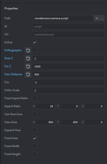
When you set the camera to Fixed Width, after it is init, if the window changes, it will adjust its zoom so you see the same width in world space filling the width of the window.
The Use View Area option just controls the initial width that the camera will use.
If un-checked, the camera will use the current width of the window.
On desktop, this is usually the window width you set in your game.project file.
On mobile, this will be whatever the device tells Defold it’s screen width is.
If checked, the camera will use the width (“X”) that you set.
In other words, if Use View Area is not checked, the width that your camera will use is kind of random: it’s whatever your mobile device’s horizontal screen resolution is, or the current window size on desktop. Probably I should change this behavior to use your game.project settings instead.
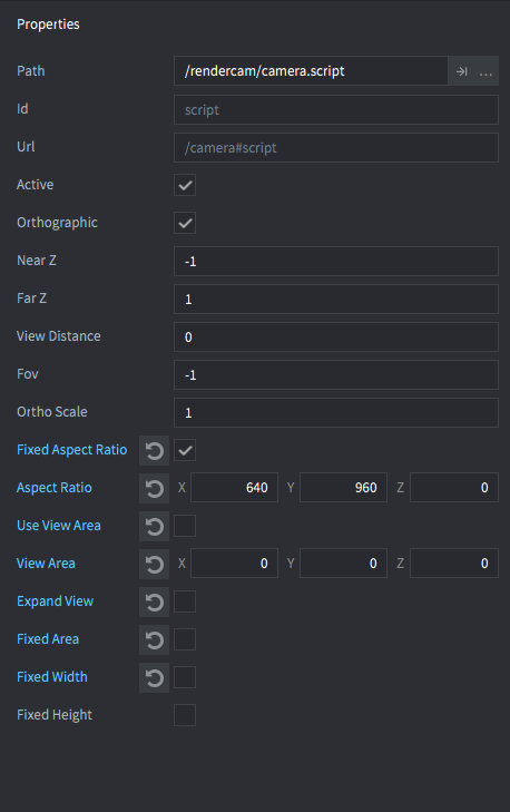
If you set your camera to Fixed Width, check Use View Area, and set the View Area > X to 640, then you will always see 640 pixels width of world space, no matter what your window size, device resolution, game.project settings, etc.
In your test project’s game.project file, you have the display width & height set as: 640 x 1136. With “Use View Area” un-checked, if you start it up on desktop, the window width will be 640, so the camera will use that as its fixed width. My test phone, regardless of game.project settings, it tells Defold that it has resized the window to 540 x 888, so the camera uses 540 as its fixed width.
If you want to check this on your device, open rendercam.lua and under, function M.update_window(newX, newY), add:
@Dragosha Sorry. I didn’t hear any complaints before now, so I didn’t think to change it. I see now that it’s the wrong way to handle things by default!
Can you tell me what you would expect the camera to show with those settings? If it used the game.project width x height, would that seem correct?
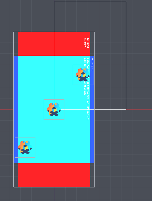
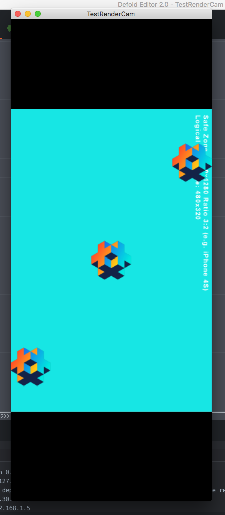
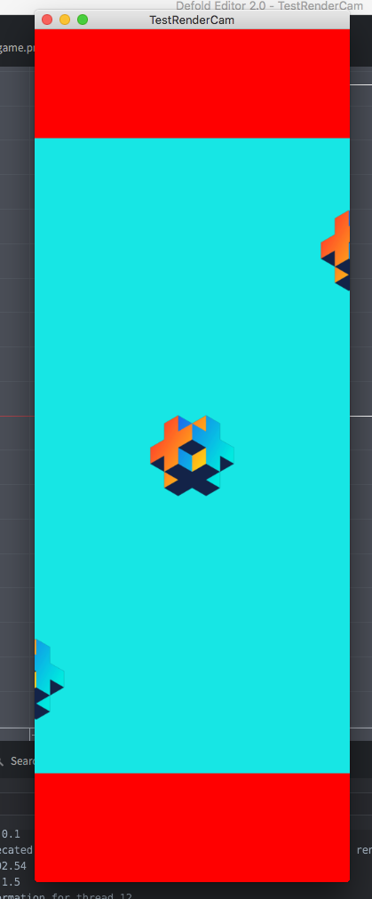
Well, if you un-check Fixed Aspect Ratio, then of course it will do nothing. You should also use the “Use View Area” option, as before, to ensure it zooms to the exact same area on all devices. Using those options, you will always see the exact cyan area, and only the cyan area, with black bars filling any excess space. You can use GUI nodes to cover the black bars with background images if you like.